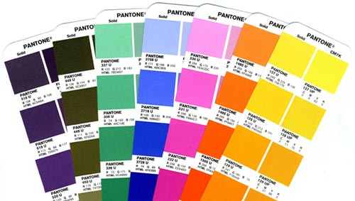
Printing with Pantone Colors and Spot Color Inks
Color creates the first impression of any print. Even the lack of color can be a bold statement. Because of that, you should put thought into how you want colors to impact your brand through print.
The biggest choice you will need to make when it comes to ink is whether to use spot colors (Pantone Matching System
®) or
CMYK process printing. Understanding the difference between the two "color systems" and when you should use each is the key to making it an easy choice.
What is a Pantone (PMS) color?
A PMS color is a specific numbered color in the Pantone Matching System® used in the graphic arts, printing and other industries to facilitate accurate and consistent color reproduction, especially across multiple production runs, vendors and manufacturing processes.
CMYK vs Pantone: Printing Processes Demystified
When preparing an image for printing in CMYK, the electronic file is separated into four primary colors: cyan, magenta, yellow and black. The image is recreated using screen tints made up of small dots that are applied at different angles to the four process colors. The separated color images are then transferred to four different printing plates on the press. The colors are then printed one after the other to recreate the original image. The CMYK colors are manufactured colors and are not mixed by the end user. This method can be referred to as 4 color, full-color or standard process printing.

CMYK or cyan, magenta, yellow and black inks used in process printing
The PMS system uses pre-determined, published color formulas to create a large number of ink colors. PMS stands for Pantone Matching System
®, and is a standardized color reproduction system. Similar to the paint swatch guides you find at your favorite paint store, the pantone color chart contains thousands of color swatches created from a palette of basic colors. Each color has a 'PMS' number assigned to it. These numbers are used to identify the exact color needed. Using PMS inks is called spot color printing.

A selection of colors from the Pantone color chart
Get it Right: Benefits and Drawbacks of Printing with Pantone
Color is very subjective, which is why the Pantone Matching System
® works so well. It takes all the guesswork out of color identification. Every computer monitor is different, every printer is different. By standardizing the colors, manufacturers and customers in different locations can all refer to the Pantone system to make sure colors match. It is used by many printers and graphic artists to deliver reliable, reproducible colors to their customers. The ink manufacturers who create the base color inks are strictly licensed by Pantone for color accuracy.
Why PMS Isn't Always King
Even though Pantone is a great option in certain cases, it doesn't always make sense to incorporate it into your printing project. Using spot colors is usually more expensive than process inks due to the extra production costs involved in "washing up" and changing out the ink in the press, particularly when using more than one or two PMS colors depending on the printer's manufacturing equipment and processes. Since CMYK process printing uses the same base colors all the time, it's a more cost-effective solution.
When Spot Colors Should Reign Supreme
There are certain times in commercial printing when your colors need to be exact. That's when you should consider using Pantone colors, either on their own or added to standard four-color process printing. Here are a few examples:
- Consistent Branding/Logos - Think McDonald's red or UPS brown. Using PMS colors for your logo and stationery will allow you to ensure color accuracy and establish a standard that anyone working with your artwork will be able to match.
- Colors outside the range of CMYK - There are some colors that just can't be produced with CMYK, including colors such as reflex blue, fluorescent orange or metallic silver.
Need technical or creative advice on using Pantone inks on your printing project?


