The Psychology of Color in Marketing
Color has a deep impact on how people react to products and marketing materials. Understanding the influence of color can help you create more effective marketing materials and a stronger brand.
Does Everyone React the Same to Color?
 We’ve been taught to believe that everyone responds positively to green, yellow is the happiest color, and that no one likes brown. Instead, studies about color find that reactions to color are deeply personal and are created by each person’s life experiences. We assign meaning to everything in life—even color. One person might find orange to be the happiest of colors because of an orange chair she used to cuddle with her grandmother in. Another person might react negatively to orange because he broke his arm when he fell off his orange bike as a kid. There is no way to know how every individual is going to respond to a color.
When Are Responses to Color Predictable?
Despite that, some scientists think our brains are hardwired to respond in certain ways to specific colors. Blue signifies a clear sky and good weather. Supposedly, this is why so many people respond positively to blue. Brown and muddy greens and yellows signify illness, which may suggest why they are not popular colors. And we have definitely been conditioned by marketing and our society to associate some colors with certain concepts (green with environment, white with clean design, and red for warnings).
Rely on Target Audiences When Choosing Color
While not everyone reacts the same way to colors, studies do show there are clear gender preferences when it comes to response to colors. In general, men don’t like purple but women definitely do. Men tend to prefer bolder, more saturated colors and those that are darker while women lean towards softer versions and gently tinted colors.
Color preferences also differ around the world due to cultural beliefs. In the U.S. red is a color that is often associated with warning, while in Japan it signifies good luck. In the U.S., white usually implies purity or clean lines, but in China it is associated with death. These preferences are important to keep in mind when you are thinking about your target audience.
Does Color Impact Consumer Decisions?
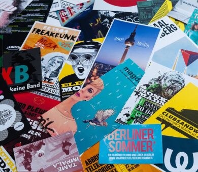
Even though everyone responds differently to colors, we do know that color is incredibly important and influences how people make decisions. In fact, up to 90% of snap judgments about products are made based on their color and 84% of consumers say that color is the main reason they buy a product. Ads that are in color are read 42% more often than those in black and white. There’s no question that the colors you choose for branding and printed marketing materials impact consumers’ decisions.
How Does Color Play into Branding?
Choosing a color scheme for your brand is one of the most important decisions you make. When choosing colors, think about the traits you want your brand to be associated with and stand for. Think carefully about your brand’s personality.
It’s important to choose a color that stands for your brand. People are more likely to respond positively to a product when the color makes sense to them and is appropriate for the product (this is why there are no purple Caterpillar bulldozers). Your brain decides for you what brands you like. If it’s easy to remember, easy to understand, and doesn’t make your brain work too hard, you’ll probably like it.
When coloring your brand, you also want to be sure to choose a color scheme that stands out from that of your competitors. You want to be memorable and different so consumers remember your brand and your product. Use color recognition to help drive brand recognition, the way that Coca-Cola® and John Deere® use red and green as an integral part of their identities.
Use Color to Direct Your Customers
When creating marketing materials, think about what you want people to do and use color to guide them in that direction. Some of the most effective marketing materials use softer color combined with a bold, loud color. A page that is white and blue with a red button for signing up for a newsletter or requesting a quote can be very effective.
People remember things that are printed in bold, bright colors. Their attention is drawn to that area on the page and they notice what you tell them in bright colors. Think of color on the page as creating a set of signs for your customers. You want them to follow where the signs are leading, so the signs must stand out and be very clear. Motorists won’t pay attention to a brown stop sign. Readers need to be told with words and colors what you want them to do, think, or remember.
If you want customers to click on things or take actions on web pages, incorporate buttons that are bright and stand out from all the other colors on the page, so they can’t help but notice them and are tempted to click. If you want a call to action to get a response, make it a different color than everything else around it.
How to Choose Color
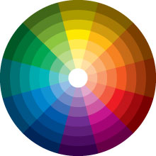
Customers respond positively to pages that have colors with similar hues, so choosing a color family can be important. The general theme of your pages should be done with analogous colors, with your most important information or calls to action in contrasting colors. When you look at a color wheel, the colors that are next to each other are analogous and combine harmoniously. If you draw a triangle from that area, you’ll find the two colors that are triadic, or contrasting colors to your harmonious family. These are colors that will really stand out and create a bold statement on the page, yet won’t appear to clash or seem discordant. This color wheel can help you put together some great color combinations.
Print Marketing and Color

When you’re ready for top-quality printed materials, find a printer that invests heavily in producing accurate color that creates effective marketing materials. There are a lot of choices you’ve got to make when you choose to print in color. First, you have to choose between CMYK and Pantone colors (or a combination of the two). CMYK uses a mixture of four basic colors (cyan, magenta, yellow and black), providing a huge range of color variations.
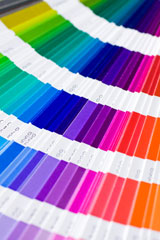
Pantone color printing has numbers assigned to the specific colors identified within this system. This allows you to select a numbered pantone color for your brand logo for example, and take it anywhere, to any printer, and have it look the same. The drawback is that you can only use the specific Pantone colors, which could be slightly different than the color you want or have been using. One caveat, Pantone colors can’t be accurately produced on digital presses. Many companies use a combination of CMYK and Pantone. These can be combined, for example using a Pantone color for a logo and CMYK for the other colors in the graphics.
If you’re interested in best-in-class color printing, keep Printing for Less in mind. We put your needs first, our customer advocates help you choose the best method to keep your brand colors vibrant, accurate and in budget. We have over 20 years of experience and we’ll make sure your color-sensitive printing gets done correctly. Give us a call for a print marketing consultation today: 800-930-6040.


