Postcard Design Tips
 Good postcards are colorful, catchy and short on words. They’re also one of the most effective ways to reach your target audience and get a response.
Postcard Perfect
Since postcards serve a lot of purposes, the best design is one that achieves the outcomes you want for the piece. Whether you seeking new leads or customers, announcing a new product, service or event, or following up with an appointment or survey card, your marketing goal should always drive your postcard design. The job of a business postcard is to impel taking action. Follow these Do’s and Don’ts to help ensure your message gets attention and results.
First and foremost, does your postcard printing convey the right visual and tactile impression? How you come across on paper depends on key fundamental graphic design concepts and printing choices:
Images and Color

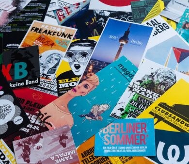
- Do use color for interest and emphasis. It can be in your logo or other images, in text or in background elements. You’ll find many stock image sites on the web if you need some artwork to spruce up your design.
- Keep your postcard design consistent with the general color and design scheme on your website, in your store, and other marketing materials.
- Do include photos if they’re appropriate for your message. Postcards that are personalized are especially useful for service businesses where an ongoing relationship is a critical factor and for displaying your products.
- Avoid most clip art for your logo or other elements. Your brand is your identity and these days you can easily find affordable images or get help with a custom logo online.
Text and Font Types
- Do keep it bright and brief! Too much text can get cluttered on smaller postcards. Your card should the teaser that motivates the recipient to contact you for more detail, don’t try to squeeze it all in. Resist using large blocks of copy. Highlight words and phrases like “Free” or “40% Off” to get your reader’s attention and encourage them to read further.
- Do limit your postcard to one or two font types.
- Don’t use light colors that are difficult to read or have an excessively dark image in the background that obscures your text.
Postcard Composition and Format
- Do keep it clean and simple. Avoid visual overload. Consider using a larger postcard size if you need more space for additional info. See common postcard size options.
- Do match the “tone” of the card to your market space. For example, if you’re targeting business executives for B-to-B marketing or luxury good buyers, consider using a more conservative approach in language, color and layout than you might for general consumers.
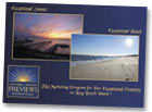
- Do strive for contrast and balance. Dark against light, opposite colors and large elements juxtaposed with smaller ones create contrast which attracts attention. Keeping the weight of elements relatively distributed on the card creates balance and pleases the eye, as do elements of similar tone or size. (sample image)
- Think outside the box. Non-standard elements such as round corners or special cut-out shapes (called die cuts) spark interest and can give a distinctive touch. Learn more about our Custom Printing Options.
- Consider putting eye-catching content on the back of the card and more text on the front. Most postcards actually get delivered with the back side up in mailboxes, so make the back interesting to grab attention quickly. Put the concept to the test and create two different versions, measure which one gets better results.
- Do use bleeds to extend colored backgrounds or images to look like they’re “bleeding” off the edge of the postcard for a professional look. Be careful not to cut it too close around the edges of the card, or use borders that could look uneven with slight variances in cutting.
See our Layout Specifications for more info on setting up your card with bleeds and safe margins.
Layout for Mailing Postcards
- Do keep clear space on your postcard mailing piece that’s free of any design elements to allow for barcoding, addressing and permit imprinting per US Postal Service regulations. This ensures both that the mail piece is eligible for your preferred mail service class and that any content in your piece isn’t covered up in the addressing and mailing process. See our U.S. Mail Layout Guides for postcards.
Paper and Texture
- Opt for a high-quality, thick cover stock for maximum impact and durability, generally 12-14pt thickness (100# to 120# cover). Compare papers when shopping for postcard printing services.
- Do match the coating to your purposes. Go with gloss to make photos look beautiful. Select a dull or matte finish for smooth, non-shiny postcards that are easy to write on. Uncoated paper has a slightly textured feel that can look more formal and match stationery such as letterhead and envelopes.
Request samples of our papers to see and feel the differences.
The Finishing Touch
Review the details before you finalize your design. Include relevant contact info including an email address and website url. Double check the numbers and spelling of all text before you send it off to your postcard printer and again when you review your proof. Typos and wrong numbers are easy to miss.
Follow these tips to create postcards that pack a powerful punch to help grow your business.


