Large 3 Panel Brochure Design Review
Can a Brochure Make You Feel Hungry?
Chef de Paris’ brochure stirs the appetite!
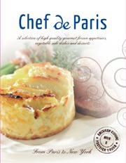 Presentation of your product is important with any brochure, but when your product is food, extra special care must be taken to entice the customer rather than repel.
Just like a chef at a fine restaurant knows, the presentation of the food can influence a customer’s perception of taste. Whether your company is a restaurant or a manufacturer of high-quality food products, the images of your cuisine and their surroundings can drive customers to you – or drive them away.
Target
The frozen appetizers, vegetable side dishes and desserts produced by Chef de Paris in Merrick, New York, are created for discerning restaurants that maintain the highest culinary standards. Certainly their brochures need to maintain the same standards as their food products.Appeal
Chef de Paris’ products are a critical component to a restaurant’s menu. They can make-or-break a restaurant customer’s dining experience. The brochure must give the restaurant owners confidence in Chef de Paris’ high standards.
- 120# dull cover stock – The thickness of this paper portrays quality and class. Combined with the smooth dull matte finish the brochure shows off crisp printing without sacrificing the ability to easily write on it and circle the items you want to order.
- Paris – Just by saying the word conjures up ideas of the Eiffel Tower, sophistication, cafes and exquisite food. As the reader looks at each picture in this brochure they can trust that the food will be mouth-watering.
Attention Directors
The designers used several techniques to display the food in this brochure.
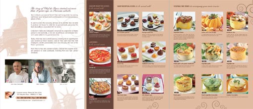
- Format and Fold – The tri-fold used in this 11 x 25 brochure makes a big impression. Using the large 3-panel brochure format, the designer arranged multiple pictures that are evenly spaced throughout the piece without over crowding the brochure. The three panel brochure makes a cost effective small catalog.
- Images of food – Close up images of the food in the brochure allow the reader to focus on each picture one at a time. By having the close-ups the reader is able to see the perfection and artistry these chefs pride themselves in.
- Colors – Using browns and whites for the background accentuates the vibrant colors of the images making really pop and stand out in the brochure. Your eyes are drawn to the appetizing food as you pick and choose the ones you want to order. The design and colors used in the background of the brochure really highlight the food and makes it the all-star of the brochure.
- Manufacturing – Having a great design is just one step in the process of getting a high-quality, printed brochure. Make sure your printer puts as much time, effort and attention to detail with their printing craft as you do with your design. Also request brochure samples from your printer specific to your topic – food in this case. Can your printer make your food brochure even better than you imagined? Don’t settle for less.
Motivators
Contact information – After opening this tri-fold brochure the first thought for most is how can I get more information? With that in mind, the designer strategically placed the contact information on the inside panel. They also used the back panel underneath the packing information to display their contact information again.
Summary
Displaying photos of delectable treats and appetizers requires a keen eye for details along with the ability to achieve a high perception of quality and class. Chef de Paris accomplished both in their brochure by their paper selection and using close up images of the food allowing the reader to focus on what they would like to order.
The different panels of the 3 panel brochure are used effectively.
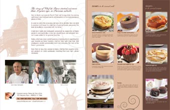
2 Panel spread after opening the brochure
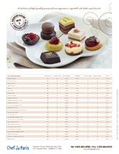
Back cover showing product information
Give our helpful experts a call at 800-930-2423.
