Horizontal Small Catalog Design
This 8.5 x 5.5 small size catalog exhibits unique design, and quality execution
 Want to create a printed piece that’s easy to handle and looks flawless? Check out the Thomas Nygard Gallery’s latest catalog for some marketing inspiration.
It can be difficult to design a concise catalog that is truly impactful, yet handy and ergonomic. You want the customer to experience the full appeal of the product while not feeling overwhelmed by bulky media. In this featured piece Printing for Less created for the Thomas Nygard Gallery in Bozeman, Montana, all of the important details are included, but the smaller catalog format brings a fresh and unique feel to the piece. The result is an 8.5 X 5.5 catalog that maximizes space on each page – leaving the viewer with a piece that is convenient, portable, and stylish.
Think you need a full sized catalog to be outstanding? Think again!
Target
The Thomas Nygard Gallery has grown since 1976 to offer arguably the finest collection of art in the American West. Working with a broad array of clients, from private collectors, to formal institutions – The Gallery provides a full range of offerings and services. Whether it be framing, restoration or sales; The Gallery is a leading authority of fine art in the West.Appeal
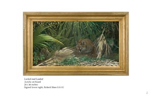
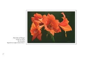
The Thomas Nygard Gallery exudes a sense of elegance, which radiates throughout the catalog. However, as a working exhibition space, The Gallery also possesses an ability to showcase beauty and value in an extremely persuasive way. This “showcase” aspect is also an essential theme in the piece. Fantastic print design focuses the viewer’s eye on each painting – translating the showcase from gallery to catalog page.- Product Images and Technical Specifications This piece provides the customer with information about one specific artist. The introduction summarizes the artist’s life, and the following pages are filled with his paintings. The paintings are focused in the center of each page, surrounded by blank white – with nothing but the title and date in the margin. A brief history of The Thomas Nygard Gallery follows the images.
Attention Directors
- 8.5 X 5.5 Catalog – The essence of this catalog is to showcase the rare and valuable kinds of artwork that The Nygard Gallery has to offer; exemplified by one single artist and his work. Instead of distracting the viewer with a typical catalog approach that attempts to preview nearly everything available; this catalog chooses to capture the customer with focus on one unique artist.
- The cover image of the catalog features a single painting – fit to fill out the entire page with no borders. “Richard Sloan, A Retrospective” is printed across the upper right. The four color process brilliantly illustrates the subtleties of the painting. From a design standpoint, filling the page completely is a shining example of getting the most out of a half page sized catalog cover. With the cover image brought out to fill the page, there is no room for error…
- Inside the front cover you find copyright information as well as basic contact info for The Gallery; hours, and appointment process. After a two page description of the artist and his career, you will find over 25 high quality images of his work. This is the true brilliance of the catalog’s design. Each painting appears at the center of the page surrounded by blank white space. The eye is drawn toward the image and away from distraction, not unlike a gallery wall. The final page features a short description of the Nygard Gallery’s history and expertise.
- If you are wondering how to produce a catalog that is both captivating and convenient, give us a call and let one of our designers show you some examples.
