Going to Press Efficiently
These best InDesign preflight practices will save you time and money.
InDesign has many uses, some of them surprising. For many, InDesign long ago replaced PowerPoint as a slide show creator—just export pages cum slide deck to PDF, and use Acrobat’s or Adobe Reader’s built-in presentation features to display it to an audience. Many print-turned-Web-designers are using InDesign to wireframe, or sketch, Web sites. Features that allow embedding of multimedia, such as QuickTime movies and sounds, and interactive elements, like buttons with rollovers and actions, have positioned InDesign as the tool of choice for developing rich user experience PDFs. Thanks to innovations in CS4, InDesign is even catching up to its main competitor as the non-Flash-savvy-user’s Flash content creation tool.
All of these uses, whether expected or not, are a testament to the versatility and ease of use of InDesign. They also attest to the expansion of even traditional print design workflows toward electronic publishing. Still, despite the Web, PDF, and Flash, the main purpose for which the majority of us employ InDesign is to create materials destined to become ink on paper.
 It’s startling, though, how little information there is on the subject of going to press these days. I don’t mean how to use InDesign’s Print dialog or why you should use CMYK instead of RGB color swatches. I’m referring to best practices for going to press. My friend Sandee Cohen recently mentioned that she’d met a woman who, within the last five years, had graduated college with a graphic design degree—which included at least one full year learning in InDesign—but without any instructor ever having defined the word “prepress” or having explained how layouts get from InDesign to ink on substrate!
Some people don’t even know why they should avoid the default and undeletable Registration color swatch; someone once said, “Don’t use it,” so they don’t use it, without knowing why.
In this edition of InTime, I’ll try to fill a few of those gaps. Hopefully even seasoned pressmen with ink embedded beneath their fingernails will find something herein to take away. And, I hope they’ll write in and share some of their wisdom and time tested prepress truisms and techniques with me, so I can pass along that information in a future InTime.
Consult the Wizard of Press
I’m often asked for my recommendation on the very best resource to give a designer the information she needs to send InDesign documents to press efficiently, with the best quality, highest color fidelity, fewest errors, and the least expense. Have you wondered the same thing? If so, you might be surprised by my answer because it isn’t this magazine, a book, Web site, or industry guru. Nor is the best resource Adobe itself.
The single most important resource you can consult regarding your InDesign (or any) for-print project is the printer who will output it for you. Your printer knows all, your printer sees all, your printer prints all. He can tell you more about your specific document, how to format this and configure that, than any of the gurus in this magazine. Why? Because we’re not RIPping and printing your job. We can give you general advice, specific techniques we’ve learned over the years, even best practices that will serve you in many, perhaps even most, situations, but not one of us can tell you precisely what will happen to your specific document when it goes to a particular print shop’s prepress and then press stages. The only one who can is the person who takes work like yours and processes it day in and day out on those very prepress and press systems.
Then, after you deliver your project, go visit the printer if possible. Watch the job RIPping and printing. Do press checks—examining printed examples of your job as they roll off the press to ensure output as expected. Ask more questions.
Decide Before You Design
Before you can choose File > New Document you must make crucial decisions about the content and output of your printed design. The below, used as a checklist, can help you ask yourself and your print provider the right questions, make the right decisions, and begin your project already halfway to producing a top quality InDesign document efficiently before you’ve even launched InDesign.
- What kind of paper are you printing on? Or are you printing on plastic, fabric, or another substrate? Each of these require special printing processes.
- What is the color of the substrate (see “White isn’t Always White” below)?
- How heavy is the substrate?
- Is it coated or uncoated?
- What type(s) of ink will be used—process CMYK, premixed spot colors, Hexachrome, screenprint ink (typically for fabrics and other non-paper substrates), or another media?
- Will the final piece be flat paper, multi-dimensional (like a box printed flat and then folded), or non-flat (such as directly labeling a bottle or can)?
- If printed flat, will the final piece require folding or perforating?
- Do any colors touch the side of the page? If so, you’ll have to set up a bleed.
- Will the final printed shape be a rectangle or will it require cutting dies?
- If the document will be bound, how will it be bound—perfect bound like a book, saddle stitched or -stapled like many magazines, wire- or GBC-bound to lay flat when opened, or another type of binding?
- Because of the binding method, what are the required inside and outside margins?
- If the artwork will run ink-to-edge (bleed), what size bleed guide do you need—how far out from the page edge will you need to extend your artwork?
- What is the required live area inset? (That is, how close to the edge of the page is it okay to print text or important details?)
- Will you need a slug area, and, if so, what will be its dimensions?
- What is the ideal image resolution?
- Does the printer have a PDF Print Engine (such as APPE) which can handle native transparency, or will you need to supply a flattened PDF version?
Files to Get
Before you begin each project, ask your printer for the files listed below. The printer will have at least some of them ready, though you may not need the rest, depending upon your output options and file delivery methods.
- The ICC/ICM color profile for the output device and selected substrate. This is updated frequently, so get a fresh copy for every job, for every different medium you’re printing on.
- While few printers want PostScript files anymore (it was an old 90s thing), if they do, ask for the output device’s PPD (PostScript Printer Definition file).
- If you’ll be sending a PDF instead, ask for a custom PDF preset. If your printer doesn’t have one, he or she should be able to tell you what settings to use in the Export to Adobe PDF dialog box. Alternately, they might tell you to use PDF/X1-a, X3, or X4, which are standard presets that ship with InDesign.
- A trap preset file. It’s pretty rare that the printer would have one of these for you, as they will likely prefer to handle trapping themselves, usually in- RIP. But it never hurts to ask.
There is No Generic Color Profile
If I had a dollar for every time I’m asked for the best color profile for “general use” I’d probably own Adobe Systems by now (and I’d have built in an option to hide that darn Registration color swatch). There is no best, ideal, default, or generic general use setting when it comes to sending documents to press. There are guidelines, though. For example, most printers in North America are used to receiving documents and images saved with the U.S. Web Coated (SWOP) v1 CMYK color profile (part of the North America General Purpose 2 preset in Creative Suite). That’s actually strange, because most printing is done on sheetfed presses, not web presses. If you’re printing to sheetfed, consider using the Coated GRACoL 2006 profile, which ships with CS4, as it will likely give you better results.
But these kinds of guidelines are if you don’t know have an accurate picture of how a document will be printed (which actual printing press, which inks, which paper, and so on). If you can find those things out, you could use a color profile generated specifically for that particular output device. The point of color management is that there are no typical settings. Every device renders color differently, and the entire purpose of color managing a file is to target your document’s colors to a specific device’s unique color rendering characteristics.
Where do you get the color profile for your output device? Your printer. A good printer profiles his output devices, generating custom ICC profiles. They should gladly send them to you free, and then, with a properly calibrated monitor, you can be confident that what you see on screen is pretty darn close what you’ll see in print.
White Isn’t Always White
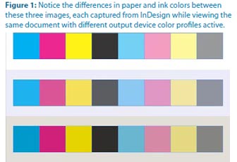
To paraphrase Bruce Willis in the Last Boy Scout, we all know that water’s wet, the sky’s blue, and paper is white, right? Well, no, not always. Frozen water isn’t wet, the sky changes color, and so does paper. Some white paper is whiter or brighter than others. Thus, not only will the unprinted “white” of your jobs differ from one stock to the next, so will the colors of your inks because the color of the paper will mix with them, tinting them (Figure 1). For that reason, you should proof your work from time to time onscreen using a color profile targeted not only to a particular output device but also to the specific substrate you’ve chosen. Once you have it (from your printer again), here’s how to use it.
- With InDesign closed, install the ICC/ICM file into the following path:
Windows: \Windows\system32\spool\drivers\color
Mac: /Library/ColorSync/Profiles - Open your document in InDesign.
- From the View menu, choose Proof Setup > Custom.
- Select the newly installed profile from the Device to Simulate dropdown menu and check Simulate Paper Color, which will also automatically check Simulate Black Ink. Click OK and, if your monitor is properly calibrated (with a device such as the Datacolor Spyder or an Xrite Eye-One), you’ll see onscreen colors very close to what you’ll get off the printing press.
Changing the options in the Customize Proof Condition dialog automatically turns on color proofing. To turn it off, just toggle the View > Proof Colors command.
Use Best of Breed Printers
Like designers, printers tend to specialize in certain areas. A printer who cranks out the most beautiful magazines, catalogs, and brochures may not be equipped to do the best job on your promotional posters, business cards, or signage. Some may not print jobs outside their specialties at all, others will offer “full service printing” to augment their primary projects income or as a convenience to clients who need something outside the norm once in a while. Many of both types will vend out the job to other printers. This is particularly true of the highly specialized business card printing business. Few print shops actually do business cards; most vend them out to a handful of boutique business card printers. And, sometimes, you can get better quality and price by cutting out the middle man.
Unless you’re always producing the same types of printed projects, establish a stable of print vendors and vend to them only the jobs at which they excel in producing. That said, cultivate relationships with your printers. Gifts help. Bruce Fraser, the late co-author of Real World Photoshop, recommended offering a “pint of Haagen-Dazs sorbet or, for really big favors, Laphroiag.”
Cash Off the Top
Did you know that you can often pay 10-15% less for your print job? If the job is for you—your identity package or marketing material, say—you must pay full price. However, if you’re bringing a client job to press, you are acting as a print broker, not as a print client.Why You Shouldn’t Use Registration Color
As we all know, the InDesign Swatches panel includes four undeletable swatches. Their names are bracketed and three of them have an obvious purpose—None is no color; Black is black; Paper is effectively no color, allowing the color of the paper or substrate to shine through or knockout ink. The fourth undeletable swatch is Registration, and, surprisingly, not many people know what it’s for, just that they should never use it for any object to appear on the printed page unless instructed by their printer.
Simply put, the Registration color is a magic swatch that will print on every ink plate. If you’re working strictly in CMYK, any object set in 100% Registration will print out at 100% of cyan, magenta, yellow, and black. If that’s cool to you, think again. The result is usually not a nice rich black but rather the color of old mud. Worse, ink is tacky and that much of it aggregating in too large of a place will make your printer very unhappy. If you’re working in CYMK and two spot colors, your Registration-colored object will print out in six colors. (That’s even uglier.)
So what is the point of the Registration swatch? To create such things as registration marks, those little cross hairs that enable press workers to identify when one or more colors don’t match up, indicating that something is misaligned on the printing press. The color is also used for other information or structures that need to print on all plates—usually in the slug area—such as the client name, job number, and other specific information. The easiest way to include that information on the film is to set it in the slug area, in the Registration color swatch.
PDF or INDD?
Most prepress pros are firmly in favor of sending only PDFs to the printer. Many printers are firmly in favor of you sending them the native InDesign document (packaged to include images and fonts). So which is correct? Send the PDF first. After all, the most common prepress problems, such as font embedding issues, alteration of trap and overprint settings, can be fixed directly in the PDF. That’s a whole lot better than the printer opening your file and possibly introducing accidental major changes like text reflow. But be prepared to package and send the InDesign file if the print shop insists on it.
Multiple Instances of Spot Colors
Working in a layout application like InDesign you often combine image assets from various sources, even different decades, into a single document. Well, if you haven’t noticed, ink libraries differ from application to application, one time period to another. An EPS image exported 10 years ago from QuarkXPress may contain a PANTONE color with a slightly different name than the same color added into the Photoshop PSD file last week. Placing both images into InDesign will bring in that same color as two separate color swatches— and it will output them as two separate color plates, doubling the cost and work involved in printing that one color.
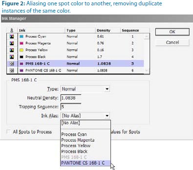
How do you resolve such a situation? You can’t delete one swatch and replace it with the other, not if the spot color is part of a linked image. Should you pull the EPS into Illustrator or PSD into Photoshop and fix the mismatched ink there? Sure, you could, if you’re comfortable with those applications, but it’s not the most efficient way to fix the problem—particularly if you have multiple assets using the same conflicting spot colors. Instead, configure InDesign to overcome the problem internally, at print or export time.
- From the Swatches panel flyout menu, choose Ink Manager (Figure 2).
- In the Ink Manager dialog highlight the first duplicate ink, preferably the one with the older, more obscure, or otherwise undesirable name.
- From the Ink Alias dropdown menu select the other instance of the spot color, the one with the name you do want to keep. Click OK.
The first ink is now aliased or mapped to the second. All instances of either spot color will now output on the same plate, as the same ink.
Time and Money
Going to press efficiently—which includes preparing to design the right way—will save you time and expense. Maybe we should call this column InTime and InExpense? I’ll bring you more tips and techniques for going to press efficiently in future installments of InTime. In the meantime, open the April/May 2009 issue of this magazine for some great related advice from Steve Werner in “Will it Print? 10 Tips for Creating an InDesign File that Prints Perfectly.”
Pariah S. Burke is the author of Mastering InDesign CS3 for Print Design and Production (Sybex, 2007), and other books; a freelance graphic designer; and the publisher of the Web sites GurusUnleashed.com, WorkflowFreelance.com, and CreativesAre.com. Pariah lives in Portland, OR, where he writes (a lot) and creates (many) publications and projects for Empowering, Informing, and Connecting Creative Professionals.
More on InDesign Magazine. Each issue gives you tips, techniques, and time-savers by an all-star cast of industry experts.
