Gate Fold Brochure Design Review

How to use four color printing, unique folds and custom paper to reel in guests at a Montana guest lodge
Customers, getting customers, grabbing their attention–It is safe to say that business owners know with certainty one thing: clients and customers can be finicky, temperamental and easily distracted. How do you grab the attention of a potential customer, hold on to it, and make an impression? One way is through your marketing materials, specifically a brochure. Many businesses count brochures as a key piece in their marketing arsenal, along with their business cards, direct mail pieces like postcards, and of course their websites.
One company that uses brochures to successfully convey the warmth and hospitality of their fly fishing lodge is Yellowstone Valley Lodge, out of Livingston, Montana.
The Brochure
Their brochure, a custom size 9 x 16″ closed gate fold, uses a folded, closed vertical orientation to achieve two things: ease of placement in standard sized brochure racks and a closed gatefold to maximize real estate of the printed piece. At first glance, the size is similiar to most “rack cards” or other tri-fold brochures, but once an interested customer grabs one, they begin to unfold not once, but two more times, revealing pertinent text and compelling photographs.
The Design Elements
This piece also uses an often overlooked component of winning printed pieces – the custom paper stock. Printed on a 65# Neenah Sundance Cover Felt, the look and feel of the paper works well with the subject matter—a Montana lodge providing down-home hospitality in a setting with stunning scenery, great fishing and fantastic food and amenities. This “feel” is enhanced by the softer, textured paper stock, which is reminiscent of a well-worn fishing vest. Also, this stock is made with a minimum of 30% post consumer fiber, adding to the environmentally friendly aspect.
Printing for Less’s customer, Yellowstone Valley Lodge, used a printed background that resembles lightly-worn leather, adding to the richness of the piece, and ultimately, the experience of a stay at the lodge.
The Impact
All of the components of the brochure set the stage for a potential guest at the lodge to start seeing themselves in the photographs, whether casting a fly to rising trout, wildlife viewing in Yellowstone National Park or enjoying the great food and landscapes. This is something that a website cannot do, and coupled with the portability of the piece, makes it a perfect reminder for a potential guest to start booking a trip!
Get Your Own Winning Brochure
Let’s take a look at some of the features this brochure uses to really stand out from the crowd:
- Custom paper stock adds “feel” and richness
- Visually-appealing photographs that capture the essence of the experience
- Text is laid out in an easy-to-read format, telling the “story” of their lodge
- Back panel is set up as a mailer, giving it dual-use, whether in a rack as a takeaway or sent to a specific mailing list
- Unique fold that makes it user-friendly, easy to mail with a tab, but also maximizes space and enhances information presentation
Interested in Creating Your Own Winning Brochure?
Adding a brochure to your business’s marketing toolbox is a great way to pull in more customers, and if you are ready to get started, give Printing for Less a call today at 800-930-2423 and speak with one of our Technical Service Representatives and get all of your questions answered, or email us at info@printingforless.com. We can help you with paper selection, fold layout, design and mailing services.
The different panels of the gatefold brochure
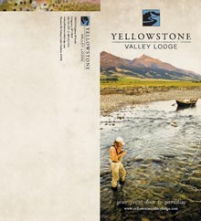
Front and back covers
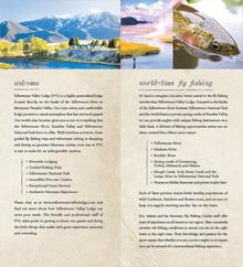
Panel spread after opening the brochure
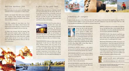
Full inside spread

