Design Postcards in InDesign to Connect
Make sure your message is delivered by laying out and printing postcards correctly.
Since the mid-1800s, postcards have been a comparatively inexpensive way to send a short message. But with so many modern options for flashy digital interactive messaging, how does the humble printed postcard survive? The reason is simple: You can’t avoid physical mail. Even if you just pick up the postcard on the way to the recycling bin, chances are you’ll see something on it.
As designers, our job is to use our skills to use that brief encounter to convey real information and, hopefully, prompt an action. By following a few design strategies and production criteria when creating postcard layouts, you can offer your clients an effective, lower-cost vehicle to get their messages across.
You can let your imagination run wild on the front of a postcard (as long as nothing can be mistaken for an address or indicia). However, the back side and the card’s overall dimensions must adhere to several layout rules and ink and paper choices if the cards are to be delivered as quickly as possible for the lowest possible cost. These strictures vary across the world; in this article, I’ll focus on United States postal regulations, but two tables do include information on postcard sizes and rates around the world.
How to Design the Best Backs
Whichever side holds the ship-to address is Design Postcards to Connect considered the mailing panel (more commonly, the “back”) and has the most restrictions for positioning of graphic elements. My recommendations in this article will, for the most part, result in a postcard back readable by the Post Office’s scanners. That lets you take advantage of lower automation or bulk rates.
The address must be parallel to the longest side, so that it’s readable when the postcard is horizontal. (Cards that are square, round, or die-cut shapes can ignore this regulation, since they’ll be hand-sorted by the Post Office.) The rest of the graphics on the mailing panel can be the same orientation as the address or rotated, as long as they don’t interfere with the postal scanning.
In any print project, there are three edges to be aware of: trim, bleed, and live. The trim area is the most obvious, being the finished size of the printed piece. The bleed area is larger and extends past the trim, allowing images to appear right up to the cut edge. The live area is the inner safety zone for important images and information, where there’s no risk that they’ll be shifted too close to the trim and risk being cut off.
Keep the Clear Zones Clear
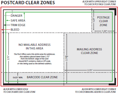
There are no special printing considerations for setting up the trim, bleed, and live areas for postcards, but there are definitely mailing guidelines for where ink is permissible.
“Clear zones” are locations that are reserved for postal use, so don’t place text or graphics in those areas. Ink coverage less than 10% density is allowed, so very light screened-back photos and tint colors might be OK, but it’s safer to keep these areas entirely free of printing.
To qualify for the lower presorted standard and bulk rates, you must keep the postage, address, and barcode zones clear of any unrelated printing. (First- Class mail is less strict about the clear areas required but does cost more to send.)
The upper right corner—1.25″ down from the top and 1.25″ from the right edge—is a postage clear zone reserved for the indicia (mailing permit imprint), metered postage, or stamp.
The lower right corner—2.75″ up from the bottom edge and 2.75″ from the right edge—is the mailing address area where no other visuals except the shipto address may appear. Because the indicia must be positioned to the upper right of the delivery address, the top of the address must start lower than the 1.25″ postage clear zone from the top edge.
An area at least 0.625″ (5/8″) across the bottom (longest) edge of the mailing side should be kept unprinted for the sorting barcode. The Post Office will print a barcode here if the area is clear, or slap on a barcode label to cover the area if there is any printing. Either way, any artwork in that space will get covered up, or worse, make your postcard unmailable.
Mailing Rates Vs Delivery Times
If your client demands postcard rates, which are lower than First-Class mail, you must design within those parameters to avoid higher rates and surcharges. But do prepare your client with the information that when mailed First Class, postcards arrive at their destination more quickly and with fewer quantity restrictions.| Postcard Rates | Domestic | To USA | To Mexico & Canada | To the rest of the world |
|---|---|---|---|---|
| U.S.A. | 0.28 US$ | — | 0.79 US$ | 0.98 US$ |
| Canada | 0.57 C$ | 1.00 C$ | — | 1.70 C$ |
| Great Britain First Class 0,39 £ Second Class 0,30 £ |
0,62 £ | — | 0,56 £ | |
| Australia (a.k.a. small letter) | 0.55 AUS$ | 1.40 AUS$ | — | 1.40 AUS$ |
Make the Address Machine-Friendly
The mail-to address is critical to delivery. Follow the recommendations below so that automated postal equipment can read and understand the address text.
- Face: Serif and script typefaces may be difficult for pre-sorting scanners to read, so the Post Office recommends sans serif.
- Case: Uppercase letters are more evenly shaped and easier to scan, so use all-caps whenever possible.
- Size: 10 to 12 point is optimal for the postal scanners to read, so make that cap-height your minimum.
- Spacing: Overlapping characters caused by too much tight kerning/tracking can confuse the scanner, but extreme letterspacing can be a readability problem,
- too. Keep the horizontal letterspacing so that each character stands alone without overlap.
- Leading: If you don’t use all caps, overlapping characters can happen between lines of text as well, so leave enough vertical space clear between lines.
- Underlines: Additional ink near the letters can confuse the character shapes, so no underlines.
The address locations are also important to scanners. Including a return address is a great opportunity for branding and providing contact info, but be careful with the positioning of the return address in relation to the mailing address. The relative position of To: and From: will determine which address the Post Office uses for delivery. Use the wrong return address position, and all of your postcards might mistakenly be sent to the sender!
Any text within 2.75″ of the bottom edge will be scanned as a potential mailing address, so keep your return address above this area. Also, be sure your message can’t be mistaken for an address—don’t include state or ZIP code in your text, or it might be misinterpreted.
Create Mailing Permit Indicias
An indicia is text that tells the Post Office the details of how the mail delivery is being paid for. (The U.S. Postal Service calls it a “Mailing Permit Imprint,” but for simplicity’s sake, let’s stick with “indicia.”) It should be in the same upper-right location where you’d put a postage stamp. Indicia text should be 10 to 12 points, all caps, and a sans-serif typeface. The indicia imprint can be four or five lines, as needed to fit in a compact area, and can be enclosed in a box or not (designer’s choice).
An indicia for outbound mail has several required text elements, in this order:
- The RATE MARKING, showing the mailing service used.
- The words “U.S. POSTAGE PAID”, usually with “PAID” on its own line.
- The CITY and STATE where the mailing permit’s held.
- The words “PERMIT NO.” and the mailing permit number.
Depending on the mail services you use, indicia Rate Markings can include any combination of First-Class, Standard, Bulk, Pre-Sorted, Non-Profit Organization, and/or Customized Market Mail. A mailing permit has registration costs and minimum quantities that may be too much expense for a small client or project, so many printers and mailing houses will let
Postcard Sizes
Cards that qualify for the postcard mailing rate start at 3.5″ x 5″ size (the smallest allowed size of any U.S. mail piece) and go up to a maximum of 4.25″ x 6″. The most common postcard trim size is 4″ x 6″.
Any piece larger than 4.25″ x 6″ up to 6.125″ x 11.5″ is charged the First-Class rate, even when it’s a flat, unenclosed card. Some standard trim sizes that mail as First-Class include Large 5″ x 7″, Deluxe 6″ x 8.5″, and Super Size 6″ x 9″ postcards.
International Postcard Sizes
| Country | Postal Service | Web Site | Smallest Width x Height | Largest Width x Height | Minimum Thickness | Maximum Thickness | Min-Max Weight | Shapes |
|---|---|---|---|---|---|---|---|---|
| U.S.A. | United States Postal Service | www.usps.com/ | 3.5″ x 5″ | 4.25″ x 6″ | 0.007″ | 0.016″ | — | Customized MarketMail |
| Canada | Canada Post · Postes Canada | www.canadapost.ca/ | 90mm x 140mm | 120mm x 235mm | 0.18mm | 5mm | 3g – 50g | Dimensional AdMail AdCard |
| Great Britain | Royal Mail | www.royalmail.com/ portal/rm |
90mm x 140mm | 120mm x 235mm | — | 5mm | up to 100g | Non-rectangular postcards must be enclosed in envelope & mailed at letter rate. |
| Australia | Australia Post | www.auspost.com.au/ | 88mm x 138 mm | 130mm x 240mm | — | 5mm | up to 250g | Impact Mail |
In addition to width and height, depth (thickness) also has minimum and maximum limits. A ¼” is the maximum thickness for a standard piece of mail, including postcards larger than 4.25″ x 6″. A card thicker than that is considered a flat or large envelope, with different postal rates. Standard mail has a 0.009″ minimum thickness if the piece is 4.25″ x 6″ or larger, but mailers sized smaller than that are allowed to be slightly thinner. Postcards within the 3.5″ x 5″ to 4.25″ x 6″ range can be as light as 0.007 inches thick, and up Design Postcards to Connect to 0.016″ thick. Less than that is just too thin and flimsy to go through the mailing equipment. See Table 2 for these numbers at a glance.
Proportion matters, too: The aspect ratio has to fall within a certain range to be mailable at regular postage rates. The aspect ratio (length divided by height) has to fall between 1.0-to-1.3 and 1.0-to-1.25 inclusive, or it’s considered non-standard. Anything non-standard must be processed manually, which costs more. Square or skinny shapes outside of this range won’t go through the automated postal equipment, so those get a manual-handling surcharge.
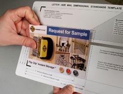
Figure 2: A free template from the Post Office helps check mail piece dimensions. To get an actual template, contact a Postal Business Service Center.
You can quickly evaluate your project against all of these size criteria by using a free template from the Post Office. The Dimensional Standards Template (Notice 3A) is an easy way to check for minimum size, proper height to length ratio, and thickness of your mail piece. Just align your design sample over this white plastic card and see if the corners fall within the recommended dimensions (Figure 2). There’s even a slot to test the maximum thickness of your design sample; if it fits through, it’s OK to mail. Pick up a template at your local Post Office.
Reply Mail
Subscription cards inside magazines are an example of Reply Mail—postcards meant to be sent back to the source. The Post Office has a few options for these kinds of postcards: Business Reply Mail (BRM) and Courtesy Reply Mail (CRM). If your postcard is sent BRM, the sender pays for return postage. If the postcard is sent CRM, senders have to add their own stamps. The Post Office delivers BRM and CRM postcards faster than standard mail, giving a possible business advantage of several days.
A third option, Meter Reply Mail, uses preprinted metered postage affixed to it that doesn’t get charged until it arrives at the originator. But since the MRM format has no special limitations to design around, I won’t cover it in this article.
There are so many restrictions on BRM and CRM card layouts that it’s best to use the official
Post Office digital templates (Figures 3 and 4). You can download Mac and Windows files in several trim sizes at http://pe.usps.com/mpdesign/mpdfr_addl_all.asp. These well-structured documents have an Instructions Layer, Working Layer, and Dimensions Layer. They’re available as Illustrator, Acrobat PDF, and Freehand files, but unfortunately not as InDesign files.
There are more detailed layout guidelines for BRM in Quick Service Guide 507 and for CRM in Quick Service Guide 507b. Check your postcard project against all of these criteria by using the free Automation Letters Template (Notice 67).
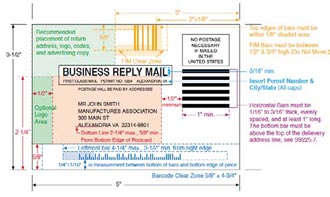
Figure 3: Layout guidelines for Business Reply Mail are in the Dimensions Layer of the template.
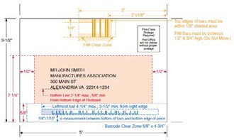
Figure 4: The Dimensions Layer of the CRM digital template shows the layout guidelines.
Shapes: Beyond the Standard Rectangle
So far I’ve covered rectangular postcards within a fairly narrow range of size and proportion. But you can send almost any flat shape through the mail. In 2005, the USPS started the Customized MarketMail (CMM) program, which allows for die-cut “shaped mail” to be sent through the postal system. The first oversized specialty die-cut postcard mailed was shaped like a box of Krispy Kreme doughnuts.
Don’t worry that odd postcard shapes will be tangled in the mail sorter. Because these pieces are sent express to each ZIP code distribution center and then hand-sorted by the final postal carrier, they don’t ever go through any automated machinery. Minimum dimensions of 3.5″ x 5″ and 0.007″ thick still apply, but the maximum size for CMM is 12″ x 15″ x 0.75″ with a top weight limit of 3.3 ounces. Uniform thickness is not required, and attachments up to ¼” thick are allowed. That means you can glue things onto your postcard, such as a product sample. The only shape limitations are the die-cutter tolerances at your print finisher.
CMM materials can be anything semi-rigid that fits within the dimensional criteria. That means materials that would otherwise be considered unmailable are now open for consideration: clear or semi-transparent; mirror-reflective; rough and heavily textured; furry; fluffy; and spongy surfaces are all fair game for CMM.
Having your odd postcard shapes gently handled by people during every step of the delivery process has its price, and some benefits. Between the express delivery and the prioritized hand sorting, CMM can actually be faster than First-Class mail. The postage itself is not bad, but the cost of organizing and drop- shipping each CMM ZIP-zone batch can add up. Note: Due to the additional expense of drop-shipping to each postal station, CMM is more cost-effective when targeting specific ZIP codes than when sending to scattered addresses across the country.
Because of the multi-stage delivery process, CMM won’t be returned to the sender, so you must include “Carrier-Leave If No Response” on CMM pieces in the location of the return address or under the return address, in a minimum 8 pt font size. Be sure to leave a 3.375″ x 2.5″ area to include the mailing address, optional return address, indicia, and “Carrier-Leave If No Response”.

With a huge size, almost any shape, and minimal restrictions on materials, Customized MarketMail is the place where creative postcard inspiration can flourish. CMM will cost you extra, but the dramatic impact of sending attention-getting shapes in the mail may be worth the expense (Figure 5).
Printing Postcards
Postcard printing is fairly straightforward. You can output at your local press or find lots of affordable options from online printers.
Base Stock
If you want the Post Office to process your cards automatically, the stock must be between 0.007″ and 0.016″ thick, and bar-coded pieces more than 4-1/4″ high or 6″ long (either dimension) must be at least 0.009″ thick. Rigidity is also an issue; make sure the stock isn’t too flexible.
In general, avoid patterns, textures, and colors of more than 10% density from white. Within these guidelines, there may be plastics or other non-paper materials that qualify for postcard or letter rate. If you use a stiffer plastic or heavily laminated stock, the rigidity may bump it up to an “automated flat” rate. Check stock samples with the Mailpiece Design Analyst at the nearest Postal Business Service Center, because only they can make the final call.
As you discovered in the section “Shapes: Beyond the Standard Rectangle,” paying a little extra for a “flat” rate or manual handling opens up many more options for mailing postcards made of different materials.
Varnishes
Flood varnishes or coatings can add a nice look and feel to the finished card, but that’s not everything to consider. You may want to keep the postcard surface uncoated or matte so it’s easier to write on, especially if it’s a survey or appointment card. For a calendar or reference postcard that’s intended to be kept and handled repeatedly, adding a heavy laminate or UV coating will make the card more durable.
Inks
Don’t use metallic inks for addresses, because the reflection makes the text unscannable. Also be sure to keep the address color darker than the surrounding area, with a color contrast of at least 15% from the base it’s printed on. Black ink for addresses is the safest choice, and what the Post Office recommends.
Color Control
There are amazing deals online for printing large quantities of color postcards. Many times, these cards are batch-printed with other orders, so your postcard may be one small section of a ganged-up press sheet. You may not have the opportunity for exacting color adjustments and can reasonably expect to get “pleasing color” results only. If your project needs precise color execution, beware, but if pleasing color is acceptable, then by all means give these options a try.
Tempting Templates
With all of these production criteria to consider, optimal postcard design might be more complex than you originally thought. It’s tempting to use a template for guidance. Postcard templates are available from printers and the postal service, and as part of support files that ship with InDesign and Illustrator. But beware that each source has its own agenda. Printers are most concerned about where the ink hits the paper, the Postal Service is simply enforcing pre-sorting and automated mail processing, and the design programs encourage creativity without worrying about critical aspects for mailing (Figure 6).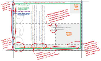
As I’ve mentioned in previous sections of this article, the Postal Service offers working template files for BRM and CRM, and plastic templates with measurements and guidelines. These are your best bet to ensure that your design qualifies for the lowest possible rates and the most delivery options.
Adobe’s InDesign and Illustrator postcard templates are problematic because they don’t follow the best practices described in this article. In fact, as Figure 6 shows, some of them wouldn’t even be mailable! However, they’re fine for visual inspiration before you get into production setup.
InDesign CS3 and CS4 templates are in Library > Application Support > Adobe Templates > InDesign in their respective version folders, with a postcard example in the Business Sets folder. You can also navigate to the InDesign examples by choosing File > New > Document from Template. In Illustrator CS3, check out Cool Extras > Templates to find folders with Basic and Inspiration examples, and in Illustrator CS4 look in the Cool Extras > en_US > Templates for a few options.
Performing Postcards
The point of any postcard is to deliver a message. Many marketing postcards are meant to be returned to the sender so the message impact can be measured. Whether they come back by mail or in person, you as the designer can improve the return rate. For example, use the Business Reply Mail (BRM) or Courtesy Reply Mail (CRM) layout formats. Those little black bars help with automated pre-sorting for return delivery that can dramatically reduce time in transit.Better Postcards by Design
Based on its dimensions and setup, a mail piece can qualify as a postcard, letter, automated flat, Customized MarketMail or package. Add in lower rates for pre-sorting and bulk quantities, discounts for Non-Profit Organizations, and surcharges for manual handling, and there are lots of factors that determine the actual cost of mailing. Don’t worry, there’s a friendly neighborhood Mailpiece Design Analyst (MDA) to check your work and make sure it fits the criteria. Run a sample of your project past the MDA at any Postal Business Service Center for a free mailing evaluation, find the one nearest to you at https://tools.usps.com/go/POLocatorAction!input.action
As designers we can create postcards that people may glance at and toss out, or that catch their attention with immediate visual impact. Beyond the design of your message, there are plenty of ways to layout your postcard for optimal results. With a very straightforward printing process and a fraction of the cost of other delivery options, these little mailers can be valuable communicators.
Cathy Palmer is an award-winning graphic designer who has worked in both the creative and production sides of publishing. She currently provides digital media skills training and seminars on graphics applications, teaching designers how to build smarter pages and let their computers do most of the work so they can focus on the creative stuff.
From InDesign Magazine. Each issue gives you tips, techniques, and time-savers by an all-star cast of industry experts.
