The Complete Guide to Creating Press Ready Print Files
Even the best designers break out in a cold sweat when it comes time to send a project to a printer. There are a ton of moving parts, checklists and details to keep in mind when it comes to getting your project ready for commercial printing. This guide will cover the technical do’s and dont’s, give you tips and best practices and walk you through how to take a project from your computer to the printing press.
How to Plan For Perfect Color Printing
One of the most common issues with professional printing is sending your printer graphics files that is in the wrong color space. Here’s what you need to remember about color before you send your file to your printer.
CMYK not RGB
Your computer uses a color space called RGB to produce the colors you see on your screen. A printing press uses a color space called CMYK to produce similar colors using just four colors of ink: cyan, magenta, yellow and black, also know as 4 color process. When you send your files to a commercial printer, they must be in the CYMK color space.
This is so important that we have a whole page dedicated to RGB vs CMYK color space if you want to learn more.
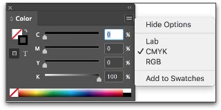
Here’s how you change your color space in InDesign: When you create a new document, the color space changes based on your intent.
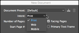
You can also change the color space in the Color Panel.
Spot Colors
Most of the colors produced in color printing are created by blending just 4 colors of ink: cyan, magenta, yellow and black. But sometimes you need a very specific color. Despite all of the advanced techniques and technology at a professional printer, matching the exact color from printer to printer and even from one order to the next can be a challenge. Consistent color-matching is what separates good printers from great ones.
When you need a very exact color, such as Coca-Cola’s trademarked red or John Deere’s famous green, you’ll need to use a spot color. A spot color is not created by mixing other types of ink, but rather it is made to order for the project at hand. This also means the printer must make an additional plate for the spot color, which usually makes using a spot color more expensive.
If you have to use a spot color, you’re likely using a color from the Pantone Matching System. It is a commonly used system of spot colors that helps press operators achieve the exact same shade, every time. Find a Pantone Color here.
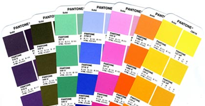
Speciality inks like metallics, neons and unique colors will also have to be run as spot colors.
Spot colors can be expensive for short run orders, but become more economical if you’re doing larger quantities using offset printing.
Viewing spot colors that are blended with other colors, or are somewhat transparent, can be a problem in your page layout program. Make use of Overprint Preview when you’re working with spot colors.
Planning Image Quality for Professional Printing
Low quality and low resolution images produce terrible, ugly, hideous printing but many people don’t understand the relationship between quality and resolution. You must plan for your final output at the beginning of your design, otherwise you’ll be left with an unusable final product.
Print will always look better with higher resolution images. Let’s get clear on what we mean by resolution.
Image resolution is how much data is in a digital image, it is directly related to how many pixels are in the image. When you print an image, you must transfer that data into dots per inch (DPI) which determines the image quality of a printed piece. Usually, 300 DPI is what you’ll need. Most images on your computer are not at 300 DPI, but 72 DPI. This is because 72 DPI looks good on most computers and the files are much easier for the computer to store and display. Be sure to check your images for print quality and insure that they are 300 DPI or higher.
How to Resample Images for Printing
Resizing images can lead to problems when they are printed because the resolution can be unintentionally changed.
When you resample an image, you are changing the amount of data in the image. Downsampling removes data and upsampling adds data. When you make an image smaller than its original size, you are downsampling it, when you make it larger you are upsampling.
You should always avoid upsampling your images. Adding data to an image will usually result in a very poor printed image.
Sometimes you may want to resample an image to change the size that it will print. If you are downsampling, for example, resampling can make the image take up less space. In InDesign, make sure the Resample Image option is checked when you change the size of an image. It is checked by default. When Resample is checked, you change the data in the image when you up or downsample the image.
- Changing pixel dimensions changes the physical size but not the resolution.
- Changing resolution affects the pixel density but not the physical size.
- Changing the physical size changes the pixel density but not resolution.
Note, you can change the resampling method from the default bicubic automatic to other options to change the sharpness or smoothness of the resampled image. Bicubic produces the best results in most cases.
When you uncheck the Resample Image box, the amount of data in the image is unchanged even when you change the size of the image. This has the effect of changing the pixels per inch (PPI) of your image. For commercial printing, you want a rather high PPI value.
- For printing purposes you want 300 PPI or greater.
When sending press ready design files to a printer you should send your images in the highest quality (not fastest) image format possible. Different image formats compress image data differently. PNG and TIFF images work the best for most print projects. JPG images work Ok at 100% quality, but every time the JPG is saved it is recompressed, so the quality can drop quickly if it is saved often at less than maximum quality.
Most images are created using a bitmap, or series of dots, and are called raster images. Vector images are not made of dots, but a shape plotted by points along a mathematically generated path. Vector images can change to any size without losing quality. Popular vector image formats are AI, SVG and EPS formats. When you are printing commercially, vector images are very important.
- Your text should always be in a vector format.
- Line drawings, such as plans or blueprints, should always be in vector format.
- Logos work best in a vector format.
Really, anything that isn’t a photograph will work better as a vector.
When possible, do the following:
- Do not upsample your images.
- Make sure your images are at least 300 PPI (or 300-600 DPI).
- Use vector formats for text, line art and logos.
Use image formats with less compression like PNG, TIFF and maximum quality JPG.
What Are Bleeds? Why are Bleeds Important?
A bleed is printed content that extends beyond the trimmed edge of your final printed piece. Bleeds are important because they allow your artwork to be cut without artifacts. If there is no bleed you may have a small white space around the cut edge. The bleed should be 0.25″ larger than the trim size (0.125″ on all sides). Learn more about bleed. You should design your project within the trim size and add bleed settings in InDesign.
How do You Design for Folds?
If you are printing brochures, catalogs, folded cards, or boxes you’ll need to plan for folds.
- Use guides and the ruler to measure exactly where the fold will happen. Plan your artwork and design accordingly.
- Consider the thickness of your paper and the types of coatings and effects on your finished product, you may need to adjust where folds happen to accommodate paper thickness.
- Balance form and function with your folds, think about how someone will unfold and refold the piece: what do they see first, last and how does it go back together? Learn more about folds.
How to Design Your Project for Binding
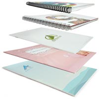
Binding is what holds books, magazines, catalogs or pamphlets together. There are many different types of binding, such as coil, wire-o, perfect binding and saddle stitching. When you’re creating a bound piece like a catalog, it is very important to understand pagination. Pagination is how the pages will be ordered in your document so they’ll be printed correctly.
Pagination can be very confusing because the way a document is printed is not exactly the way you look at it in your page layout program. InDesign allows you to switch to a printer spread view or a reader spread view. When you change your document to printer spread view the pages go crazy, and things appear out of order. This is the format that the printing press needs your document to be in so it prints the pages out and folds and binds them properly, a process know as imposition.
You might think that by changing your document to printer spread view that you’re doing the printer a favor. But you aren’t! Keep your document in a reader spread view at all times, modern prepress systems convert your documents correctly so there’s no need for a confusing printer spread.
- Remember to include blank pages so you have the right number of pages for your piece.
- Work with your printer when you’re printing books and catalogs to get the pagination correct.
- Each binding format has a minimum and maximum number of pages and a specific multiple of pages.
- Your printer should provide you with a template that works for your binding method.
- Always ask for a proof, especially with this type of printing project.
Planning for Custom EffectsEmbossing and Debossing
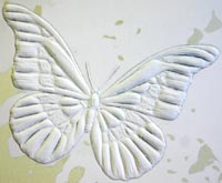
Embossed graphics, text and artwork are pressed upward, giving a 3D texture to a printed piece. Debossing is the opposite, where text or artwork is pushed down into the paper creating an indentation. Both of these custom effects can be created in single-level, multi-level or they can be sculpted. When you get a sculpted emboss/deboss, an artist actually sculpts your artwork out of clay and that is used to make a mold for the project. Sculpted embossing/debossing is more expensive, but can achieve a much higher level of detail.
If you’re using standard (single-level or multi-level) embossing/debossing, be aware that super fine details may not be visible. The thickness (weight) of the paper has an impact too. The thicker the paper, the less fine detail you can achieve.
- The thinnest detail should be twice the thickness of the paper.
Work with your printer to pick the right type of paper and embossing/debossing style to make your project look perfect. Learn more about embossing here.
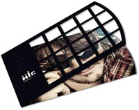
Die cutting slices your paper up so you have a knocked-out design. Think of it as using a cookie-cutter on your paper to make your text, artwork and designs get cut out of the paper. A die cut uses a metal die that looks a lot like a cookie cutter. This is shaped by hand and because of the limitations of bending metal, standard die cuts must keep at least 1/8th of inch of space between designs. Sharp points may not work well and very small text can lose quality.
If you need finer die cutting that is less than 1/8th” you should consider laser die cutting.
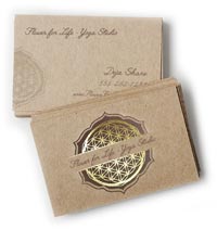
Foil stamping is a very popular way to make text, artwork and logos pop. It is often used to make a seal or award burst off the paper with a golden sheen, but in the hands of a great designer, foil stamping can create true works of art.
There are two types of foil, metallic and matte. Metallic foil can achieve much more detail than matte foil because the surface is literally harder — it has metal flakes in it, giving it more strength. Even so, both types of foil can begin to bleed together and details are lost if you are doing very fine detail or tiny text.
When sending in artwork for foil stamping, try to use vector artwork, not bitmap files. For example, use an Adobe Illustrator EPS or AI file vs a JPG image. Using bitmap artwork can have a negative impact on foil stamping, making it look blocky and lower quality.
Planning for Trimming, Cutting and Shaping Your Printed Piece
Your printed piece is going to be cut and trimmed. Your printing company should help you plan your printing properly, so there isn’t much you need to do to prepare, but here are the industry terms so you can speak fluent printerese.
A bleed is needed when printing extends to the edge of the paper, so when the piece is trimmed or cut to the final size, the artwork goes all they way to the edge. A full bleed describes a print project that has artwork that touches every edge. When in doubt, include bleed in your document.
- Create a bleed that is 0.125″ on all sides.
- If you’re making multi-page InDesign documents add the bleed in document settings.
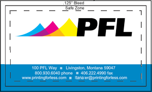
A margin is the space between the print and the edge of the page, sometimes called the Safe Zone. The margin should be a minimum of 1/16 or .0625″, preferably 0.125″. You just want to make sure your critical artwork or text has a bit of room so it isn’t in danger of being chopped off in the cutting process.
Margins become complicated when you print a bound piece like a catalog or booklet. The size of the margin changes on each page because of the wrap of the sheets of paper around the spine. Check with our printer to make sure you get the correct specs for this before laying it out.
Choosing Paper & Ink
You’ll need to work with your printer to choose the best substrate (paper) for your project. Paper comes in a variety of weights, finishes and coatings.
The paper type and weight can sometimes affect how you prepare your press ready files, especially related to folding and binding, so confirm your paper choice with your printer to make sure any considerations are accommodated.
Paper options can be daunting: here’s what you need to know to get started.
A paper’s weight is, more or less, a measure of its thickness. A higher weight will be sturdier, thicker and firmer. Higher weight papers are great for business cards, bottle-neckers, cards, tags and catalog covers. Lighter weight papers are ideal for brochures, envelopes, stationery and interior pages of catalogs. Higher weight paper is usually more expensive.
There are also premium papers that are made with a high quality texture. They feel great to the touch and are used for some stationery, formal invitations, artwork and important legal documents. Choosing a paper weight means thinking about how your piece will be used. Will it be held? Will it be abused in a wallet or purse? Will it be bound into a thick, hundred page catalog? Is it going to be folded?
Papers also come coated or uncoated. Coated papers have a gloss or matte finish that resists smudges and stains and displays the ink brighter and crisper. This also makes writing on the paper difficult. It’s best used for brochures, some business cards and marketing pieces that need to look higher end and aren’t being used for writing.
Uncoated papers lack this solid surface and are more porous. They are easy to write on, but can get smudged and stained more easily and the ink looks duller. There are also synthetic papers that are totally water and chemical resistant and spill proof. They are perfect for menus, industrial stickers or anything that needs to withstand the elements or outdoor use.
There are also specialty coatings that can be added after a piece is printed. These help protect the entire piece or are used to create eye-catching effects.
UV coating, Spot UV coating and varnish provide a high-gloss or matte look and offer protection and improved visual appeal.
Exporting Your Work for the Printer
If you’d prefer to supply the actual InDesign document to your printer – make sure you package the InDesign file. Zip the entire file and provide that to your printer. Your printer will need all of your images and fonts, so you’ll need to include the entire package not just the Indd file. When packaging, check the boxes shown below.

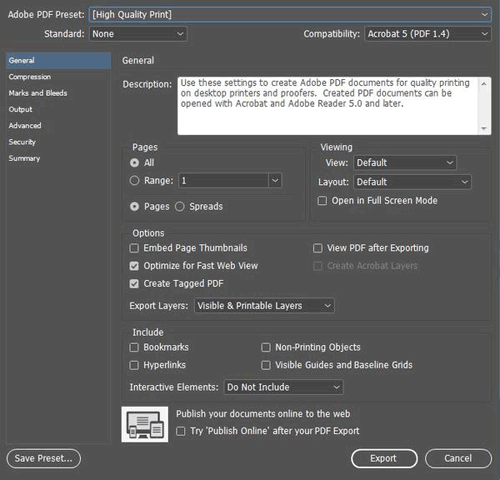
When exporting a PDF from InDesign:
- Include all pages
- Export the document in pages not spreads
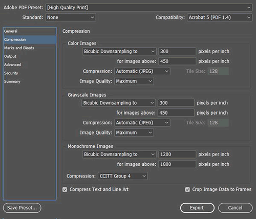
- Either choose “no compression” or choose Bicubic Downsampling on Color and Greyscale images to 300 pixels per inch for images above 450. For Monochrome images set bicubic downsampling to 1200 pixels per inch for images above 1800.
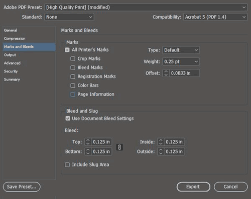
- For marks and bleeds – don’t include any marks, but make sure you check “use document bleed settings” if you included the bleed in your settings. If not, you can specify the .125″ bleed here.
Exporting your press ready file for the printing company is very easy in all modern page layout and design programs. Usually you’d export everything into a PDF but sometimes you may export the entire project including images, fonts and other elements. Here are some tips to keep in mind, many that have already been mentioned:
- Make sure your images are the right DPI (300 or higher) for printing.
- Use vector for text, drawings and logos when possible.
- Don’t export a PDF with security settings and password protection unless your printer is prepared for and can work with that security.
- When in doubt, always choose the highest quality file possible.
- If your project file is too big for email, consider using Dropbox or Google Drive to host the file or see if your printer has a solution for handling large files.
Following these tips will save you time and trouble and make your printer happy, insuring the best possible outcome for your project.
Call us now at 800-930-6040
