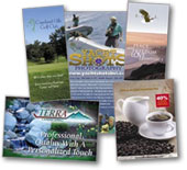
Brochure Marketing – A Vital Component for Your Business
 Brochure marketing can be a daunting task for many business owners and industrious entrepreneurs, but it doesn’t have to be. A straightforward approach, some solid design, compelling layout and messaging, and getting your brochure in front of potential customers is the goal. Marketing your business with brochures is really about hitting the right people, with the right message, at the right time.
Does Size Matter? Common Brochure Formats
One of the early steps in your brochure marketing project is to decide what size piece to use for your brochure marketing project. Key factors to consider are the amount of content you’re delivering and how you plan to deliver it. The most common sizes and uses are:
- 8.5 x 11 brochures – ideal for flyers, fold-out pieces and standard mailers
- 8.5 x 14 brochures – perfect for 4-panel brochure designs
- 11 x 17 brochures – the most versatile size – provides full-size panels with half fold, or other creative folding options, great as larger mailers
- 11 x 25.5 brochure – maximize your message with full-size panels with tri-fold or use as a fold-out product catalog
Don’t be limited by these sizes, however. Unique shapes and sizes are can be more eye-catching, and you are limited by only your imagination, time and budget. For ideas on how to make your brochure stand out, see our tips for designing brochures. Get brochure design and fold templates for the standard size brochures.
Business Cards are Good, but Brochures can be Better
Have you ever received a business card from an interesting vendor or business and wished you had more information about them at your fingertips? Many people like to have something on hand to look at, file and refer back to. And even with the preponderance of the internet for providing information, people expect that “real” companies will have quality printed sales and product materials. Don’t leave them short-handed, offer a brochure or sell sheet along with that business card to an interested prospect!
Point of View—the Customer’s, Not Yours!
While you have control over the content of the brochure, the look and overall feel of it, create the content from the view of your customer or prospect. Balance the amount of company information you promote with useful insight, product offers and services. Consider any questions you have heard from customers before and use the answers as a road map for your brochure, and organize the content accordingly.
Judging a Brochure by its Cover
Scanning a rack of brochures at a tradeshow, a hotel lobby and the brochures you receive in the mail, it’s easy to toss the ho-hum pieces based solely on their covers. Too much industry lingo? Boring. Nothing compelling? Garbage. No images to catch the eye? You guessed it—trash. Your brochure cover should both grab attention and outline why it would be worthwhile to open it up and read further.
Be sure to provide benefits of your products, and how your services will make their life easier. Running a great offer? Promote it on the cover. Opening a new store? Tell them about it, with directions to the front door. Don’t hide it, and don’t assume everyone will take the time to review the brochure past the cover. There will be an opportunity to provide more details about your products and company within the body of the brochure. Now is the time to pique their curiosity and get them to continue reading.
Speak to Your Reader
“I am talking to you right now, the reader of this article. The only significant goal I have is that you get good information, a plan, and solid ideas to make your brochure marketing project a success.” Did the tone of that sentence seem slightly different than the previous parts? It should have. It was more direct, more personal, and it was intended for YOU. Keep this in mind when creating content and copy for your brochure. When I open up your brochure, I want you to talk to ME. Hone in on the reader, not just the masses. This will help you increase response rates and levels of interest. Reading “our company can help many people be more efficient” seems bland compared to “at XYZ Company, our goal is to make sure that we personally work with you to help your company succeed on every level.”
Sell, Sell, Sell!
Be sure to promote your product and services thoroughly in your brochure. While company information, a brief history of how you got started or your greatest accomplishments are important, remember, you are ultimately trying to land a sale. Lay out the offer, the benefits, and how they can act on it.
Call to Action
You’ve worked hard to outline all the important components of your brochure – compelling design, engaging copy, the right audience. All your hard work will be wasted if you don’t tell your reader what to do after reading. Wrapping up the brochure with a distinct call to action is essential to getting a good response rate. Whether you are directing your reader to a website, impelling them to call you on the phone, asking them to redeem an offer, or driving them to your store, spell it out clearly.
A strong brochure design, printed professionally and actively marketed is a powerful tool in your business arsenal. Think of your brochure as another way to reach your customers, provide them with valuable information and benefits. As your brochure may advertise, “don’t wait, act now!”
Brochure Samples and Design Ideas
Brochure Design Concepts
Brochure Fold and Layout Templates
Brochure Templates for Word


