Next time you’re staying in a hotel, stop by the brochure rack in the lobby. Among the brochures for tours, cool attractions, natural wonders, amusement parks, local restaurants, and historical sites, you might find a slightly out-of-place brochure; one that speaks of elegance, high class, and exclusivity. In the brochure rack you’ll be hard pressed to find a brochure as well designed and beautifully produced as this one.
Target
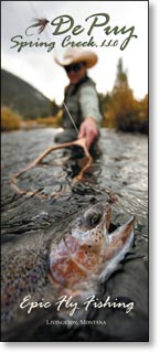
DePuy Spring Creek is one of the finest wild trout streams anywhere in the lower 48 states. Located 6 miles outside of Livingston, Montana, the original gateway to Yellowstone National Park, millions of park visitors stay in hotels within close driving distance to the spring each year. DePuy Spring Creek, LLC, offers reserved fly fishing spots on this world-class trout fishery.
This brochure needs to appeal to fly fishers who may have an open day or two during their visit. These potential customers typically have some disposable income and occasionally enjoy dining at a fine restaurant.
Appeal
To appeal to the target audience of this brochure, the whole piece has to say, “Epic Fly Fishing!”
Professional photography – The best way to appeal to this audience is to put a big, giant trout right on the front cover. Actually, the photographer did one better and shot an image of a big, giant trout just coming out of the water with a fly in its lip.
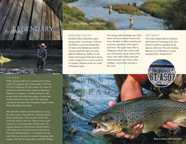
Appealing “inside” information – Not everyone would find a license plate splattered with bugs exciting. But to the right person, this means big fish. The bug smeared license plate photo on the inside of the tri-fold tells a fly fisherman that the driver just went through a caddis fly hatch – a favorite food of trout. This photo cleverly sends a “coded” message to the right audience.
Font and Leading – A serif font was used with slightly expanded spacing between letters to give a clean, easy-to-read feel. Sarif fonts are good to use on brochures built around a nature theme. The font style has a more classic, old world finish and fits right in on this piece.
Paper – An 80# gloss text was used to provide the right finish to the piece.
Attention Directors
Nature is heavily represented in this brochure, and there are many design elements that were integrated to help accentuate those natural elements and leave the reader with warm feelings.
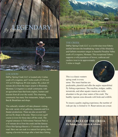
Hue – This brochure is filled with pictures of wood, wooded mountains, lush stream banks, rocky-bottomed crystal clear streams, and colorful rainbow trout. To give a more consistent look to the images, and to add effects like warmth, the hues of the greens and browns were slightly changed. Magenta was added to the green hue, or the color’s position in the natural spectrum, to give the greens a natural consistency like a forest of evergreens. A slight amount of yellow was added to the browns for warmth
Format – Since this piece was designed for display racks in hotels, chambers of commerce, rest stops, visitor centers, and the like, this brochure had to be an 8 ½ x 11 tri-fold to fit in display racks.
Motivators
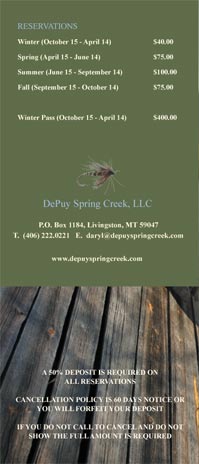
Contact info – You don’t want your contact info placed too inconspicuously on your brochure, but you also don’t want to detract from the piece. The designers here did a good job subtly placing a contact number on the inside of the tri-fold, and wisely using the center of the back fold to place the company’s full contact information.
Price – Placing pricing information on a brochure is not always a simple or easy decision. There are times when you don’t want to place price on a brochure. It may be a good idea to leave price off if:
The pricing is complex
The pricing list is too long and takes up too much space
You don’t want your price list falling into the hands of a competitor
You might want a customer to speak with a sales rep first
Your prices change often
It seems tacky to put price on your brochure
Due to the target market and nature of the product, it was necessary to put pricing on this brochure. Here it was placed very appropriately on the back panel.
The different panels showing the nice design layout.
Click images for a larger view
Inisde with Right Panel Folded Over Notice the nice crossover design when viewing the first step in unfolding
Inside Panels Nice cross panel presentation with large good looking and engaging photos
Back Panel Clean and effective
Summary
Excellent professional photography, a clean crisp feel, and a very warm, natural appeal make this elegant brochure really stand out. Look for it next time your travels take you near Yellowstone National Park.
Need help or advice on a brochure design? Give our helpful experts a call at 800-930-2423.
RELATED MARKETING & DESIGN TIPS
CD Cover Size Specifications
See standard CD cover dimensions, layout specifications, guidelines, and design tips for printing CD covers and CD inserts. Guaranteed quality & delivery.
Direct mail remains a powerful marketing tool because it creates a tangible connection. So, whether you’re looking to boost sales, increase engagement, or build lasting relationships with customers, here’s a look at how to harness its power and integrate it…
Templates Pre-made templates are a great way to springboard your creativity and make sure everything is laid out exactly the way you need it. Utilize one of our printing templates and speed up the printing process even more.