I remember the first time I encountered the term CMYK. I was just a kid, probably 15 or 16 years old, and I was working on my family’s Mac.
At the time I didn’t know a thing about the printing industry, but I was fooling around with the color settings in MacPaint and saw three options: Grayscale, RGB, and CMYK. I switched between the three to see what would happen (which, of course, was nothing, because the tiny screen was black and white anyway).
But RGB made sense, conceptually: red, green, blue. Nothing scary about that.
But CMYK? CMYK was mysterious and strange, and therefore should be feared at all costs. I switched the color settings to anything but that.
CMYK Makes the Print World Go ‘Round
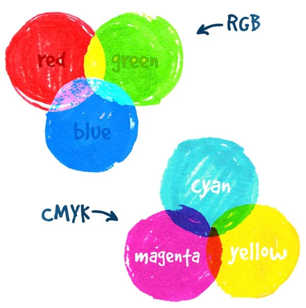
As it turns out, I had CMYK all wrong. CMYK (which stands for cyan, magenta, yellow, and black) is nothing to be afraid of. It’s just another color system, like RGB.
But if you’re a print buyer, designer, or jack-of-all-trades small business owner, it’s important to know what those color settings mean when it comes time to create printed content.
I won’t explain the physics behind RGB and CMYK here, but if you’re interested, find more information here on the three different color systems for printing (including Pantone), the science behind the CMYK color model, and how the RGB color model works.
RGB vs. CMYK
The RGB color space is huge, as it incorporates all of the visible spectrum of light. A range of colors (literally millions) are available to choose from in RGB, and electronic display devices like computer monitors and televisions use that spectrum.
CMYK is a much smaller color gamut offering thousands of colors. It’s the color system used for offset lithography, the main printing process you’ll find being used at commercial printers.
Here are the main differences between RGB and CMYK, as they pertain to printing:
| RGB vs. CMYK | ||
| RGB | CMYK | |
| Type of color mixing | Additive | Subtractive |
| Number of colors | Millions | Thousands |
| Main use | Digital display | Print materials |
| Conversion | Doesn’t always convert to CMYK | Converts easily to RGB |
Why Converting RGB to CMYK Can Be Tricky

Think of the RGB color space as a large circle of options, with the CMYK color space taking up a smaller circle within it.
In other words, while you can recreate just about any CMYK color on a screen, it doesn’t go so easily the other way around.
All pieces designed in the RGB color space must go through a RGB to CMYK conversion process to be printed on a press. A little preparation upfront is well worth it later — after all, it’s obvious that if you choose a color in RGB that doesn’t exist in CMYK, there might be a big problem when it comes time to get your file ready for the press.
The CMYK Blue-Purple Conundrum
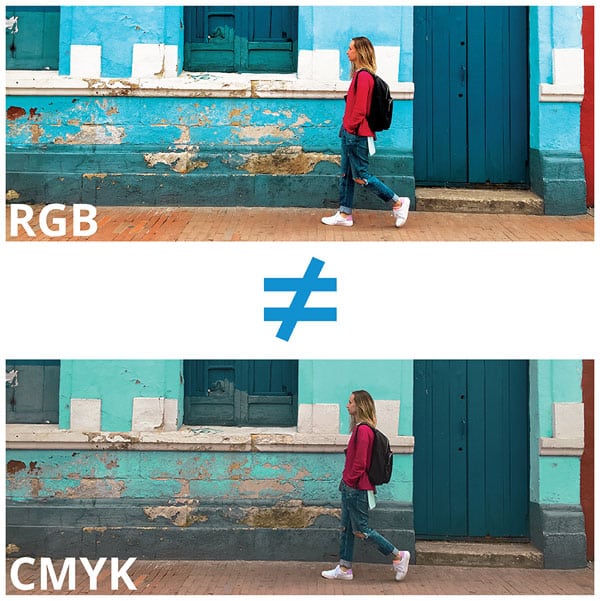
One of the most common problems I see when converting RGB to CMYK are with blues and purples. Often, strong blues (think neon blue, or navy blue) turn purple when printed as CMYK.
Here’s why: the software or device that’s converting the color, whether it’s Adobe Photoshop, Adobe Illustrator or even Microsoft Publisher, is trying to come up with a solution for a color that doesn’t exist — so it comes up with something it thinks is close.
If this sounds like you, you’ll need to select a CMYK or Pantone color that most closely matches your brand rather than trying to convert from RGB to CMYK.

Fixing RGB to CMYK Issues with a CMYK Color Chart
Enough with the problems, how do we solve this thing?
If you have a digital design that you’re nearly ready to print, most programs allow you to switch to CMYK mode to help insure against unpleasant surprises when your design hits the printing process. You can also use an online RGB to CMYK color chart to switch between the two systems.
This is the DIY method, though, and there are a few pitfalls to it:
- Paper stock. What matches your brand exactly in CMYK may look completely different on the final type of paper your printer uses for your project.
- Branded elements designed in RGB. If your logo or brand colors were originally designed in RGB, they may not actually exist in CMYK — requiring a rebrand or a lot of headaches trying to work out how to translate your digital content into print.
- Inexperienced designers. As a rule of thumb, check with a designer to see if they have print design experience before hiring them for a job. If you pick an inexperienced designer, the quality of your content will suffer.
If you’d rather eliminate the guesswork, the best plan is to have a good consultative relationship with your printer. Your printer can provide you with a CMYK swatch book printed on the paper you’re going to use for your project so you can make sure your colors look superb before you spend a penny on printing.
A little research upfront can provide you a massive return on investment, plus the peace of mind that you’re creating fantastic looking print materials to represent you and your brand. Don’t hesitate to reach out to Printing for Less for advice at [phone number] or [email address] — we’ve been doing this print thing for over two decades (and I’ve come a long way since my days of CMYK terror!)
Printing for Less has been an industry leader and provider of high-quality, unique printing services since 1996. Though we are a large company with customers across the globe, we treat our customers with the attention and care you’d expect from a luxury printing boutique. From business cards and banners to letterhead, flyers, and beyond — Printing for Less knows printing like no other. Let’s talk about your project! Our print consultants are available 8am-5pm MT Monday through Friday at (800) 930-7978.
