When it comes to creating effective business cards, it’s all about standing out against your competition. After all, a business card is usually something you give a customer when they’re just getting to know you. You haven’t had a chance to win them over yet, and they may never give you a call if you don’t make a strong impression.
A strong business card can be every bit as powerful as a strong business pitch. Yet, so many businesses still default to the standard rectangle, with standard information, on standard paper. What will your customers think of you when they see these? Simple: they’ll think you’re just like everybody else.
But here’s the secret. It’s not tremendously expensive or complicated to completely transform your business card design into something incredible. If you’re having trouble getting your creative juices flowing, here are ten business card commandments to live by.
Sure, no design “rule” is really written in stone (see what we did there?). However, we’ve seen businesses get powerful results when they employ some of these unique business card designs, so we think these ten commandments are at least worth considering!
1. Thou Shalt Not Always Conform to the Paper Standard
Who said business cards have to be made of paper? Though this is the golden standard, and the best budget option, paper cards can often come across as rote and boring.
In the example here, see how a plastic business card fits this brand’s message perfectly. The unique, see-through element gives clear plastic business cards a modern touch. Plus, clear cards can incorporate a number of design elements, from frosting (a foggy look) to partial or full color printing.
They are perfect for businesses and individuals looking for that competitive edge, and may be especially fitting for specific industries — think window manufacturers or cleaners, opthamologists, or a beverage company, for example.

2. Thou Shalt Encourage Interaction
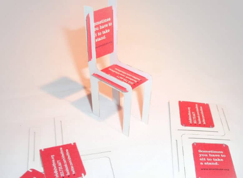
Take a look at this example. This business card uses a die cut print effect to convert a standard piece into a 3D chair! It doesn’t just look cool, it also invites a tactile experience for the person using it. Go on: imagine trying to look at this thing and not turn it around in your hand.
Another way to encourage interactivity is to use a partial die cut (called a “kiss cut”) to make a section of an image pop up from your business card.
3. Thou Shalt Embrace All Shapes
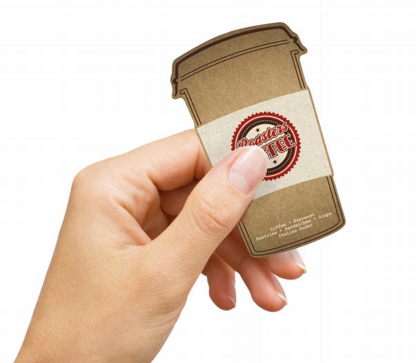
The more personal you can make your business card, the more your customers will connect with you — and recall your brand. This die cut to-go coffee cup is a perfect fit for a coffee shop or café. It can also double as a frequent drink card that your customers are sure to hang on to.Inventive die cuts are an excellent way to grab the attention of the person receiving your business card. Like a cookie cutter, a die cut can create any shape you can imagine.
4. Thou Shalt Not Worship the Rectangle
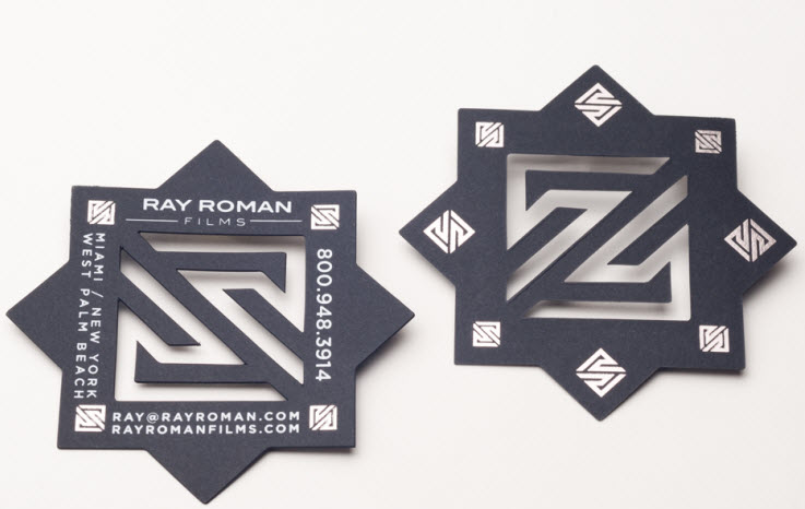
Rectangular business cards are designed to fit rectangular wallet slots, but why not design your business card into a shape that won’t be instantly lost and forgotten in a wallet? Square, vertical, and custom-shaped business cards are growing in popularity. In the example below, a die cut created these see-through geometric shapes. Still, there’s plenty of room for essential information: name, address, phone, email, and website. Also, the black matte card stock is an excellent base for the silver foil stamping at each of the edges, giving it an ultra-sleek look.
5. Thou Shall Be Multi-Purpose
One of the surest ways to avoid your card being forgotten is to give it another purpose. The design below functions as a guitar pick and a business card, doubling the brand’s staying power. Every time a user picks up this pick, they’re reminded of the Gibson brand.
You, too, could make your business card multi-purpose by making it a rewards card, including a sticker to peel off, designing it in the shape of a bookmark — the possibilities are endless!
6. Thou Shalt Perforate Thine Edges
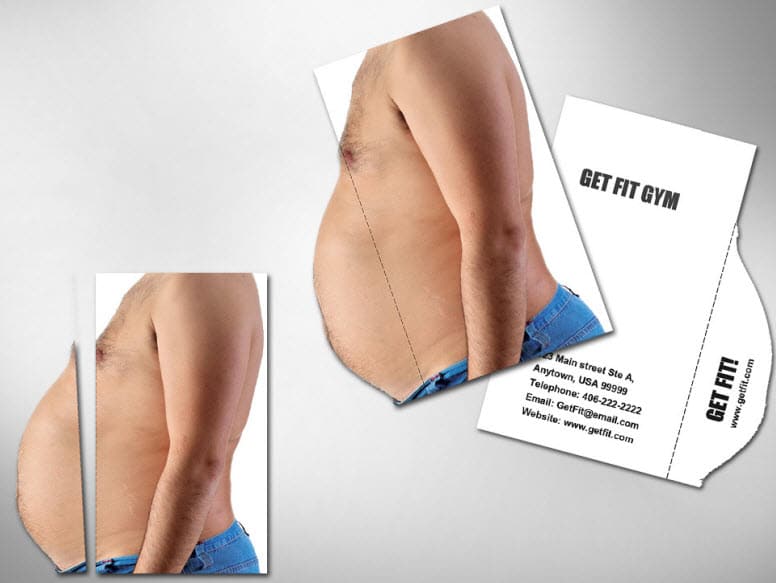
Perforation is another common trick that has a world of creative uses. This card stands out in more ways than one. Its creative use of a die cut with a perforated tear off belly not only grabs your attention, but lets you know exactly what this gym can do for you. It also invites a tactile experience, and every additional second your prospect spends with your business card engrains your brand further in their mind.
7.Thou Shalt Not Think Bigger Is Better
There’s a time and a place for big print projects, but a business card is a first impression, and it’s unwise to assume your card recipient wants to empty their purse or briefcase to make room for your brand.
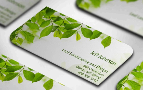
This example is small (1.75 X 3.5”) but elegant. It’s a true testament to simple, classic design, with diagonal rounded corners giving it a natural effect that perfectly mirrors the cardholder’s industry. Altering the size of your business card or adding rounded corners is an inexpensive way to make a business card memorable.
8. Thou Shalt Not Be Centered
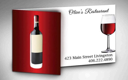
Center-aligned content may be classic, but that also means everybody’s doing it. One easy way to stand out is to move your design elements off-center and leave plenty of white space. Here, an off-center fold and a creative die cut give this card great dramatic flair.
The best part? Adding a fold is a simple tactic, but one of the least expensive custom print effects. Think of all of the content you could design around a fold: a flipbook-style image that changes when you open it, hidden content behind the panel, or even a coupon with a perforated edge.
9. Thou Shalt Excite With Custom Images
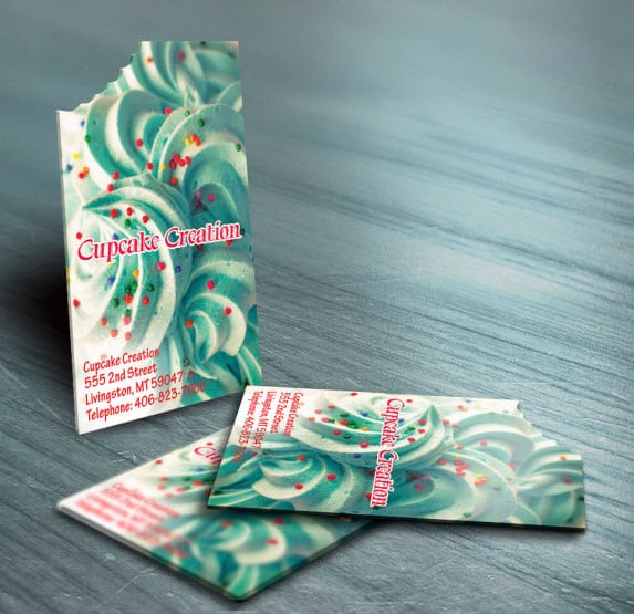
If only paper tasted as good as frosting! We haven’t mastered the art of edible business cards yet, but this one comes pretty close. This creative use of a die cut works in perfect harmony with the custom image below. It’s clever, a great conversation starter, and depicts a perfectly-executed example of meaningful design.
10. Thou Shalt Not Reveal Everything Upfront
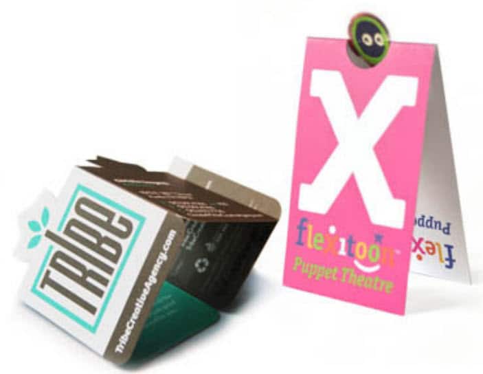
When you withhold the right information, you arouse a sense of wonder and curiosity in your customers. These folded business cards do exactly that, using die-cut elements and multiple folds. Instead of thinking of your business card as a static, 2D shape, imagine some of the folds you’ve seen on brochures (the tri-fold, gate fold, or cross fold, for example) and think of how you might shrink them down to business-card size.
Need help with your print? Talk to a live print expert today: 800-930-7978.
