If you’re hoping to produce brochures that don’t look like they were born from generic brochure templates, you’re in the right place. If you want to maximize the format and stand out to your audience, we’ve got some tips.
What Is a Brochure?
A brochure is a small print piece, frequently folded. Most companies intend to distribute their brochures for free, usually to advertise products or services and inform a specific group or audience.
In this digital age, interactive brochures have become popular in the online space; however, the most commonly referenced “brochure” consists of ink printed on some sort of paper stock, and occasionally bearing special treatments like embossing or foil. While some business owners try to get inventive with brochure alternatives, a well-designed brochure can be stunning on its own.
To decide on the most effective brochure design, and to make sure it will reach potential customers, first ask yourself, how am I going to use this brochure?
- Will you need to mail it?
- Will you display it in a rack next to competitors’ marketing material?
- Will you be handing out printed products in person at a conference or trade show?
- What featured product is being sold?
- What services are being offered?
- Is the target audience receptive to print media?
- Will existing brand guidelines determine the design? Have decisions on the color palette, typography, and imagery already been made?
- What are the budget limitations?
- What is the ideal timeframe for design, printing, and distribution?
Once you’ve answered these questions, you’ll have the perfect foundation on which to build something truly stunning and inventive.
Pacing Your Visual “Pow”
One way to make your brochure stunning is by paying attention to the pacing of your visuals and information. Try to gradually introduce your audience to your services and products.
Maybe you want to pose a question to pique their interest, and then lead them through a sequence of printed panels before you give them the answer. Command their attention with the very first panel — through color, line, and copy. Then, fill your interior panels with the majority of the information that you might appear on a text-based pamphlet or leaflet — but with style.
Be sure to lead them gradually towards a call to action and give them your contact information as you close. They’ll put it down with your memorable message still in mind.
Using Minimal Text Inventively
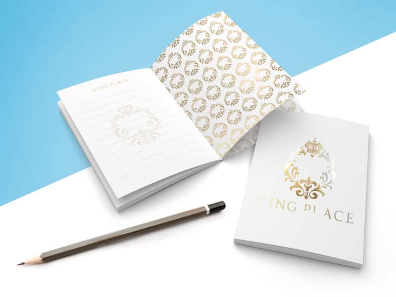
With only seconds to grab and hold attention, you’ll want to keep your initial copy concise. Distill your message to the minimum possible number of words so that they stand out, giving you an opportunity to be inventive with your design and color usage.
We’re not recommending you dumb down your content or graphics — we’re reminding you that the more creative and inventive you are, the more your audience will remember your business. And sometimes, the best injection of creativity comes from self-imposed limitations. How can you more clearly and effectively communicate your message with less?
White space is an important element to give your audience room to breathe. How little text can you use, and still convey your message? How much white space can you include, and still get your point across? Devices like subheadings and pull quotes can also preserve white space and also draw attention to your chosen words.
[
Get Inventive with Color
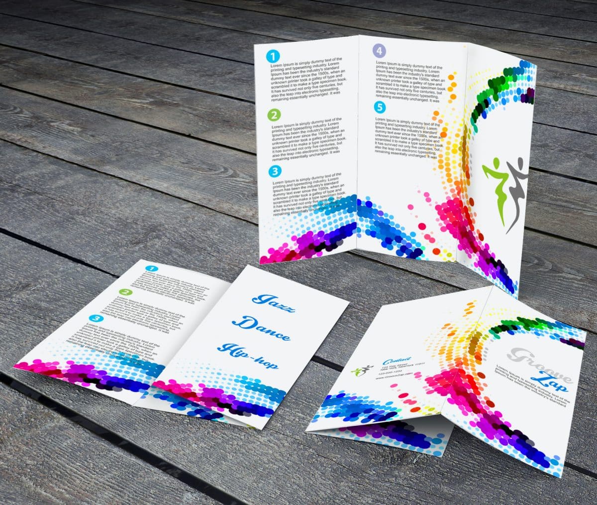
Color is a key design element, whether you’re getting inventive with lots or less color. You can use color to communicate emotion, mood, and even quality. Here are some approaches you can take to make your color choices memorable:
- Guess which colors your audience will expect, and then choose a completely different color scheme.
- Try to communicate a lively mood with minimal color.
- Use color to break up different sections of information within your brochure’s content.
- Use color only for callouts.
- Make your brochure into a colorful map, literally.
- Allow your colors to move along geometric shapes and lines.
Fun with Folds
Part of the tactile nature of a brochure is the way it folds. Folding is dimensional. And it allows you to deliver your message with greater impact and interest. It helps organize information by literally letting it unfold in a logical order. A well designed fold can help pace a story, direct the reader’s attention to key points, and even introduce an element of surprise.
Choose a fold that suits your message. How will a particular folding style help you tell your story? To test the effectiveness of your design, print it out or mock it up and give it to several people, and see how they respond to the brochure.
Some possible brochure fold solutions:
- Half-fold: Also known as a bi-fold brochure, a half fold described a single piece of paper literally folded in half, which looks like a booklet. It’s a basic brochure design that accommodates large amounts of information.
- Tri-fold: Instead of a single fold booklet, the tri-fold separates your piece of paper into three panels. This fold can be exciting in terms of design, but also means less content per panel — and you’ll need to make sure your audience can follow the flow!
- Gate fold: To make gate fold, two smaller half-panels are created by folding the outside edges of the main panel inward. The two smaller panels end up looking like a gate. This fold tends to work for higher end pieces due to the complexity and expense.
- Cross fold: A cross fold requires multiple folds in order to change a larger scale, often poster-like design into a portable format. This fold is most common for maps and tourism handouts.
- Z-Fold: Also known as a concertina fold, a zig-zag fold, or an accordion fold, a Z fold has three panels like the tri-fold but gets folded like an accordion. It’s more of an interactive format, and tends to be remembered because of the unusual ways information can be presented.
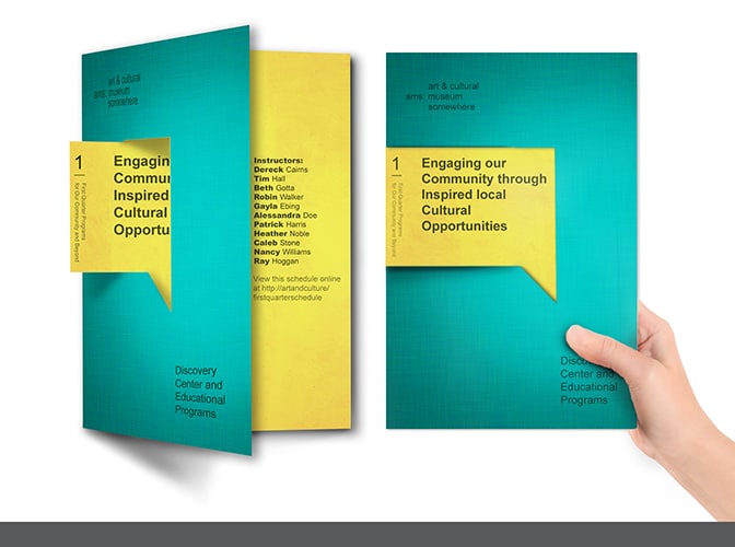
- Die-cut fold: A die-cut fold is similar to the Z-fold, but the top of the paper gets cut in a diagonal incline. This means the panels will be different sizes, and some of the interior content will be visible even in its folded state.
If you’d like to play around with different folding templates, you can contact our print staff or use the template generator at FoldFactory.com.
Stunning, Creative Framing of Stock Imagery
Unless you have a professional photographer on staff and available on demand, you’ll most likely find yourself downloading both vector and photographic stock. Maybe you’re lucky enough to have a budget big enough to commission original artwork, but frankly, we doubt it.
At this point, we’ve all seen enough stock images and generic graphics to forget them as soon as we’ve seen them. So the best way to be budget-conscious and stay top of mind is to use those common images in a new way.
You aren’t required to include people in your brochure artwork, even though viewers tend to respond to pictures of people (especially when they’re in action); you can use vector silhouettes and crop them creatively. You can combine multiple types of stock imagery to design an innovative and truly impactful visual. You can merge abstract shapes with more recognizable forms. There aren’t any limits, even when your budget is small!
The “Wow” Factor: Special Effects
Although special effects may seem like the obvious and easy way out (and they do tend to require some extra budget room), they’ll definitely help you make an impact. Special printing finishes such as die cutting, embossing, foil stamping, and spot varnishing will instantly impart class to your brochure.
Because many of these finishes are tactile (and therefore addictive to the senses), your audience may also find themselves keeping your brochure around long after your event or promotion has ended.
How might you use some of these specialty finishes?
- Die cutting can create slits to hold additional inserts (such as business cards) or even custom paper shapes.
- Embossing (with or without ink) produces a raised image in the paper, heightening dimension and visual interest.
- Gloss or matte varnishes can cover your entire sheet or just parts of your brochure. They can protect your brochure from scratches simple add dimension and interactivity.
- Spot UV blind prints in varnish without ink. Your printer will let you know the best way to set up your brochure files for such an effect.
No matter which way you choose to make an impact, we always recommend consulting your printer for the best advice to merge about cost and practicality. To find out how to make an impact with your new brochure, speak to one of our print consultants today.
