Need to get your small business out in the open? Signage — indoor and outdoor— is a great way to get your message out there. But where do you begin? The options and best practices may seem overwhelming. But we’ve been helping people get their ideas printed, so let us help you! Ready to turn some eyes your way? Let’s begin your signage journey.
Signage for Different Occasions
First things first: be clear on your needs. There are different signs for different purposes and occasions, not to mention marketing purposes, so let’s break them down:
Brand Awareness: Need to get your logo and tagline known? Banners, posters, yard signs, car magnets and flags are a surefire way to get your contact details, information, branding, or anything else you need, out in the open.
Outdoor Events: Festival goers and craft fair mavens need to know how to get to your goods! Arrows, signs, banners and flags can help attract the attention of potential customers.

Trade Shows: Prepping for an indoor event? We can help you choose the best table tents, banners, foam boards and branding details with ease.
It’s a Sale! Estate, yard, liquidation sales and more. People won’t want to miss out on your mega deals when they can see them advertised!
Window Displays: Posters and decals help attract extra attention and spread your news.
Consider the Details
Now that you know what kind of signs you need, think about how and where they’ll be used. For instance, an outdoor sign in Florida needs to not bleach out in the sun, whereas a sign outside in Montana needs to stand strong against wind and snow. Where is the sign going to be physically placed? Size up and down, with respect to your messaging, appropriately.

Do your signs need to tie to a pole or trees? Does it need to be free-standing? Does it need to be tied down some other way? Think the physical details through before you head over to design and get it all laid out.
Get That Sign Designed
You know what you want and you know what your signage needs to stay in plain sight. Now it’s time to get your idea into its visual shape. Here are some tips to get you started, straight from our design expert’s mouths:
- Wise Typography Wins: Use big, bold fonts to capture attention. Fonts with elegant, thin lines are hard for the eye to immediately recognize and understand.
- Keep it Simple: Big signs are not meant for complex messaging. Keep your ideas boiled down to the fewest possible words and symbols. The longer details belong on printed pieces that are closer to people’s eyes and that can home with them, like brochures, one-sheets and cross foldes.
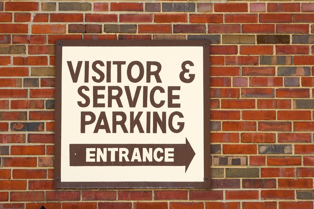
- Be Eye-Catching: High color contrast is hard to miss. If your logo is a dark color, go for a light background. Keep the sign’s location in mind too– don’t use dark shades in a shady area, or for instance reds against a brick wall!

- Learn Substrates: Will there be glare? If so, avoid glossy finishes. Matte finishes work best in brightly lit spaces.
- Vector logos only: You need your artwork to be scalable, and a fixed, flat image file won’t work. Go for as high-resolution as possible, always. A file can always be scaled down, but not up, and keep its clarity. We gladly accept virtually every Mac & PC file format, including any version of:
- Adobe: Acrobat, FrameMaker, Illustrator, InDesign, PageMaker, Photoshop
- Apple: Works
- Broderbund: The Printshop, version 15
- Claris: Works
- Corel: Bryce, Draw, Lotus, PhotoPaint, Quattro Pro, Ventura, WordPerfect
- Deneba: Canvas
- Macromedia: Fireworks, Freehand
- Microsoft: Excel, Home Publishing, PhotoDraw, Powerpoint, Publisher, Word, Works
- Quark: Xpress
- Serif: DrawPlus, PagePlus, PhotoPlus
- Also: .EPS, .JPEG & .TIF files
Need help with your print? Talk to a live print expert today: 800-930-7978.
