The power of color in marketing is hard to understate. It’s not just about looking good, different hues and palettes can actually evoke certain feelings and convey different meanings. Colors are therefore integral to a brand’s identity and play a huge role in influencing how consumers see and experience brands and products. That’s why it’s important that brands think about their marketing colors mindfully. Our guide to seasonal color palettes can help you find the right hues and tones for your brand based on season.
Why Incorporate Seasonal Colors Into Your Marketing?
The idea that colors can influence our mood and perception is rooted in human psychology. In Ancient Egypt, people used colorful rooms as a form of therapy. More recently during the 20th century, color psychology was formally explored by scientists using brain activity and heart rate measurements to understand how people respond to different colors..
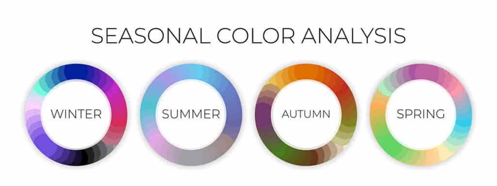
Seasonal color theory builds on the foundations of color psychology and integrates the four seasons. In the context of branding, seasonal color theory suggests that shifting color pallets with the seasons and holidays can trigger different emotions.
Think about it, who doesn’t love the holiday season? Printing for Less’ Director of Sales Katie Younge expresses her excitement for all things Christmas saying, “I feel like it [holiday branding] gets you in the spirit. Personally, I love Christmas. It’s my favorite. So when things are really Christmassy and festive, I’m like “yeah, I wanna go Christmas shopping.” Ultimately using holiday color schemes can remind your customer’s the holidays are coming and get them thinking about shopping for gifts for their loved ones.

Christmas isn’t the only time brands can utilize seasonal vibes to give their marketing a refresh. Use updated color palettes year round to keep customers engaged with your advertising campaigns no matter the season.
The Four Seasonal Color Palettes

Spring Color Palette
Spring, the season of blossoms and renewal, is associated with bright, light colors that have a degree of richness.If your businesses is thinking of doing a new spring time campaign, go for vibrant greens, corals, rose reds, bright teals, and yellows. Spring is an easy one to keep aligned with your brand because you can always use your original branded colors and dim them down into pastels, keeping them on brand, but still refreshing.
Summer Color Palette
The summer season color palette is all about contrasting with the heat of the weather. Cool, muted tones—like grays, dusty pinks, watery blues, and greens—convey calmness and often feel rejuvenating. Consider a 4th of July campaign or just a beginning of summer campaign and lighten up your color palette. Everyone looks forward the start of summer and having a summer campaign can help get costumers ready for (arguably) the best time of the year.
Autumn Color Palette
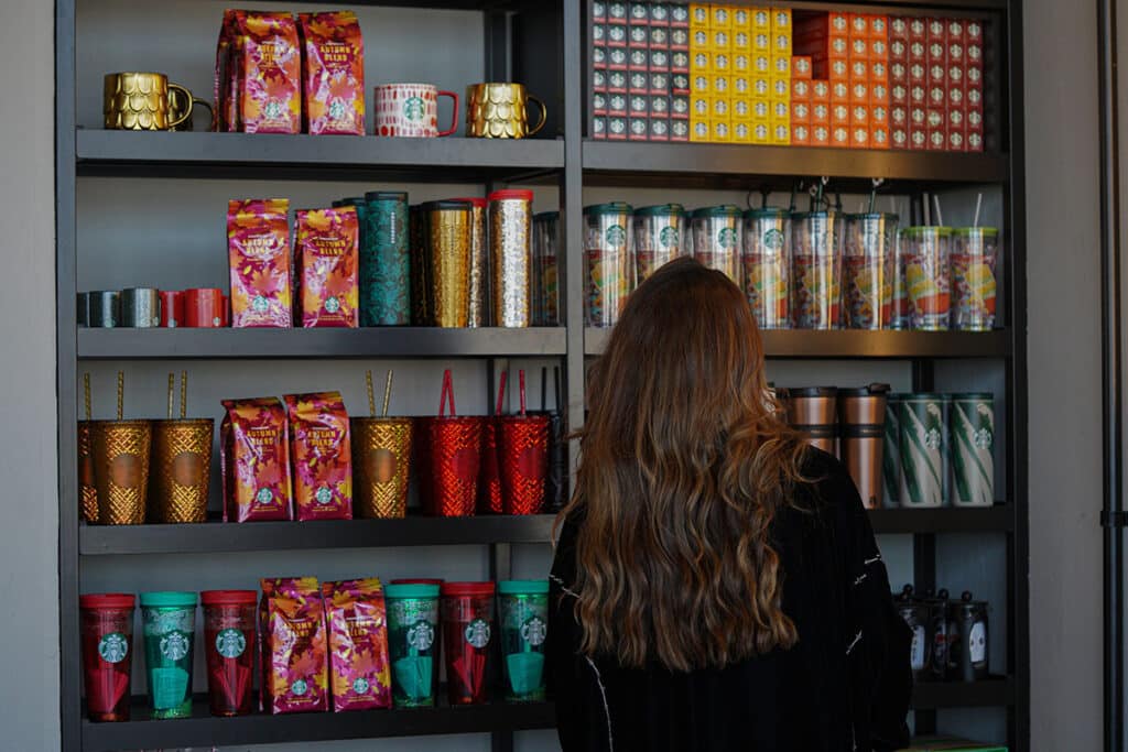
Warm, earthy tones that bring us a sense of coziness are a signature of the autumn color palette. You only have to look out your window in the fall to get a sense of the season’s colors: natural oranges, reds, and golden yellows, as well as rich greens and browns. Getting your color palette a little moody for the fall evokes feelings of nostalgia that can make customers more inclined to shop.
Winter Color Palette
The winter season color palette is all about strong cool hues, like highly saturated reds, blues, greens, purples, and yellows. Winter is arguably the easiest (and best) time to switch up your color palette since customers are eager to do a little holiday shopping.. Whether you celebrate Christmas, Hanukkah, Kwanza, Boxing Day, Ōmisoka, or just the cold weather, there are plenty of reasons to feel festive and tons of color hues to choose from.
How To Incorporate Seasonal Color Palettes
Like any marketing strategy, there are best practices when integrating a seasonal color palette. Let’s take a look:
Make Sure the Colors Align With Your Brand
The first and most important step in incorporating a seasonal color palette into your marketing is to make sure the colors align with your brand’s identity and message. Yes, it can be fun to switch it up for the seasons, but be sure not to steer too far away from what your business represents.

Use Secondary Color Palettes
Once you’ve established your brand’s central color palette, you can start to think about a secondary color palette. Secondary color palettes are a great way to change up your marketing, particularly at certain times of year like the holidays. These colors should feel like an extension of your brand’s classic palette, not a departure. Ambre Zachmann, Printing for Less’ eCommerce Marketing Specialist, sums it up by saying: “Brands should include a seasonal palette, but it has to be on brand and look cohesive.” We recommend trying different hues from the same color scheme for your secondary color palette.
Refer To a Designer
If you’re still unsure about what seasonal color palette is right for you, or what specific colors to integrate into your branding and marketing, it’s never a bad idea to speak to a professional. Designers have a deep knowledge of color theory and can help you find seasonal colors that look great together while still aligning with your brand’s personality.
Request Free Proofs
You can spend weeks choosing the perfect color palette for your brand only to find out that they look different when printed out. That’s why we always recommend requesting a printed proof early on. “Blues and purples can be particularly hard when printing, because the tiniest shift in magenta levels can make blues look more purple and vice versa,” Ambre explains. Printing for Less offers free proofs so that brands can ensure that their palette will match on screen and in print
No Matter The Season, We’re Here to Help
A successful brand is one that understands itself well and knows how to flawlessly convey its message and offerings, through logos, slogans, designs, and—of course—color. At Printing for Less, we are here to help your brand come to life with posters, brochures, business cards, and more. Our team is dedicated to recreating your brand’s unique color palette—no matter the season—across all printed materials. Reach out to an expert today and start planning your next seasonal campaign.
