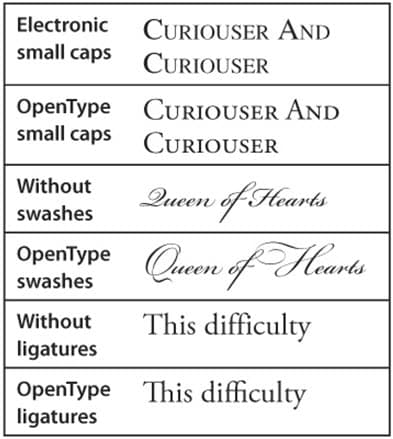
In our first blog posting about the OpenType font format, we discussed its advantages. This posting will discuss some of the extra typographic effects that are possible with OpenType fonts.
The actual typographic features built into an OpenType font vary by font. In the OpenType submenu of InDesign, features that are in square brackets are not available. Features that are selected have a check mark next to them. In the OpenType panel in Illustrator, the buttons for unavailable features are grayed out.
Here are some examples of the typographic features possible when using OpenType fonts:
• When an OpenType font includes small caps, you can apply the small caps feature to change lowercase text to small capital letters. This creates small caps whose weight matches the upper and lowercase letters, as opposed to using fake small caps by scaling down the caps that will be thinner than the letters around them (see examples in the illustration below). Note that InDesign will still use fake small caps when real ones are unavailable.
• If a font contains swash glyphs, ordinary glyphs are substituted with a more stylized alternative. Sometimes these are contextual, which means they only occur in specified situations, such as between two particular letters or at the beginning of a word.
• Ligatures are letters that are combined together—for example fi or fl. Adobe OpenType Pro fonts usually include additional ligatures like ffi, ffl or ff. Sometimes there may also be a discretionary ligature feature, which includes more rarely used discretionary and historical ligatures.
To get more information about the features in your OpenType fonts and how to use them, refer to Adobe’s excellent OpenType User Guide. You can download it from this URL: http://www.adobe.com/type/opentype/
Need help with your print? Talk to a live print expert today: 800-930-7978.

