What is your goal?
It goes hand-in-hand with ‘motive’ and ‘purpose.’ It is an all-encompassing mindset that looks beyond a single printed piece and engages the outcome of an entire business as well. While the content of a printed piece is important, the impression it leaves with the consumer has a far greater impact.
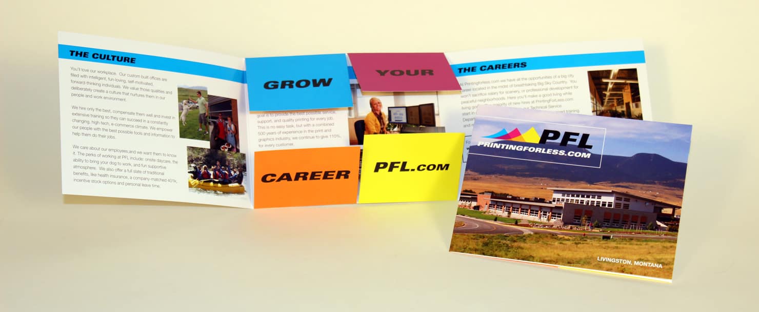 If your piece is mostly informational, you may consider a brochure. A creative fold, such as the popular ‘cross fold,’ encourages exploration of the piece, such as in PrintingForLess.com’s HR recruitment piece. On the other hand saddle stitching or perfect binding can encourage a customer to walk through the piece in a more orderly manner.
As much as we don’t like to admit it, we as humans develop impressions, values and sometimes stereotypes based on a first glance at almost any situation. That’s why the choice of the format for your printed piece is so meaningful: it directly affects how the customer sees the product in the long-term.
![]()
 This charging rhinoceros, die-cut and UV-coated, is the logo for Shirt Rhino, an online T-shirt company for custom screen-printing. The powerful design of this business card is sure to lead with a roar.
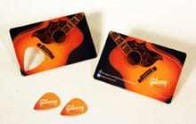
You also might try to leave something useful with the customer, such as in Gibsun’s plastic-coated business card with a die-cut guitar pick built into the card itself.
![]()
When deciding on a format, consider your overall goals: Why do you operate your business the way you do, and how can you best communicate this to the customer? What specifics are you highlighting? Use your business essentials to drive your detail choices—not the other way around.
![]()
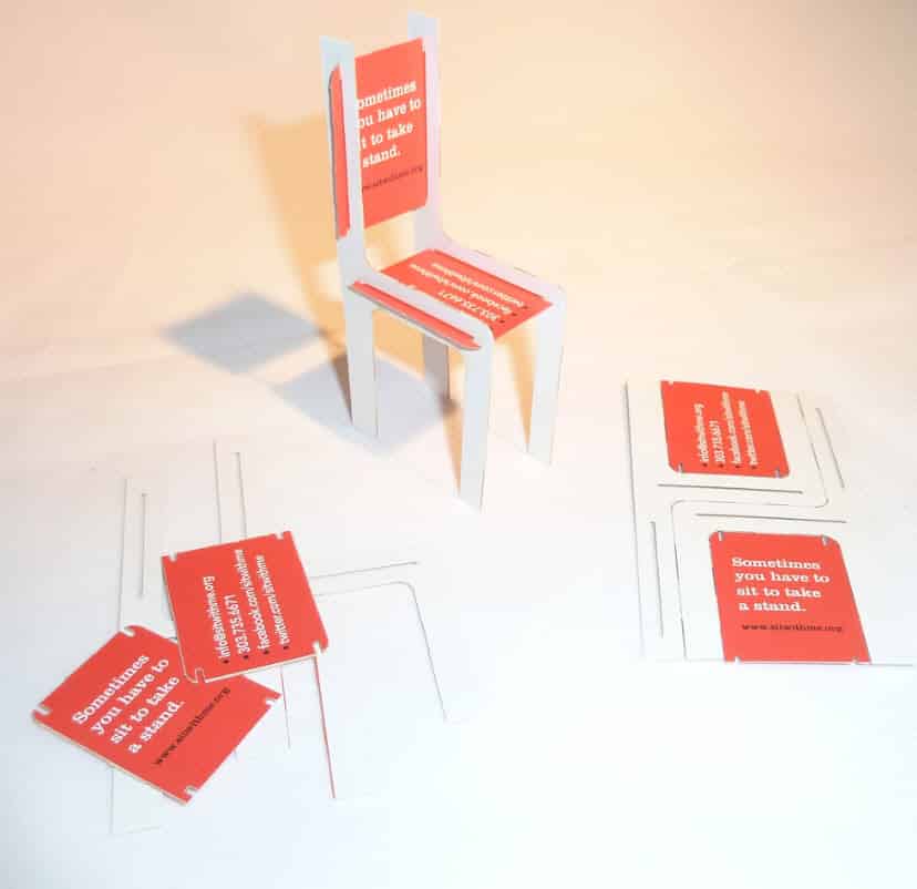
The not-for-profit coalition National Center for Women & Information Technology wanted to cement their idea of ‘The Red Chair’ in consumer’s minds: for NCWIT, this symbol promotes their slogan, ‘Sometimes you have to sit to take a stand.’ They created a business card with four die-cut pieces that could be punched out and assembled into the Red Chair itself: and still maintains its business-card purposes, with NCWIT information (and instructions for assembly) printed on all available faces.
![]()
There are a variety of options for format when it comes to printed material: business card, folder, newsletter, etc. These are fairly standard choices. But you may need to unleash your creative when it comes to details such as size, design and special effects.
![]()

![]()
Greeting cards are an excellent way to relate to customers on a personal level while stil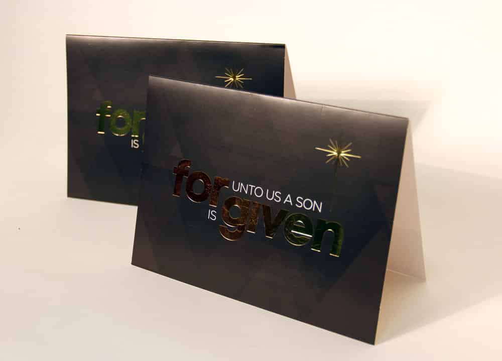
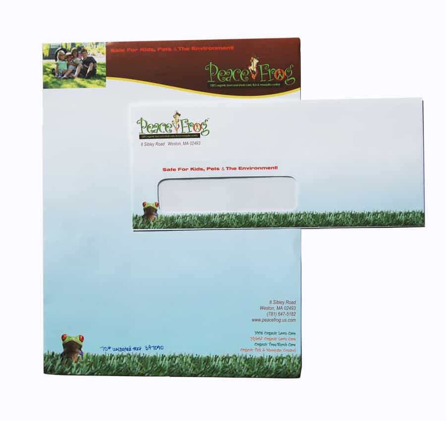
Like greeting cards, stationery can address formal issues while keeping your company’s name and logo in plain view. Matching envelopes are always an impressive touch.
Need help with your print? Talk to a live print expert today: 800-930-7978.
