Your logo is a little slice of your business, but an important one. It deserves to be front and center in your marketing campaigns. A logo is your badge, sure, but where you position it should depend on the content, the messaging, and the action you’re trying to persuade customers into taking.
Think of your logo like your business card. Sometimes it makes sense to leave it in the middle of the table during a conference, other times it’s better to hand it over after chatting with someone for a while. Context matters.
With that in mind, our print professionals have put together this short guide to logo placement success.
Logo Placement: Best Practices
So, while logo placement needs to be tailored to the medium you’re using and the impact you want to have on audiences, there are a few best practices you should follow. For instance, did you know that people are 89% more likely to remember a logo that is positioned in the top left rather than on the right?
Sticking to the practices below will help maximize the visibility of your logo, engage customers more strongly, and boost your number of conversions (according to whatever your goal may be).

Think About The Product
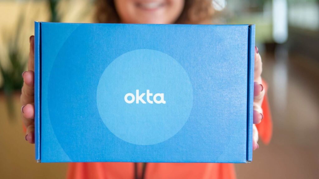
Just as they say in real estate: location, location, location. Ambre Zachmann, Printing for Less’s eCommerce Marketing Specialist, says that “your logo needs to be seen by customers. When a package or mailer arrives, your logo should be the first thing that catches their eye.”
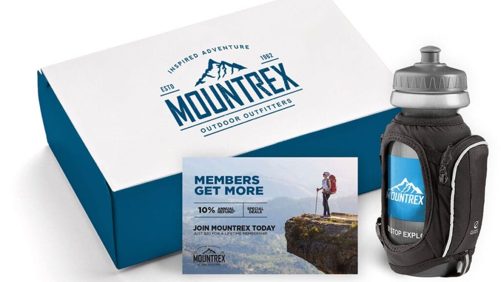
James Casey, our Account Executive, goes further to say that your logo should be on more than one side of the package. “Sometimes logos get covered by shipping labels, or when the package is delivered it might not be face up, so having your logo in multiple places will ensure that it’s still immediately visible.”
Elsewhere, fellow Account Executive, Tyler Diebold dives into the types of products that you should be targeting to showcase your logo. He explains that “promotional products are ideal for your logo. Imagine a product that is going to sit on your desk for a long time or a magnet on your fridge. These items can display your logo and subconsciously put your business in front of your customers.”

Keep It Proportional
You want your logo to be the star of the show. Whatever people are using or reading that has your logo on it, you want them to walk away with a feeling of being entertained or informed, and associating that sensation with your brand.
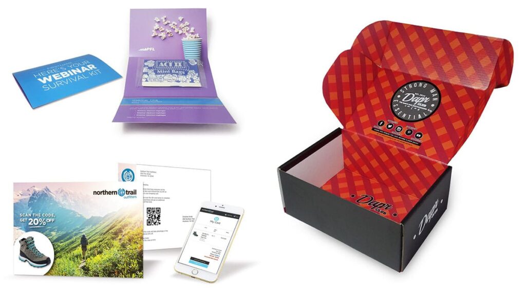
Katie Younge, Director of Sales, suggests that your logo should be on every item that you send in a package. “The sweet spot for people to remember your company is to display your logo, phone number, slogan, and other contact details at least three times.”
Account Executive, Kristi Eby, says that it’s worth adding a larger logo on the box too, as it’s the first thing that customers will see. “However, if you have a smaller box,” she says, “think about proportions. A smaller logo in the corner of the mailer can be just as powerful.”
Some Customer Logo Examples That We Love
Brooke Seidel, Printing for Less’s Sales Manager, recalls a project she recently worked on where a customer die-cut their logo to put on top of a mailer. “The result was a logo that really stood out and made the aesthetic of the package much more interesting.”
Kristi adds that she worked on a project where the customer opted for a smaller logo but then used spot UV to highlight the first letter of the company name in the background of the piece. Simple, subtle, and very striking.
Ambre also notes that Printing for Less uses matte black boxes with the company logo printed with shine or clear gloss to produce a really sharp effect. Brooke recommends that businesses do the same, or take advantage of finishing attributes with spot UV or foil.
As an overall tip, James Casey says to have a very clear contrast of colors; for example, a darker blue postcard with a white version of your logo.
Brands Doing It Right
Apple
Apple are geniuses (pun intended) at logo placement. How often do you see the iconic bitten apple logo throughout the day? You probably don’t know the exact number, but we can bet that it’s a lot, and it will have popped up in places beyond phones and laptops. The tech company’s dedication to sleek, minimal branding has meant that only the apple appears at the center of campaigns and deliveries, and that’s more than sufficient for customers to recognize the brand.
Trader Joe’s
Trader Joe’s markets itself as a national chain of local grocery stores, and so keeps its logo looking rustic and wholesome. Their classic brown bags have a large logo printed on them, carrying the theme of a neighborhood store in the greater aesthetic. And, by having a logo that is simple, block red letters, Trader Joe’s maintains its no-frills, good-quality characteristic.
Dollar Shave Club
Dollar Shave Club’s logo stands out because of its straightforwardness: the two razors combined with the business name’s three-letter acronym seems more like a stamp than a logo. Compared to other shave brands that prefer a more aggressive logo, Dollar Shave Club keeps things clean and makes the logo the central point to reinforce its offering of low-cost, high-value razors.
What Not to do
While we encourage all companies to lean into their creativity when it comes to logo placement, there is one big “no-no”. A dull logo is the equivalent of a spelling mistake at the printing press – it’s expensive and it could haunt you for years.
Your logo should be your pride and joy, and you need to take care to include it in your marketing efforts as much as possible and as obviously as possible. That doesn’t mean all your packaging needs to be a tiled pattern of your logo, but it does mean that people should be drawn to your logo in some capacity.
And, if you need a hand getting your logo into the limelight, chat with one of our advertising and design experts today.
