Foil stamping is a custom print effect that gives printed materials a metallic effect, and it’s one of the simplest ways to add an elegant touch to everything from invitations and business cards to letterheads and reports.
But what is foil stamping, and how do you design for it?
How Foil Stamping Works
Here’s a basic description of how foil stamping works. First, there are four main items involved:
- The paper, or stock, your final design will appear on.
- The die (like a rubber stamp, but made of metal).
- The dye (if your design includes color).
- The foil.
Your design is first etched onto a piece of metal called a die. Then, a piece of foil goes between the die and the paper. This is all placed within a hot stamping press, which presses these layers together and creates a metallic stamp on your paper using heat and pressure.
There are many different types of machines that create this effect. Some are manual, while others are automatic or air-powered. Regardless of the machine, the result is a truly stunning effect that highlights a design’s details in a gold or silver metallic patina. You can add colors to your foil, too, if you want to go a step beyond basic metal effects. You can even combine foil stamping with embossing to make the design pop, often with a 3-D effect.
Why Designing for Foil or Metallic Effects Is Important
Designing for foil or metallic print effects requires a bit more preparation than designing for other print effects. Why? There are several reasons. First, certain graphics and font styles will look way better with metallic effects than others. Secondly, foiling requires the printer to create a static, metal stamp (the “die”), that can’t be changed once it’s created. If you have last-minute changes to your design, it can be costly and time-consuming to alter.
That’s why we’re here to share the top best practices for foil designing — to help you or your designer have a smooth experience from brainstorm to final product.
Watch: One of our experts at Printing for Less explains the foil stamping process
A Touch of Class: Hot Foil Design Tips and Tricks
When you’re designing a piece for hot foil printing effects, keep the following items in mind and you’re sure to create an end product that’s both stunning and exactly what you wanted.
Consider the paper type.
To achieve the best finish, foil stamping requires crisp line art. This type of art is more likely to have a consistent, clear result on coated or smooth paper stocks. On the other hand, if you’re using heavy or textured paper stock, your foil design will need to be simpler and larger to produce a high-quality effect.
Adjust the typography.
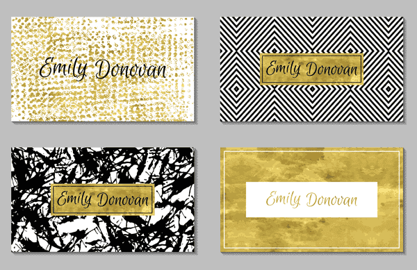
“Foiling tends to makes type appear a little larger,” says Kristine Neil, owner and creative director of Markon Brands. To make sure your text is easy to read, loosen up the kerning between letters — and increase the leading between lines.
When choosing a typeface, keep the rules above in mind. Scripts are especially elegant when combined with foil effects, but serif and sans serif typography can also look incredible. Pick what suits your brand, and only render in foil the words that are largest and easiest to read.
Go big.
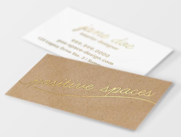
When you’re selecting which part of your design will get the metallic effect, Neil advises you avoid applying it to small details. “Foiling is not a good option for small, intricate or detailed aspects of your designs. Instead, choose larger elements such as just the company name or icon on a business card.”
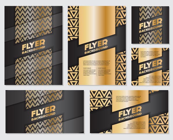
Some elements that look great in foil include logos, titles, headers, large patterned backgrounds, and contour line illustrations.
Get a 3D rendering.
Use the technology available to you to visualize what the end result will look like. If you’re working with a professional designer, ask them to provide a metallic rendering of the final result to make sure you’re getting the effect you want.
Keep it simple!
“The most important thing to remember when designing for print that includes foil or metallic effects is to keep it simple,” says Neil. “These unique finishes not only look better when used judiciously, but the finished print quality is also often much more attractive.”
Keep simplicity in mind when choosing a color scheme and your design elements. Two or three main colors (including your metallic hue) is often enough to lend a professional look without overdoing it.
If you’re using color or unusual effects, request a proof.
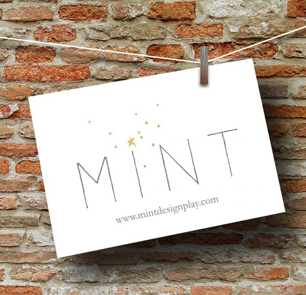
Gold and silver are the most common colors used for foiling, since they give a premium feel to any project. However, there are a variety of alternative metallic colors available — along with pigment and gloss foils for bringing a static design to life.
To make sure your colors are consistent from design to final product, ask your printer to send a proof in advance. This will save both you and your printer time and money.
Get to know your printer.
All printers have different machinery, techniques, guidelines, and limitations for printing foil effects. “The best way to get a high-quality result is to build a relationship with one or two trusted resources so that you don’t end up designing something that your preferred printer can’t produce,” says Neil. Often, you’ll find that having set parameters will actually improve your creative design process rather than hindering it.
Want to learn more about foil stamping and foil effects? Read more about hot foil stamping.
Need help with your print? Talk to a live print expert today: 800-930-7978.
