Printers continue to report an epidemic of spot colors being specified in documents when they really just need to use process inks. If you’d like to avoid this mistake (and save your printer some frustration), do your printer a favor and thoroughly check over your spot and process colors. Make use of the Ink Manager each and every time you’re prepping your files for print so that you can find any formatting mistakes before your printer does.
Getting to the Ink Manager in InDesign
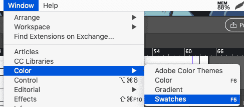
The easiest way to access the Ink Manager in InDesign is through the swatches palette. (If you haven’t opened the Swatches palette yet, go to Window → Color → Swatches or just hit F5.
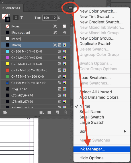
Click on the hamburger menu in the top right of the palette, and go down to “Ink Manager.”
If you don’t want to open the Swatches palette, you can also access InDesign’s Ink Manager in four other places: in the Separations Preview panel, in the “Export PDF” and “Export EPS” dialogs, and in the Print dialog box.
- From the Separations Preview panel (Window → Output → Separations Preview), click the hamburger icon and select “Ink Manager.” (image: ink_separationspreview.png)
- From the Export PDF dialog (File → Export → File Format: PDF → Save), select the “Ink Manager” from the Output tab. (image: exportPDF_inkmanager.png)
- From the Export EPS dialog (File → Export → File Format: EPS → Save), select the “Ink Manager” from the Advanced tab. (image:exporteps_ink.png)
- From the Print dialog (File → Print → Printer: Postscript File), select the “Ink Manager” from the Output tab. (image: print_inkmanager.png)
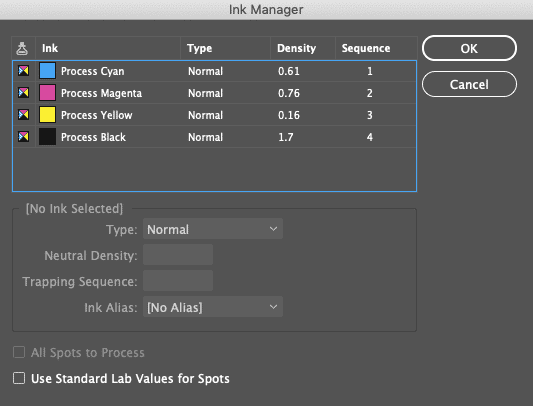
Regardless of how you get there, here’s what you’ll see when you launch the Ink Manager. You’ll see the four process inks listed at the top, followed by any spot colors. In this example, there aren’t any.
Check Your Inks in InDesign
The Ink Manager shows you all of the inks in your document. Not just the swatches — specifically, the inks. Which means each color in this list has been set to use a completely unique ink, versus a blend of the four traditional process inks. Which means each “ink” is going to generate its own plate when you print the color separations. And extra inks/plates run up your costs when you’re printing commercially.
Now, if you’ve got the budget for extra plates and you have a need for extra and specific inks to get an exact color match, then go ahead and have fun! But printers have noticed that most designers don’t actually need all the unique inks they’ve specified (which appear as spot colors in the Ink Manager list).
So, what should you do if the Ink Manager has identified a number of spot colors that don’t actually need to be spot colors?
You can convert spot colors to CMYK, which are also called process colors!
How to Convert Spot Colors to CMYK in InDesign
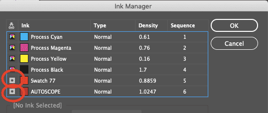
In this image, you’ll notice two unneeded spot colors listed underneath the four process inks. We’re going to convert them to process colors so that we don’t need to print extra plates for colors that can be covered by the CMYK color range.
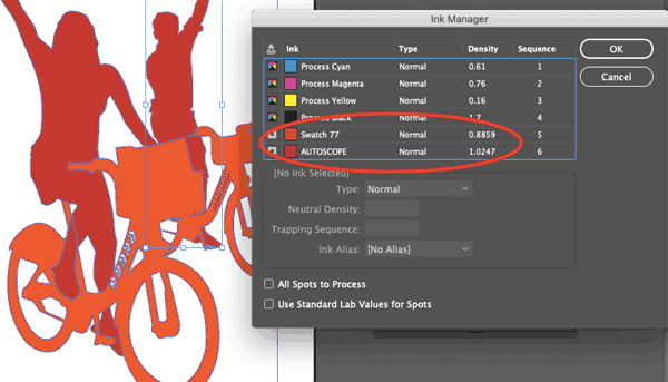
The easiest way to do this (assuming you don’t need any of the spot colors that are appearing in the Ink Manager) is to check the “All Spots to Process” box at the bottom of the Ink Manager.
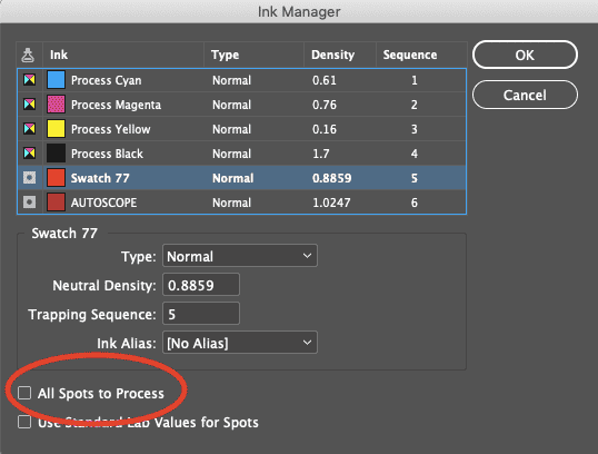
You can also convert spot colors to process colors individually in the Ink Manager panel by clicking the box with a dot in it to the left of any color designated as a spot. This will convert that icon to the four color process box icon, thereby telling InDesign how the swatch will be printed.
(Note: this doesn’t change the actual color tone; it simply removes a color plate from the printing process and allows that color to be printed with a combination of cyan, magenta, yellow, and black instead).
Spot Color Swatches in Illustrator
When you have defined swatches in the Swatches panel, you’ll notice that some swatches have a little white triangle in the lower right hand corner. These are “global swatches.”
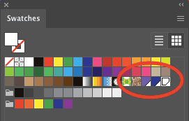
With a global swatch, any future changes made to that swatch will automatically apply to any and all objects using (“linked to”) that swatch. These automatic and “global” changes occur even when no objects are selected on the artboard.
You can also add something called “book colors” to your available swatches. An example of a book color would be a Pantone color which is a specific formula of pre-mixed ink. Colors such as Pantone or PMS colors allow you flexibility that you can’t achieve within the confines of the possible cyan, magenta, yellow, and black (process) ink mixes. When you add these book colors to your Swatches palette, you’re using a “spot color.” They’re called “spot” colors because they’re usually used in select, or “spot” parts of a document.
Spot color swatches look just like global swatches in the Swatches palette, but with a dot in the white triangle (this is easy to recognize if you open one of the Pantone swatch libraries).
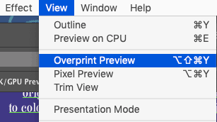
You won’t see them at their full brilliance unless you go to View → Overprint Preview, in which case your computer will do its best to render a more accurate preview of the specially mixed color at its best.
Converting a Process Color to a Spot Color in Adobe Illustrator
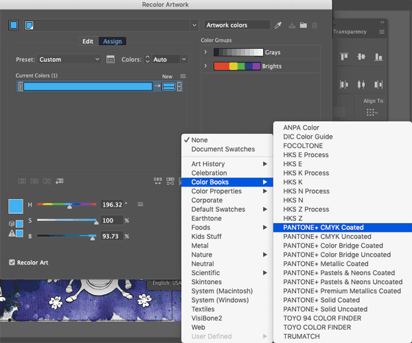
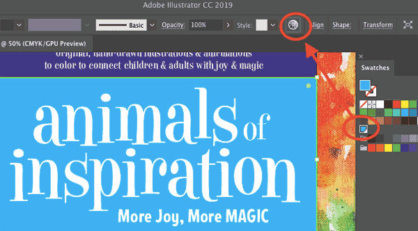
To find the closest Pantone match for an existing process color, select an object with your swatch applied, and click the “Recolor Artwork” icon in the toolbar.
Then, click on the “Swatch Library” icon in the Recolor Artwork dialog.
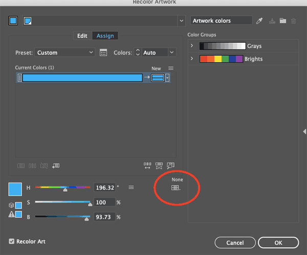
From the dropdown, choose Color Books → Pantone+ CMYK Coated.

Click “Ok.”
You’ll notice that a new global swatch has been added to your Swatches palette. When you double-click on it, you’ll notice the spot color equivalent of your original swatch. Use the dropdown to change the swatch from “Process Color” to “Spot Color,” and change the Color Mode from CMYK color to LAB, and you’re good to go.
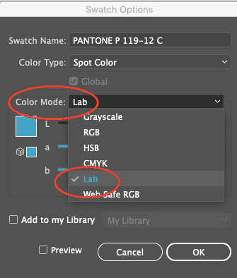
LAB is a device-independent color model. It’s not influenced by your printer or your screen; it’s supposed to emulate real world colors in your on-screen display. When you use specific Pantone spot colors in your files, the color dialog box shows them to be mixed in LAB mode.
Take note to keep the LAB Color Mode for Pantone swatches, and confirm that the swatch name is accurate (and in all caps) to save a lot of headaches when your file arrives at the printer.
How to Convert Spot Colors to Process in Illustrator
It’s even easier to go the other direction. When you have a spot color in use, simply double click on your Pantone swatch and notice a dialog open.
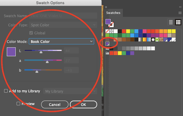
From the “Color Mode” dropdown, select “CMYK.”
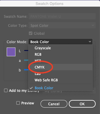
You’ll then see the CMYK values appear.
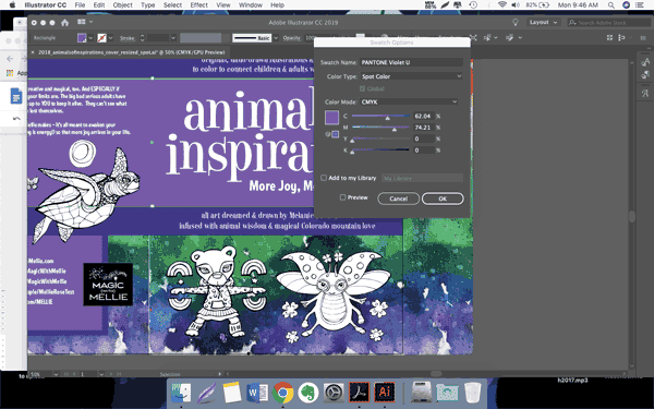
By clicking “Ok” you’re changing the Pantone mix to a process color blend.
Refreshing your memory on the difference between spot and process colors — and making sure to set them up appropriately in either InDesign or Adobe Illustrator — will give you quite an advantage when it comes to maximizing efficiency, investment… and your printer’s sanity!
Speaking of sanity, you can keep yours by using Printing for Less for your next print project. We’ve earned scores of awards for our top-quality printing services. Need help with your project? Talk to a live print expert today at 800-930-7978.
