In the ancient Greek language, the word ‘pan’ means ‘all’—limitless; vast; encompassing more than any other. The ‘pantheon’ is a temple dedicated to many gods instead of just one.
So when you’re choosing ink for your product, why stick to ‘process colors’ when you could have Pantone at your fingertips?
Pantone. All tones.
Pantone spot-color technique was developed in 1963 as a color-matching communication system for frustrated advertisers who could never match their ink after it was mixed by various printers at various locations. Since then, Pantone has morphed into a gigantic system, producing thousands of colors not previously available with standard CMYK process ink.
Although the wide range of options is certainly a plus, consistency is Pantone’s forte. Because of the Pantone Matching System (PMS), which uses a detailed combination of numbers and letters in its ink ‘recipes,’ any printer anywhere can perfectly match the color to any other printer, according to pantone.com. This is important for brand consistency. PMS can also ensure smooth coverage of large areas, keeping the colors identical from edge to edge.
The vibrant array of possibilities now available with Pantone ink has been catching the eyes of consumers for over 60 years, and has given rise to new experimentations with ink. Over the past several years Pantone has been promoting a Color of the Year; recent choices include Emerald, Tangerine Tango and Honeysuckle.
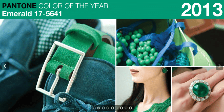
These notable colors have been setting standards around the world, inspiring clothing lines and makeup trends. This year’s Radiant Orchid was chosen for its “magical” and “beguiling charm,” according to Pantone Color Institute Executive Director Leatrice Eiseman.
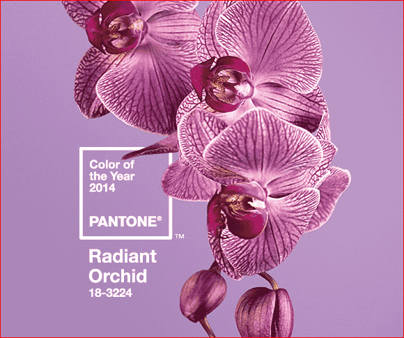
“It enhances your feeling of being more creative,” Eiseman says. “We’re all looking for that touch of uniqueness.”
Now that you have a Pantone background, it’s time to spice up your text.
Metallic ink is a good place to start. The gold or silver flakes in the ink give the text a nice pop, especially on dark paper. Push yourself out of your printing comfort zone! On a business card or brochure, use metallic ink sparingly to draw the eye to one specific point, such as the offer—don’t overwhelm your customer with rock-star bling.
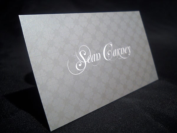
Keep your metallic ink on coated paper so the tiny chunks of metal in the ink do not sink into the paper, and are able to retain their maximum shine and that extra zing that makes metallic ink stand out. A coating is advisable as well, so the flakes do not transfer to another sheet of paper stacked on top of it. Gloss coatings are standard, but aqueous coatings give the paper a ‘watery’ appearance, even when dry.
If zing isn’t your thing, maybe you’d like a bit of texture, such as with Spot UV coating. Spot UV is applied to a matte coating to cure certain areas of flat paper into items of subtle visual interest. The area of focus, either text or image, will be glossed over slightly. This prompts viewers to tilt the card or paper back and forth to experience the quiet marvel of Spot UV.
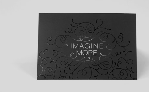
Try applying Soft Touch coating to your piece. This rubbery coating dries quickly, and gives paper another texture. It can be recycled easily, because the coating is water-based. Soft Touch is similar to the coating on many phone and laptop cases, and tends to absorb light rather than reflect it, much like a matte coating.
It’s a softly striking way to combine tactile appeal to an already visually-intriguing piece.
Finally, combining Soft Touch with Spot UV will provide a higher contrast in both reflectivity and tactile stimulus than printing either alone, making your paper products irresistible to both eyes and hands.
Your choices impact the visual and tactile experience for your customer: choose thoughtfully from the nearly ‘pan-options’ of inks and coatings.
Need help with your print? Talk to a live print expert today: 800-930-7978.
