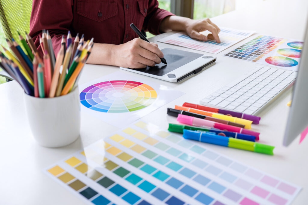
Have you ever thought about what influences you to be drawn to purchase a product you have never physically held or seen? Is it the graphics? The aesthetic of the marketing campaign? The physical appeal of the models in the photos? The color palette of the design? All of the above?
The look of your marketing campaign can literally make or break your brand. But, did you know color can actually affect us physically and mentally, too? Psychologists refer to this phenomenon as color psychology.
Believe it or not, color affects us in ways most of us haven’t even stopped to think about before. It affects our moods and decisions, and can even affect our appetite and health. We will teach you a bit about color psychology so the next time you are planning a marketing campaign you can utilize psychology to sway your customers in the right direction.
The History of Color Psychology
The use of color to treat the mind and body has been practiced for thousands of years. The Egyptians were practicing color psychology way before the term “color psychology” was coined. They painted therapy rooms orange to lessen fatigue, purple to improve the skin, and blue to relieve pain.
Color has also been—and still is—used in one of the oldest holistic medicine practices in the world. This alternative medicine practice swears by using color to improve health by influencing our moods. With historical roots in India, Ayurvedic Medicine was developed more than 3,000 years ago, calling these mood-influencing colors doshas. Ayurvedic practitioners categorize people into three different doshas based on physical stature and each dosha is said to be influenced differently by different colors. Who needs Advil when we have color?
Although color has been used for therapy for thousands of years, color psychology was not actually studied until relatively recently. The first book on color psychology, Theory of Colors, was published in 1810 by German poet and artist Johann Wolfgang von Goethe. He wrote about the significance of different colors and how he believed different colors could trigger different emotions.
Scientists immediately rejected his theory because it was not backed by scientific research and was mainly based on his own opinions and insights. But, turns out he was onto something because since then, some of his insights have actually been validated by modern research. Who feels rejected now?
In 1942, neuropsychologist Kurt Goldstein tried to back Goethe with experimentation and scientific research, but his hypothesis was deemed inaccurate because he couldn’t get other scientists to back up his research either. But, his research has since played a massive role in modern color psychology.
Modern color psychology has consistently found scientific proof that color does indeed influence humans physically and mentally.
Researchers focus on three main areas when studying color psychology—color preference, physiological response to color, and effects of color on human emotion and behavior. Color preference is important for obvious reasons, if a person likes a specific color, they will be drawn to it. Researchers study physiological responses to color by measuring things like blood pressure, heart rate, and brain activity. To study the emotional effect color has on people, researchers use a psychological test called a semantic differential scale where they offer two adjectives opposite in meaning and are asked to place an object, in this case, color, where it belongs in relation to the adjectives presented. And to observe behavior, they run experiments to simply test and observe how different colors affect different choices and behaviors.
Why Color Psychology is Used in Marketing
Every color on the spectrum has been well researched and associated with different emotions. All the hard work has already been done, and you as a marketer can use this research to your advantage, and you absolutely should.
Studies have shown that 93% of buyers are influenced by visual appearance, and of that, nearly 85% are influenced by color alone.
For instance, if you think about yourself walking around a shopping mall don’t you think you would be way more likely to walk into a shop with funky colors and cool patterns rather than a store filled with beige and white clothes? Or imagine you’re walking around your city’s downtown, wouldn’t you think you’d be more inclined to stop and read, or even just notice a poster if it was vibrant and bright as opposed to one printed in black and white?
Color is something you should always be thinking about when beginning a new marketing campaign. You can literally influence your audience with color alone. And although not every person is influenced the same way, there are a few general color theories you should be aware of.
Some Colors and What They’re Good For
The color wheel is generally divided in half creating two categories of colors – warm colors and cool colors. Each is associated with different emotions. Warm colors like red, orange, yellow, and light green provoke emotions such as passion, enthusiasm, energy, and happiness. Whereas cool colors like purple and blue and darker greens elicit calmness and professionalism. However, as much as you may really want to invoke something in your audience, it is not advised to overuse one side of the color wheel over the other; balance is still key.
Purple – Purple is most commonly known as the color of luxury, it’s viewed as regal and dignified. It is also associated with imagination and spirituality making a perfect balance between physical and spiritual. Being a cool color it is known to soothe and calm the mind bringing peace and confidence in decision-making to consumers. Beauty brands like Urban Decay, Aussie, and Tarte all use purple in their logos. Being associated with things such as luxury, imagination, and physicality, beauty and anti-aging brands often tend to sway towards purple.
Red – Red is a very powerful color, it’s a strong color, arguably one of the brightest. It is known to create a sense of urgency and is often associated with fear or love. Its energizing properties grab attention and hold focus. Red is also known to encourage appetite and is often used by fast-food chains. Think about Mcdonald’s, Chick-Fil-A, In-N-Out, Chipotle, and Pizza Hut, shoot, now that I’m listing them it’s harder to think of fast-food chains that don’t use red in their logo!
Blue – Blue is arguably one of the most well-liked colors. It is associated with trust and security and is often used to represent tranquility, peace, water, and reliability. Men often prefer the color blue, so, if your main audience is men, think blue! Further, blue is the most common color used by companies in the corporate space. Think HP, Dell, Intel, and IBM.
Green – The color green is often used to promote balance and harmony and is generally associated with things like money, power, health, and nature. Green can stimulate tranquility within the brain and can lead to decisiveness among customers. Many eco-friendly or environmentally conscious brands use green in their branding, for the obvious reason that the most common color associated with nature and the environment is well… green.
Yellow – Yellow elicits joy, cheerfulness, and optimism. If you are trying to portray anything happy, yellow is probably the color you want to go with! Yellow can also be known to awaken the child in us, companies offering pleasurable, fast-accessible products or services often use yellow in their branding, companies like Mcdonald’s or Best Buy have benefited from using yellow in their branding.
White – White is often associated with purity and cleanliness. It can represent new beginnings and simplicity. As beautiful as it can be when used properly, avoid using too much white in marketing campaigns, as it can be seen as too minimal and boring.
Black – Black is used to portray things like seriousness, power, sophistication, or authority. Black, as a powerful color, can often be overused, and therefore misused. When used correctly black can look extremely sharp and powerful, but be sure to tread lightly.
While color plays a huge factor in the influence of your consumers, it is still important to remember all visual factors play a role in the success of your campaign. But now that you have color psychology in your toolbelt, your campaign can be that much more successful.
