Capturing the attention of potential customers has become more challenging than ever. However, one traditional tool that still holds immense power is the humble brochure. Creating brochures with eye-catching designs, help captivate audiences and leave a lasting impression on behalf of your business or brand.
From clever color combinations and typography choices to striking imagery and innovative layouts, we delve into the key elements that make a brochure appealing. Discover brochure designs that unlock the potential of this versatile marketing medium as a means to make your business stand out.
Best Practices for Creating a Brochure
While there are a number of ways to capture the attention of brochure recipients via design, it is first crucial to understand the basics of using a brochure for marketing. Our best practices include:
1. Know Your Audience
Understand your target audience’s preferences, interests, and demographics. Tailor the design, language, and imagery to resonate with their needs. This will help you create a brochure that connects with them on a personal level.
2. Visual Storytelling
Use compelling visuals to tell a story about your business or brand. Incorporate high-quality images, illustrations, or infographics that convey your message effectively. Visual storytelling can engage readers and leave a lasting impression.
3. Consistent Branding
Ensure your brochure aligns with your overall brand identity. Use consistent colors, fonts, and design elements to reinforce your brand image. This creates a cohesive and professional look, reinforcing brand recognition and trust among your audience.
4. Simplicity and Clarity
Keep the design clean and uncluttered to avoid overwhelming readers. Use white space strategically to give the content room to breathe. Breaking information into easily digestible sections with clear headings and subheadings will also enhance readability and make your brochure more user-friendly.
5. Unique Formats and Finishes
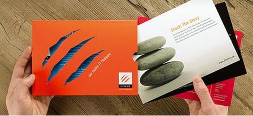
Experiment with different formats and finishes to make your brochure stand out. Consider using tactile elements that create a sensory experience. These unique touches can pique curiosity.
These best practices can create a unique brochure that grabs attention, communicates effectively, and leaves a lasting impression on your audience.
Remember to stay true to your brand while pushing the boundaries of design to create a remarkable print experience.
Why Should My Business Create Brochures?
Choosing a brochure over other types of printed media offers distinct benefits for clients seeking effective engagement. Here’s why a brochure can be a valuable choice:
1. Comprehensive Information
Brochures provide ample space to showcase detailed information about your business, products, or services. Unlike smaller print materials like flyers or business cards, brochures allow you to delve into the specifics, highlighting key features, benefits, and testimonials. This comprehensive approach helps clients present a complete picture of their offerings, answering potential customer questions, and boosting brand confidence.
2. Tangible and Portable
A brochure offers a tangible, physical form that clients can distribute directly to their target audience. Unlike digital advertisements that can be easily overlooked or forgotten, a well-designed brochure can be carried, shared, and referenced at any time.
3. Visual Impact
Brochures provide a canvas for captivating visuals. This allows clients to showcase their brand identity or services in a visually engaging and memorable way, while reinforcing their unique selling proposition.
4. Credibility and Professionalism
A professionally designed brochure exudes credibility and enhances the perception of a client’s business or brand. It demonstrates a commitment to quality and attention to detail. When compared to digital marketing alone, brochures can convey a sense of permanence and legitimacy, establishing trust in the eyes of potential customers.
5. Targeted Marketing
Brochures offer a focused approach to marketing by enabling clients to tailor their content to specific audiences. By strategically choosing the distribution channels and locations, clients can reach their desired target market directly. Brochures can be displayed at events, mailed to targeted prospects, or distributed in high-traffic areas, ensuring that the right message reaches the right people.
Brochure Design and Formatting
So just how exactly can brands push the boundaries of design? Here are a few examples.
1. Die-Cut Shapes
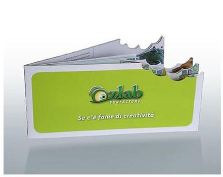
Instead of a standard rectangular brochure, you can opt for die-cut shapes that align with your brand or the theme of your content. For instance, if you’re promoting a surf school, you could have a brochure shaped like a wave or a surfboard. This adds visual interest and makes your brochure more memorable.
2. Embossing and Debossing
Embossing involves raising certain design elements or text on the paper, creating a three-dimensional effect. Debossing, on the other hand, involves pressing the design or text into the paper, creating an indented effect. Both techniques add texture and a tactile experience to your brochure, making it visually appealing and engaging to touch.
3. Spot UV Coating
Spot UV coating involves applying a glossy, raised coating to specific areas of the brochure, creating contrast and highlighting certain elements. This technique can be used to enhance logos, headlines, or other important details, giving them a luxurious and eye-catching appearance.
4. Folded Panels and Inserts
Instead of a standard bi-fold or tri-fold brochure, you can explore more intricate folding techniques to create unique panels or inserts. For example, a gate-fold brochure opens up like two doors, revealing a central content area. This adds an element of surprise and interactivity to your brochure.
5. Specialty Paper and Finishes
Consider using specialty papers, such as textured or metallic paper, to add visual interest and a premium feel to your brochure. You can also explore additional finishes like foil stamping, which involves applying metallic foil to specific areas.
The key is to think creatively and align your choices with your brand and the message you want to convey.
Businesses that Should Try Brochure Marketing
A wide range of businesses can benefit from sending brochures to potential customers. Here are a few verticals where Printing for Less customers have seen success.
- Tourism and Hospitality: Hotels, resorts, travel agencies, and tourist destinations can showcase their amenities, services, and attractions through brochures while also highlighting scenic locations or impressive accommodations.
- Real Estate: Brochures are effective for real estate agencies looking to market residential or commercial properties. Brochures can provide detailed property descriptions and floor plans.
- Education and Training: Businesses in the educational space can use brochures to present their courses, faculty, facilities, and success stories. Brochures can help prospective students and parents understand the educational opportunities available and make informed choices.
- Healthcare and Wellness: Hospitals, clinics, wellness centers, and healthcare providers can utilize brochures to educate potential patients about their services, specialties, and treatment options. Brochures can help build trust in a vertical where trust is essential.
- Event Management: Brochures can highlight event details, schedules, speakers, and exhibitors, enticing potential attendees and sponsors to participate.
- Nonprofit Organizations: Nonprofits can leverage brochures to create awareness for their projects. Brochures can convey the impact of their work, share success stories, or provide information on how people can get involved and donate.
These are just a few examples, but in general, the versatility and customization options of brochures make them suitable for a wide range of industries.


