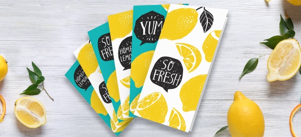
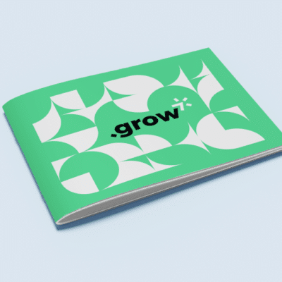
Brochures are the best way to market just about anything. Perfect for tradeshows, leave-behinds, in-store service offers, menus, maps, mailers – the list goes on and on and on. Here are some tips for making the most out of your brochures.
The 5 Essential Brochure Archetypes
There are different kinds of brochures appropriate for specific scenarios.
- Leave behinds
- Point of sale
- Direct mail
- Response
- Sales support
Your company doesn’t have to narrow its focus to just one category, but can use multiple brochures to promote different aspects of your company’s services.
Custom Features: High Octane Print Fuel
One of the best ways to make your company stand out is with custom features. Soft touch paper, hot foil stamping, die cuts, custom folds, metallic inks, spot UV coating, foil stamping and embossing add a polished touch that grabs customer attention.
Tight Cuts For Tighter Budgets
Die cuts are the coolest: you can get a brochure that looks like Abe Vigoda’s face, but that’s gonna cost you. On a tighter budget? Consider cuts that have flair without the expense of a die cut. Our favorite example is the Angled Stair Step Cut, for brochures that are 8.5 x 11 (flat paper size) or larger. This unexpected look is modern, stylish, and cost effective. And your competition isn’t doing it (yet).
Do’s and Don’ts
These tips will make your brochure current, clean, refined and most importantly, effective.
Why are you doing this?
Before you begin, know why you’re creating your brochure and what you want it to accomplish. This will help with messaging, and with knowing if you should use custom features to execute that messaging.
Make the cover count
People judge books by the cover. Brochures are really just big covers. What we’re saying is: your brochure cover should be powerful, captivating and pristine.
White space is your friend
It’s a brochure, not a novel. Don’t cram too much on a page. If your brochure appears too busy, the eye will have no path to follow, and people will abandon it.
Creative typography never hurts
While Times New Roman is more classic than an Audrey Hepburn movie, a little Marilyn Monroe never hurt anybody. Use creative typography that represents your business and that grabs the eye. But remember: everything in moderation. And stop with the Comic Sans. Seriously.
Break conventional perspectives
Brochures are perfectly designed to break your ideas into neat little compartment, if you like being boring. Break perspective and traditional brochure expectations to surprise customers.
Have a clear call to action
Marketing works if it drives action so make sure your reader knows exactly what to do. Make the call to action visible, concise and put it front and center.
Don’t forget pictures
Show, don’t tell. Throwing paragraphs of text across your brochure panels without any visuals is boring.
But don’t use the same old stock photos
With so many companies outsourcing or taking their own high-quality photos, stock images can dull your edge on the competition and come across as kitsch. There are still good stock photos out there, just dig a little deeper.
Don’t just list features
People are only interested in what applies to them. Sadly, all the fancy features of your product don’t fall into that category. The benefits of those features, however, have everything to do with your customer.
Don’t talk about yourself
Zip it and listen. Think about your customer and center your brochure on the problem you solve for them, not the product and not yourself.
Don’t try to say it all
Trying to cram too much information into your brochure can hurt your messaging because if you’re saying everything you’re saying nothing.
There you go, all the everything you need to make a great brochure. Well except the artwork. Want it to look amazing? We can’t help you because amazing doesn’t describe how perfect our brochures look. We can do better than that.
Need help with your print? Talk to a live print expert today: 800-930-7978.


