As we all know, the medical industry is heavily regulated. There are very good reasons for it but that doesn’t mean that effective marketing is out. Playing by the rules (or FDA regulations) shouldn’t mean that you can’t create amazing marketing campaigns with some spiffing new medical brochures. With a great medical brochure from Printing for Less and direct mailing, you can spread the word to a wider audience about the newest and best advancements in your field or facility.
Have a ton of information on a new procedure that you offer? Medical brochures are perfect for getting you message out there. But you should never sacrifice quality for quantity in your medical brochure design. Seize attention with something interesting, inspiring, or just eye-catching. Soothing blue borders and a stock image of a smiling doctor is done! There are tons of great medical brochure examples out there. Here are just a few.
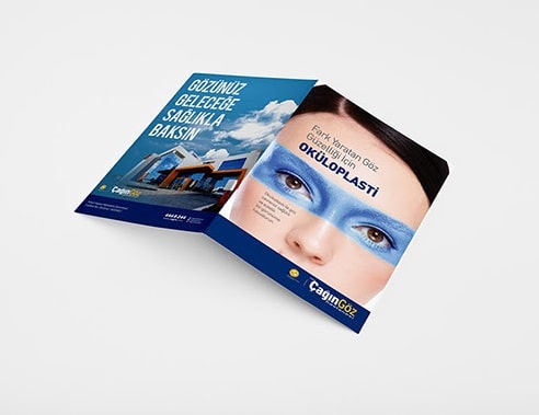
Start out by picking the right image and you can push your brochure from average to awesome just like that! If a picture is worth a thousand words, then maximize the impact of your message. With this image staring you straight in the face, it is impossible to miss the focus of this brochure. The bright blue highlight and the rich dark eyes are mesmerizing. And unlike some generic pamphlet designs, this cover cuts straight to the point. For an image this powerful, choose a clean but matter-of-fact font that won’t detract. This layout is perfect for promoting your newest product or procedure. Go bold or go home and galvanize your customers.
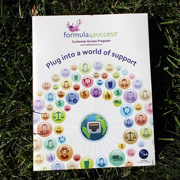
Making your brand approachable in the field of medical billing and healthcare is no easy task. Throw in anything related to healthcare or billing and you’ve got your work cut out for you. Attempting to decipher medical coverage raises most people’s blood pressure but this brochure makes it look fun. With a catchy hook of a title and a fun catchphrase, this brochure removes the stress and sets customers at ease. If your goal is to provide an accessible solution, then use visual cues, like cute and colorful icons, to lay the groundwork for your message. Taking a difficult problem and turning it into an approachable resolution will build brand awareness and create happy (and regular) customers.
3. The Pavilion
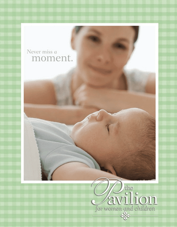
An adorable baby is always an easy front page to sell. But in the world of healthcare and medicine it is also a very common image. So if you want the ads for your prenatal exams, maternity ward, or post-natal support programs outshine the others, you will have to raise the bar.
A solid image can do the trick when you want your message to stick. Gender neutral colors and a happy but hazy parental figure increases the wider market appeal. But the real gem here is the tagline. Variants of ‘Never miss a…’ continues on to each page throughout the brochure and emphasizes not only the preciousness of these babies, but also their fleeting nature. Babies grow so quickly so missing any time with them is avoidable with the services offered.
4. Camscreen
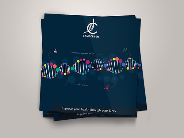
DNA profiling seems fairly complex but this design makes advertising it deceptively simple. The dark, serious colors balance nicely against the bright and playful DNA strand, creating a sense of professionalism but approachability. This cover makes a hot topic into child’s play and is a perfect example of advertising cutting edge tech and medical advancements.
5. Vector 1
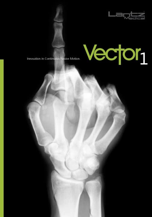
Forget medical therapy; what we really need is this ad on a band t-shirt. This cover is pretty cool, but despite the seemingly obvious clue, there is still the question of what type of medical service this brochure is advertising. Is it a radiology office, a physical therapy clinic, chiropractic, rheumatology, or osteopathy? Is it a single facility that offers all of those? Intriguing! This cover alone is enough of a lure to make us want to find out more but what we really want to know is, what is Vector 1? We must know! To build additional suspense, roll out a cover like this near Halloween. With winter sport season around the corner, you can capitalize on the spooky season while beating out the competition.
6. Pipi au Lit
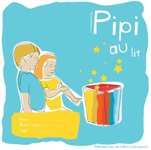
Even if you are not fluent in French, it is easy to see that this brochure is geared towards kids. From the cheerful colors, the playful font, and the gold stars to the adorably illustrated children, it hits all the right notes. When looking for original ideas for children, check out popular or award-winning picture books for suggestions on color schemes, fonts, or illustration styles. You don’t have to be French to create a Caldecott Award-worthy pamphlet out of a stressful childhood event like bedwetting (but it certainly couldn’t hurt).7. Analiza
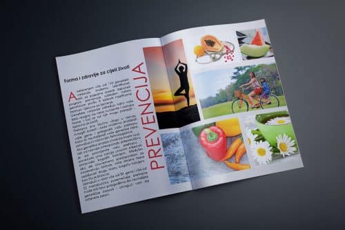
Crisp veggies, fresh flowers, and picturesque yoga backdrops; this cover has everything that you need. Direct but beautifully illustrated, this brochure doesn’t stagger the images and articles. It is all about getting the information out there and they don’t hold back. Most of the time, critics will suggest that too many images on a page can overwhelm the viewer. You want your audience to become invested in the material, not distracted by too much visual stimuli. But in this case, the critics would be wrong. There is no sense of clutter, instead this collage-like presentation succeeds beautifully. By choosing thematic images that share the same or similar colors, a series of images can act as one larger photo. This can be a tricky approach, but really pays off when you have more photos than can be reasonably arranged around the page. Just use this powerful technique sparingly. As a statement or showcase method it works best at the introduction of an article, by growing interest in the rest of the piece.
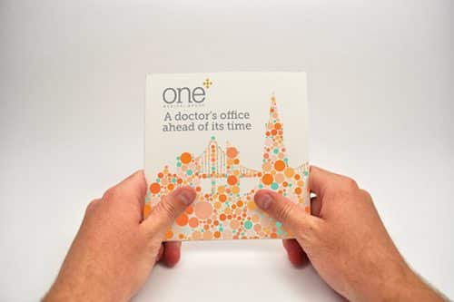
8. One Medical Group
This design by One Medical Group builds a whole new future before our very eyes. Gently contrasting colors blend to create a city of tomorrow, invoking concepts like ‘innovation’ and ‘cutting edge.’ Reminiscent of those hidden picture scenes, this cover implies that through One Medical Group, we can see the potential for new medical facilities where pioneers in the field of healthcare will make giant strides forward in the advancement of human-kind. Or maybe they’ll just have those really cool vending machines. Who knows? What is really amazing is that all of this was accomplished with dots! This technique is so versatile that it could be applied to any kind of branded campaign. The future is in your hands.
Have any questions? Talk to a print expert today and get started on your next order of brochures. Call us at 800-930-6040 for expert advice on your next project.
