Eons ago, brochures must have been incredibly innovative (you mean the paper folds into itself? How positively spiffing!)
But like the horseless carriage or the iPhone 4, the thrill of the brochure has worn off with time. Too many businesses linger in the past, creating tired brochures that all look and feel the same.
You’re not the same as your competitors, so why should your brochure be? If you’re going to spend your marketing budget on print materials, don’t settle for anything less than a fresh and snappy design.
Here are eight brochure design ideas with enough creative, cutting-edge print effects to make your brochure standout among the rest.
1. Turn the lights off.
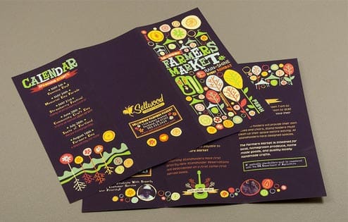
Black, as a design element, draws the eye and conveys sophistication in a way that no other color can. Bold color on a dark base draws attention to your material, almost making it pop up from the page.
And with glow-in-the-dark ink, you can create a brochure that literally works with the lights off. Restaurants, movie theaters, nightclubs — the applications for bioluminescence are endless!
2. Refresh your geometry.
We don’t know who said a brochure has to be a plain rectangle, but we suspect it was the same guy who said the Wright brothers should just give up on airplane-ing.
Brochures can (and should) come in all shapes and sizes, with different folds to accent different features.
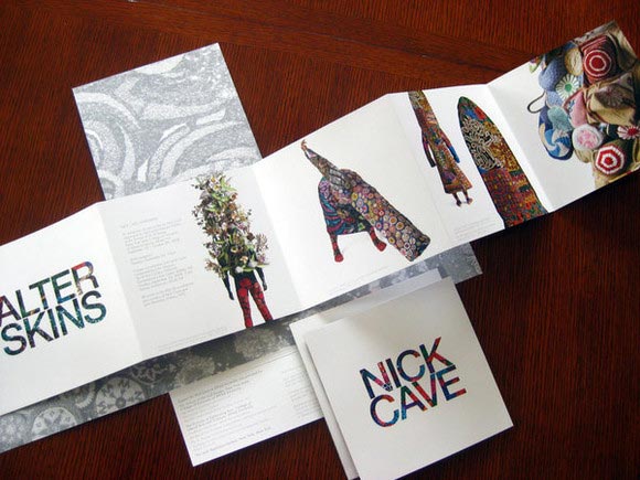
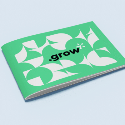
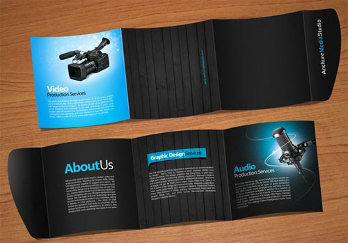
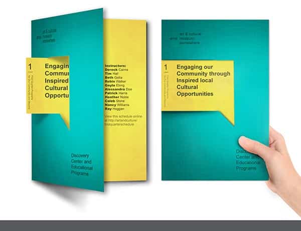
See two examples below: one, a square brochure with a sleek and modern design, and a die-cut museum brochure with a gate fold and a tab that sticks out of the side.
3. Try an cross fold.
An cross fold is a type of fold that opens outward from the middle, with four outside panels that create a cross shape.
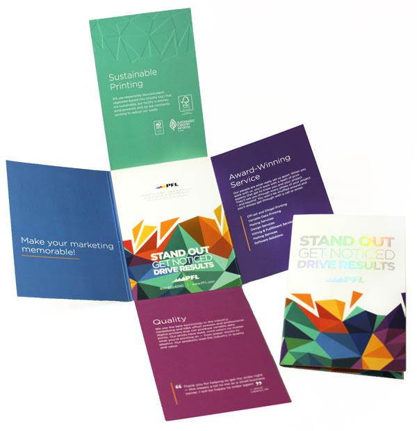
The cross fold may as well be the best-kept secret in print marketing. It’s every bit as underused as it is powerful, and here’s why. With this type of fold, a reader has to perform just a little bit more work to open it up than with a typical brochure — less than a fraction of a second. But in that second, reader engagement skyrockets.
There are three extremely compelling things at play here: there’s the tactile experience of unfolding the cross fold, and the surprising presentation of design elements (completely unlike the standard brochure) that pulls your customer in. Finally, and most importantly, the middle panel is like a magnet for the eye — making it the perfect place to plunk down your irresistible call to action.
It’s also versatile. Use a special kind of glue called a tip-on to attach a card or small gift within it, fold it up and send it as a self-mailer without packaging, and use it as a folder for loose content within it. Check out our brochure templates for more brochure folds!
4. Integrate it with your digital marketing.
The example below may look like a traditional brochure, but don’t be fooled — it’s custom-made for you.
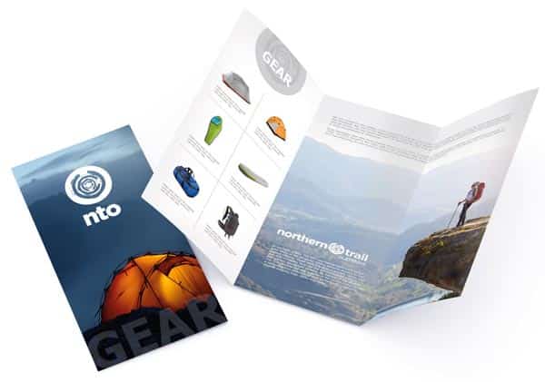
Well, maybe not you, personally. The images you see in this brochure correspond to one customer’s browsing history, or contents of their shopping cart, on the client’s website. That’s right. If Joe B. in Salt Lake City spent several minutes poking around on your website looking for camping gear, Joe B. will get this brochure in the mail 30 days later.
But the same goes for Jenny K. in California, who was looking for rock climbing stuff — except her brochure will feature rock climbing shoes, a rope, and quickdraws, and a woman climbing at Yosemite.
This customizable brochure info is powered by variable data printing, a print effect that’s especially powerful when combined with marketing automation. At Printing for Less, for example, it works like this: you set up a rule or series of rules within your CRM, and we automatically mail customized content to your leads and prospects.
Read More: Tactile Marketing Automation
5. Use a creative die cut.
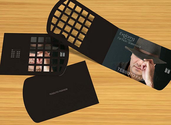
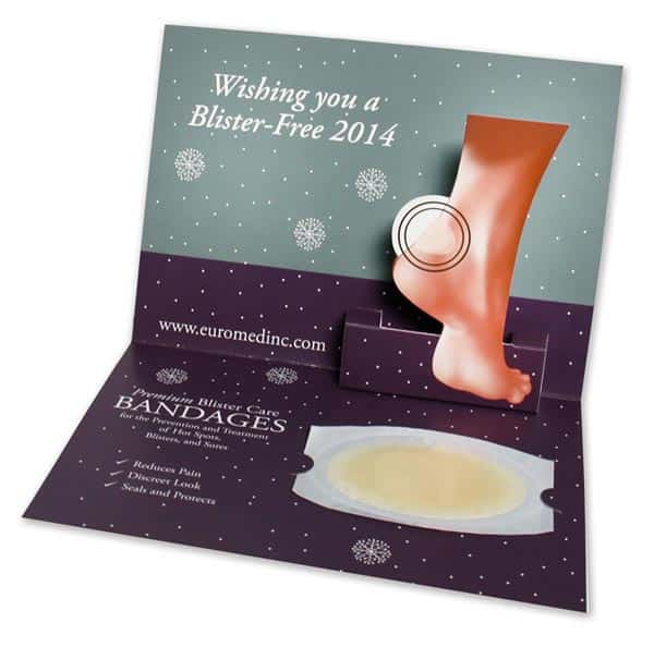
A die cut is a printing technique that’s done with a piece of equipment that’s a bit like a stamp made of blades. It can punch out any shape you can imagine: squares like the in the black brochure below, or amorphous shapes like the foot in the other example.
A die cut can create an entirely unique shape for your brochure — elements of your logo, the shape of a product you sell, or the first letter of your name, for example.
You can use a die-cut piece as a separate shape within your brochure (tipped-on with glue, folded back like a flipbook, or popping out like a popup book). You can use it to let the reader “peek through” your content to create suspense, or you can make it pop up to add surprise and draw the eye to a specific area.
6. Go Big, or Go Bigger
By now you’ve seen how many ways brochures can break the mould, but one of the simplest ways to grab attention is to crank up the size. In this example, the brochure becomes an in-depth pamphlet, giving the reader extra opportunities to interact with your brand messaging.
7. Think avant-garde
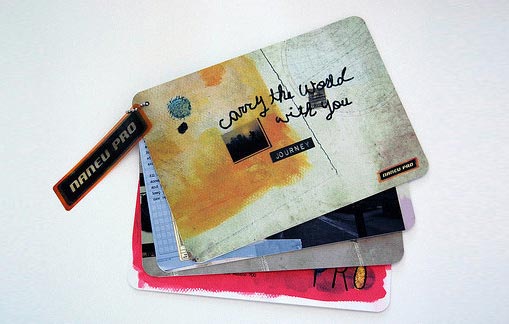
Pop the lid off your creative boiler and think of new forms your brochure can assume. Edgy concepts that depart from convention can get results just for being unusual, or featuring breathtaking original art. This idea incorporates professional design with a unique layout, and results in a truly memorable piece.
8. Design a brochure holder.
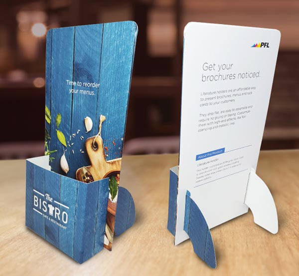
You could purchase a plastic brochure holder for your office or store. Or, you could extend your brochure design to the holder itself, creating one cohesive piece that tells a story. In this example, a custom brochure holder is made to match this restaurant’s to-go menus to keep that brand top-of-mind (even when the holder’s empty!)
If you go this route, your printer will send these holders in a flat pack that you can assemble, stock, and replace as needed over time. Not only are they cheaper than a plastic holder, but they’re spreading your brand message, which is way more than can be said for a faceless slab of plexiglass.
Ready to put these ideas into action?
Got some inspiration? Here are a few more things to help warm up your creative muscles as you set off to design one brochure to rule them all:
- Who is my target audience?
- What is the primary purpose of the brochure? (i.e. tell the company story, highlight specific products, make a special announcement)
- How will this brochure be distributed? (i.e. mail, conference, on-site)
- Is one brochure sufficient? (i.e. individual product focus, company vision, services offered, special event)
Make an outline of your key points, based on your responses above. Create the written content first. This will help your designer (even if you’re the designer!) create the perfect layout, and synthesize killer custom effects with your vision to create a brochure that your customers can’t resist.
Printing for Less (Printing for Less) has been an industry leader and provider of high-quality, unique printing services since 1996. Though we are a large company with customers across the globe, we treat our customers with the attention and care you’d expect from a luxury printing boutique. From business cards and banners to letterhead, flyers, and beyond — Printing for Less knows printing like no other. Let’s talk about your project! Our print consultants are available 8am-5pm MT Monday through Friday at (800) 930-7978.
