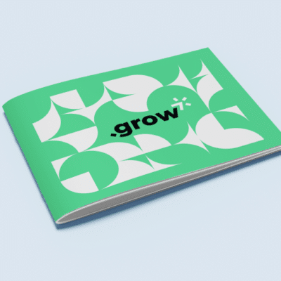
If you’ve ever considered using creative print design as a way to stand out from the competition, you have the right idea!
Sure, digital marketing (by comparison) is fast and inexpensive. You can make last-minute changes to digital designs and A/B test different landing pages and ad copy with very little risk. However, the accessibility of digital marketing also means that everybody’s doing it — and you know how hard it is to stand out in a saturated environment.
The perfect solution is to turn to print.
Printed materials aren’t ethereal like digital ones. The recipient of a digital resource may be too screen-weary to spend much time with it, while the same recipient may delight in a physical handbook that feels velvety to the fingertips.
As much as we like to fancy ourselves forward-thinking, rational beings, we’re still deeply entrenched in the delight that comes from sensory experiences. Use this to your advantage in your sales and marketing materials; go beyond the standard rectangular business card or tri-fold brochure and go where no graphic designer has gone before.
Here are seven real examples of truly creative print design that will outdo your competition.
#1: Giving New Meaning to the Die Cut
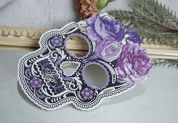
This invitation utilizes both a unique shape (a calavera, or sugar skull) and a velvety texture to grab the attention of invitees. The printing technique that creates an unconventional shape like this one is called die cutting, and it’s possible to use this effect to replicate just about any shape you can imagine.
The velvety feel is the result of a special coating effect. Think back to the last time you bought a high-end gadget or maybe an expensive cologne — the box likely had a similar velvet coating effect to communicate luxury and send a nice little tingle through your nervous system as you picked it up.
Use it: What does your business do? Can you use a creative die cut to communicate an idea about a product or service you sell? If you’re creating event invitations or a high-end product, can you incorporate a velvet coating to excite the senses?
#2: Stand Up to Stand Out
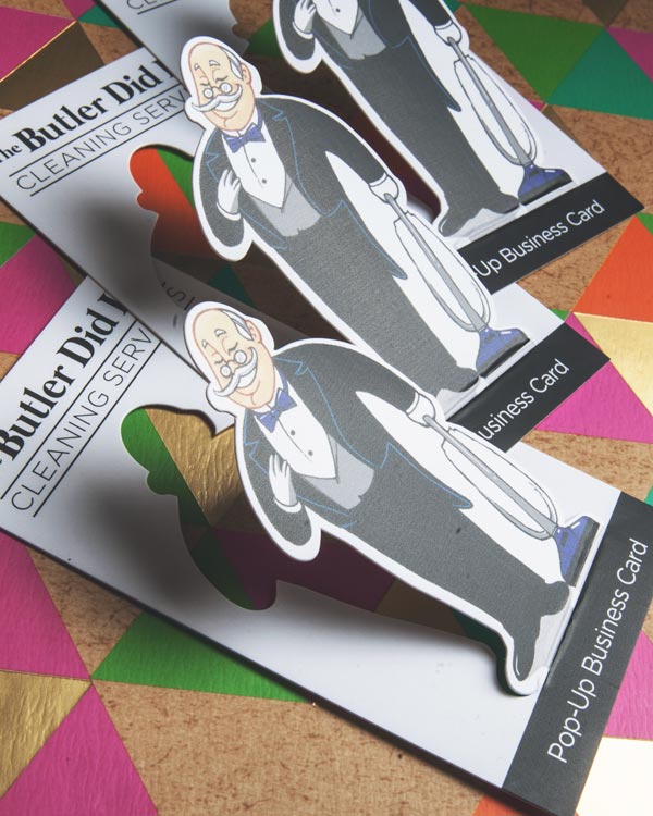
Pop-ups aren’t just for children’s books and hipster boutiques, and this popup business card (not a real company, but a real printed example) proves it. Like the first example, the butler in this business card was created using a die cut that transforms this piece into an engaging, three-dimensional conversation starter.
Imagine setting these out at an event or at a local community hotspot: your business card would be the only one jumping out at its viewers!
Use it: Where would a popup element do your business a favor? Beyond business cards, you can create 3D popup print designs within pamphlets, books, posters, brochures — you name it.
Try popping out your logo, an illustration of your target customer, an announcement, or a representation of your product or service. You can get super elaborate with popups, like card company LovePop demonstrates with their elaborate popup designs.
#3: Catch the Light, Catch the Sale
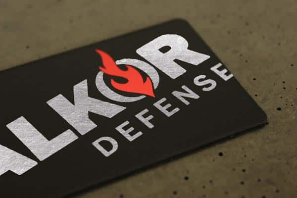
This isn’t your grandma’s business card (unless your grandma is the coolest kid on the block, in which case, it is your grandma’s business card). This card uses extra-thick matte stock which makes it super durable and memorable. The ink and red flame are both created with metallic ink, which catch both the light and the recipient’s attention.
Use it: Matte cardstock for business cards makes it possible to actually write on the card, which is super useful if you’re handing your cards out at an event and want to leave a personal note to the recipient.
It gives it a raw, unique feel as well, which contributes to a strong and lasting first impression. And using metallic ink is one of the more cost-effective ways to personalize your business card to grab more attention.
#4: Traveling Twain
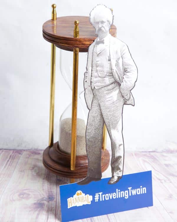
This piece was part of a social campaign that aimed to get people to take pictures of their travels alongside the famous author. It’s like a table tent (you’ve seen these at restaurants, little pop-up promotional pieces) that functions as an informational brochure. It’s made of thick cardstock for durability.
Use it: Get your customers to actually use your content in their lives. Can you start a social media movement using creative print design? Incorporate die cuts (like this cutout of Mark Twain’s body), multisensory experiences (scratch-and-sniff or bioluminescent ink), or content that you discover slowly through a series of folds.
#5: Shape Up or Ship Out
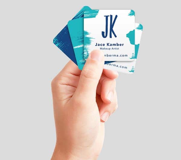
Square business cards are all the rage, but add rounded corners and a powerfully simple design and you’ve got a memorable tool that’ll outlast all of your competitors’ flimsy cards. It’s small, so it still fits in your prospect’s wallet, but the uniqueness of its shape will help others associate uniqueness with your brand.
Use it: Create a square business card design using the rule of thirds for a truly stunning result.
6#: Try a New Angle
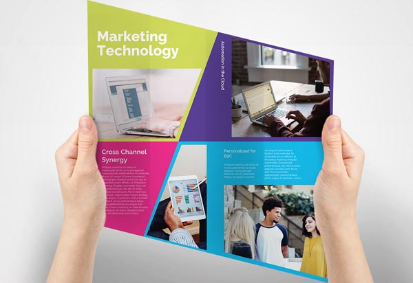
This brochure opens into a rhombus rather than a rectangle, giving it a modern look and feel. Additionally, the copy can be personalized for different members of your target audience using variable data technology. All you have to do is provide your printer with rules for which pieces should get which copy and images, and, voila! You have ultra-custom marketing materials, every bit as targeted as your digital marketing content.
Use it: If style is important to your brand — say, you’re a creative agency or graphic designer — this asymmetrical design can be the perfect choice. And variable data printing is a custom effect you can use to create any kind of customized content: from brochures like this one to EDDM mailers, postcards, kits, and invitations.
If you can dream it, we can do it! We encourage creative ideas at Printing for Less — and we specialize in helping custom projects come to fruition. Bring us your challenging projects. We will shield you from the mess of sloppy printing while meeting your printing needs.
Need help with your print? Talk to a live print expert today: 800-930-7978.
