Developing an original look for your advertising materials doesn’t have to be a Herculean task. With a seemingly endless array of possibilities, getting started by just picking a font can seem daunting. Thankfully, with our teams of experts here at Printing for Less, you don’t have to worry about knowing the ins and outs or even the How-To’s of print newsletter design. We can take care of the nitty-gritty (and can even help with those fonts), but if you are finding yourself stumped for newsletter design ideas or your next newsletter layout, then take a gander at these creative printed newsletter designs and pick up some inspiration for your next project.
1. Fashion
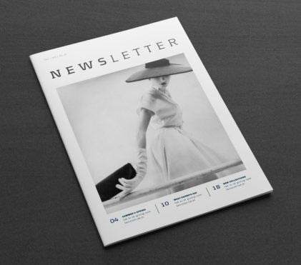
Mailbox-friendly marketing materials are always in vogue. Model yours on haute couture fashion mags and your clients won’t want to wait to get their hands on your next newsletter. Start with a gorgeous stand-alone image on the cover, then go glossy and showcase your list of contents just below for a tasteful layout worthy of Harper’s Bazaar. While black and white is always fashionable, you can spice things up with some color. Instead, try rich, beautiful tones and a matte finish for a high end feel and a modern appeal that never goes out of style.
2. Greenpeace
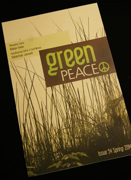
It isn’t always easy being Green. This cover beautifully blends organic imagery and earth tones with a dynamically placed title that delivers a strong on-brand message. It may be tranquil, but it is not passive. Combine this look with environmentally responsible products, such as milled paper from Oji Paper Group and vegetable-based inks (both available at Printing for Less) and showing your true colors will be a walk in the park.
3. Xplore
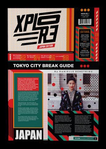
For an energetic design like this one, you need a dynamic color scheme and some great shots. This cover makes fantastic use of a strong geometric scheme and trendy colors, reminiscent of the industrial sprawl and neon signage of Tokyo’s Shibuya shopping district. Saturated contrasting colors (like the teal, rust and pumpkin used here) glow against the grounding effect of the black and white. Combined with bold and funky fonts, this is a great style for growing brand interest.
4. African Studies Heritage Studies
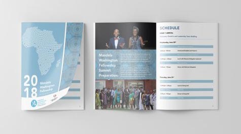
This layout showcases a classic form that offers a relaxed presentation. A fantastic style for the more formal settings of conferences or meetings, the soft tones and flow of information effortlessly carries the reader from one page to the next. Perfect for accompanying materials, your audience can easily refer to displayed data without missing out on the presentation.
5. Art News
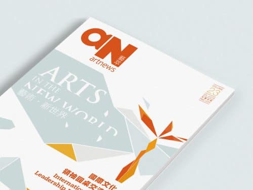
Here is another example of beautiful results that can come from the use of contrasting colors and geometric shapes. An abstract landscape graces the cover; done in arctic shades and highlighted by brilliant oranges and golds. This style has a more mature feel than the Xplore cover previously shown, but is no less visually stunning. With modern sensibilities and a playful appeal, this layout is perfect for established companies looking to cultivate their image.
6. La Memoire Vive
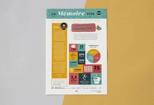
Colorful and playful, this newsletter doesn’t hide from the facts, but lays them carefully out on the front page. Primary colors and cute icons are easy on the eyes and makes those pie charts fun to peruse. Meanwhile, generous spacing keeps the layout from looking crowded and the toned down shades lend maturity. We see this style used most commonly by companies looking to invigorate their look.
7. Magnolia
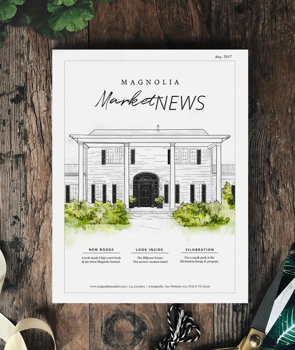
This newsletter successfully rocks an upscale East Coast vibe. Leaf green accents alongside its minimalist black and white architectural illustration give it a clean, fresh look. And a quick list of highlights neatly tucked along the bottom of the page keeps things top-notch. This layout is perfect for a first-of-the-year newsletter.
8. Vinoly
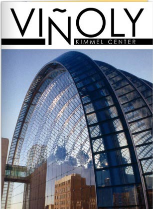
You can’t go wrong with a fantastic centerpiece. And this one, with its alternating curves and hard lines, the ribs of the structure either heavily kohled with shadow or iridescent with sunrise, is superlative.
Let your image speak for itself. Take advantage with a larger-than-life layout and a minimalist cover. Off-setting your font breaks up the straight lines of your borders and creates a point of interest, When your newsletter’s focus is information-laden articles, copy this style or take a page from popular magazines like Time or Smithsonian. Develop your written content around interest-building images. Keep them relevant and your viewers will stick with you until the end (of the article at least).
9. Power Through Peace
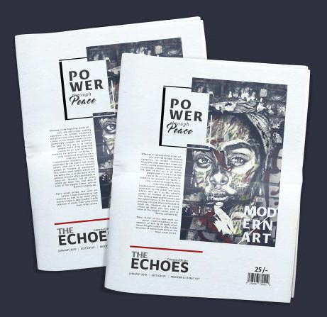
There is something fundamentally transient about this cover. One can almost taste the bitterness of black coffee, feel the rhythm of slam poetry where newsletters like these might be strewn across battered tables. Youthful rebellion is dynamic branding. Bespoke résistance showcasing gorgeous street art is trendy and the message is clear: politics change, graffiti may be painted over, but this is cool.
10. Act News
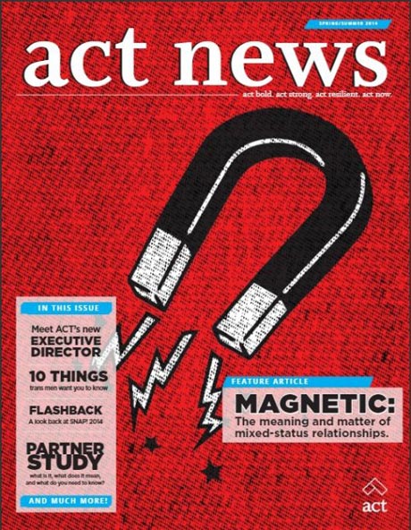
Vibrant, dynamic, and magnetic! This pop art inspired cover effectively uses saturated colors and simple motifs to drive their message. Try using an all lower-case serif to keep your title professional but low key. Direct and to the point, these semi-transparent text boxes list the newsletter’s highlights without detracting from the overall effect.
11. A News
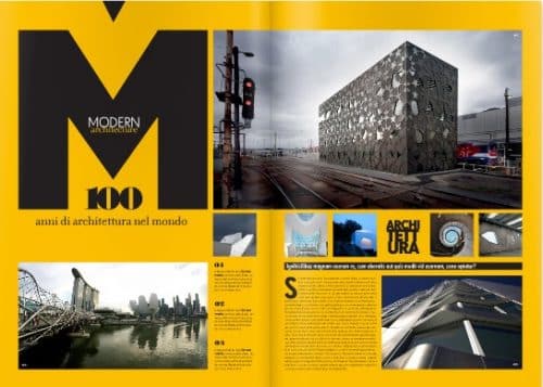
Putting the ‘M’ back in Modern, this daring spread is laden with great visuals. Framed by fantastic images, the article lies center-stage and gives you the opening you need. Grab audience attention with over-sized fonts as solid as the brick-and-mortar beauties showcased opposite. Just remember, yellow and black is daring but keep it in check with a saturated but less vibrant tone. You want to attract them, not give your viewers hives.
12. The Food Truck
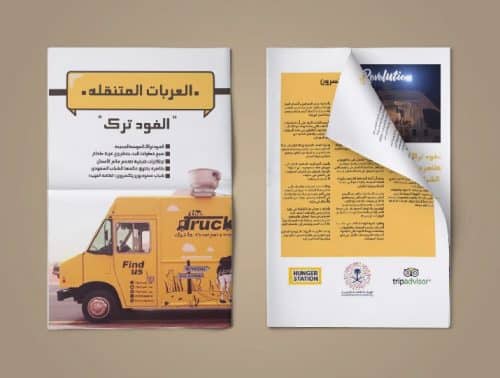
No business is too small or too new to benefit from a well executed direct-mail campaign. From food trucks to pop-up shops or even your kiosk at the next convention, you can generate interest in up-coming venues, popular trends, and developing products that are in the pipeline.
13. Grobund
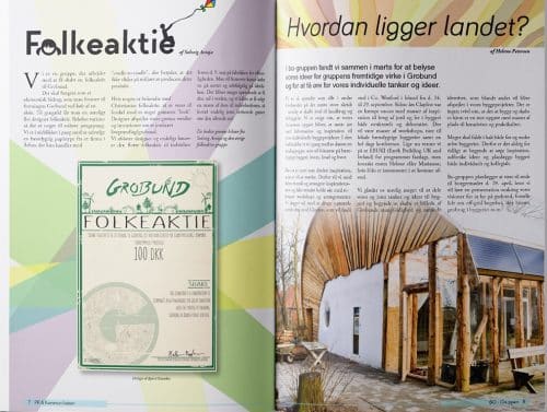
A veritable pastel rainbow, this layout is friendly and approachable and balances nicely with the raw pine frame of the facing image. Fresh spring tones beautifully frame the inset flier, tying this brochure back to a larger campaign.
14. Lux
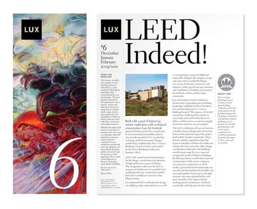
Saturated color is truly luxurious. The brushstrokes provide impeccable texture and incredibly vibrant. And yet, the picture facing it from within the article is fairly tame. This diametric opposition between the mundane and the feverish creates a sense of balance upon the page. The article provides content yet the images are the substance, acting as a foil for the spread. Meanwhile, the over-sized title carries the energy onto the next page.
15. The Cut
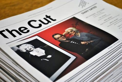
Corporate newsletters were made for newsprint. From ‘breaking news’ to the gossip column, there isn’t a single other forum that matches the pure vivacity of copy. Does that mean that you have to be big business to send out your own limited edition? Absolutely not! Tuck in a flier or a coupon for your reader’s next visit and get twice the action out of your direct-mail campaign.
Want more? Talk to a print expert today at 800-930-6040 to get started with your newsletter.
