Direct mail is a popular marketing channel for college recruitment. Starting in the spring, more than a million high school students will be sitting down to take the SATs and PSATs, and most of these tests have a small box that the student can check to receive information on different schools.
For most campuses, that information will come in the form of college recruitment brochures. Any college admissions rep will tell you that a good recruitment flier is worth its weight in gold, which is why Printing for Less prides itself on supplying hundreds of thousands of custom designed fliers and brochures every year. And with an unprecedented number of high school students eagerly awaiting their chance to shine, there is no time to waste in promoting your brand.
Enrollment is expected to continue to grow to 20.5 million between now and 2027. Yet, with the cost of education on the rise, more and more are looking very critically at their college choices. Even with an overall 7% increase in the number of first-time freshman, more than a third are applying to seven or more colleges. While some hail this as an economic coup, many more are lamenting the number of students applying to too many schools.
But how can more choices be a bad thing? With all these potential students applying to multiple schools, the odds of them picking your campus improves too, right? Not necessarily.
You have to stand out, get noticed, and deliver the value your school brings in a clear and concise way. Nothing squeezes all of that information into a mailbox-friendly format like a recruiting brochure. The trick is to make your brand out-shine the other six. For that, here are some ways to make your school stand out from the pack.
by Mark Vaile
The Natural Sciences have never looked more appealing. Vibrant, organic, and yet still grounded this brochure for the London campus of England’s Imperial College kicks off our list to a great start. Colorful imagery captures your attention but doesn’t detract from the catalogue of the department’s projects and sponsors.
by Capi VietAhn
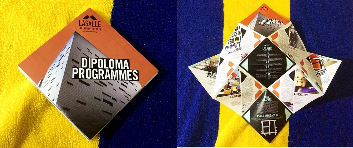
Invoking origami, this design’s inspired concept makes the most of a larger space by layered folds of card stock. When it does bloom, you will find nuggets of information tucked into each segment.
North Carolina State University, Engineering
by Jacob Fremderman
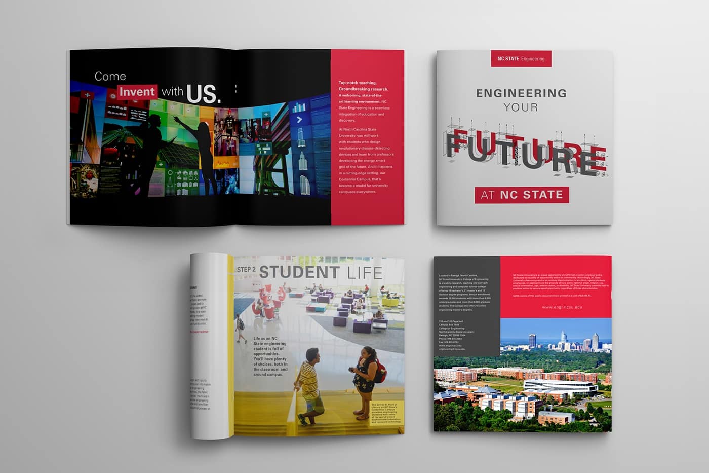
The future is now. Or next academic term, to be exact. The retro style 3D font immediately invokes a sense of futurism, while the minimalist layout and blocks of colour keeps the look fresh and uncluttered.
by Misty Bourdess Wilt
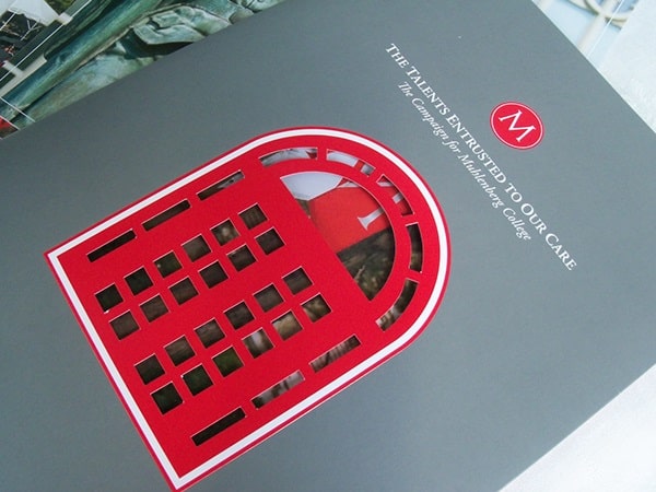
Knowledge may be the key, but in this case a great die cut is the gate keeper to a fantastic brochure. Vibrant red detailing on a classic dove gray background updates the look and lures the viewer inside.
Goa College of Art
by Jeanine Soares
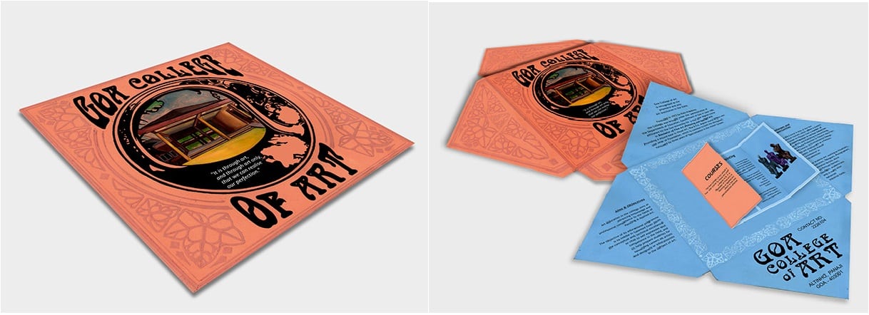
A beautiful brochure that showcases the allure a simple die cut and fold can create. The art nouveau style and square shape mirrors the album art of folk records of the 1960’s for a funky, grassroots feel.
by Martin Venezky
The cover of this brochure appears to honour the Asian wood block printings of the early 20th century and their influence on the styles of Western artists. Add a piece of delicate, almost architectural line work and you can really see how the blend of landscape and urban development influenced this San Francisco artist.
Boston University College of Fine Arts
by Chandra Wroblewski
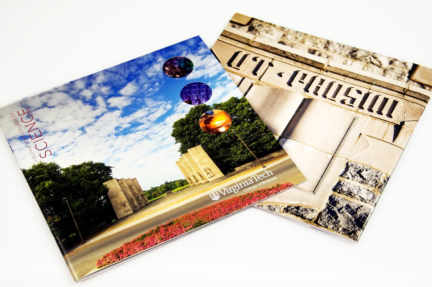
Another beautiful example of how die cuts can highlight an already great design. The dynamic exchange between the muted cover illustration and the colourful interior collage, only serves to highlight the finer points of the campus. Take a look inside, it says, and see at all the amazing and beautiful things we can accomplish together.
Virginia Tech College of Science
by Stephanie Strouse and Meaghan Dee
A simply gorgeous combination of Man’s attempts at permanence and the organic beauty of the natural world. The cover image brings to mind the Axe Historique in Paris, reminding the viewer of the precision and dedication required to create something lasting; a perfect maxim for Virginia Tech’s College of Science. And yet, by poking holes in that picturesque facade, they show hints at what is yet to come. A world of achievement lies inside their walls, if the student is dedicated.
by Tana Kosiyabong
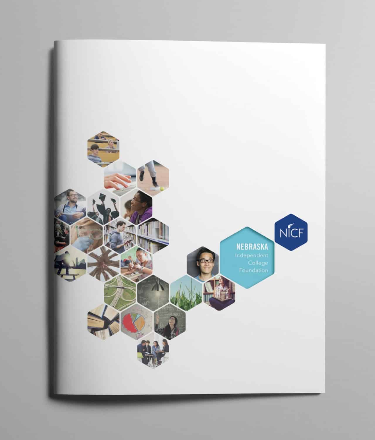
This brochure is especially fun. It successfully imparts the idea that the future is a blank canvas and their students are the building blocks that will add colour and character to the world. The honeycomb design simply enhances the idea that each student is a crucial piece of the larger picture. With Nebraska Independent, you can continue to build upon the success of your predecessors.
by Mark Coleman
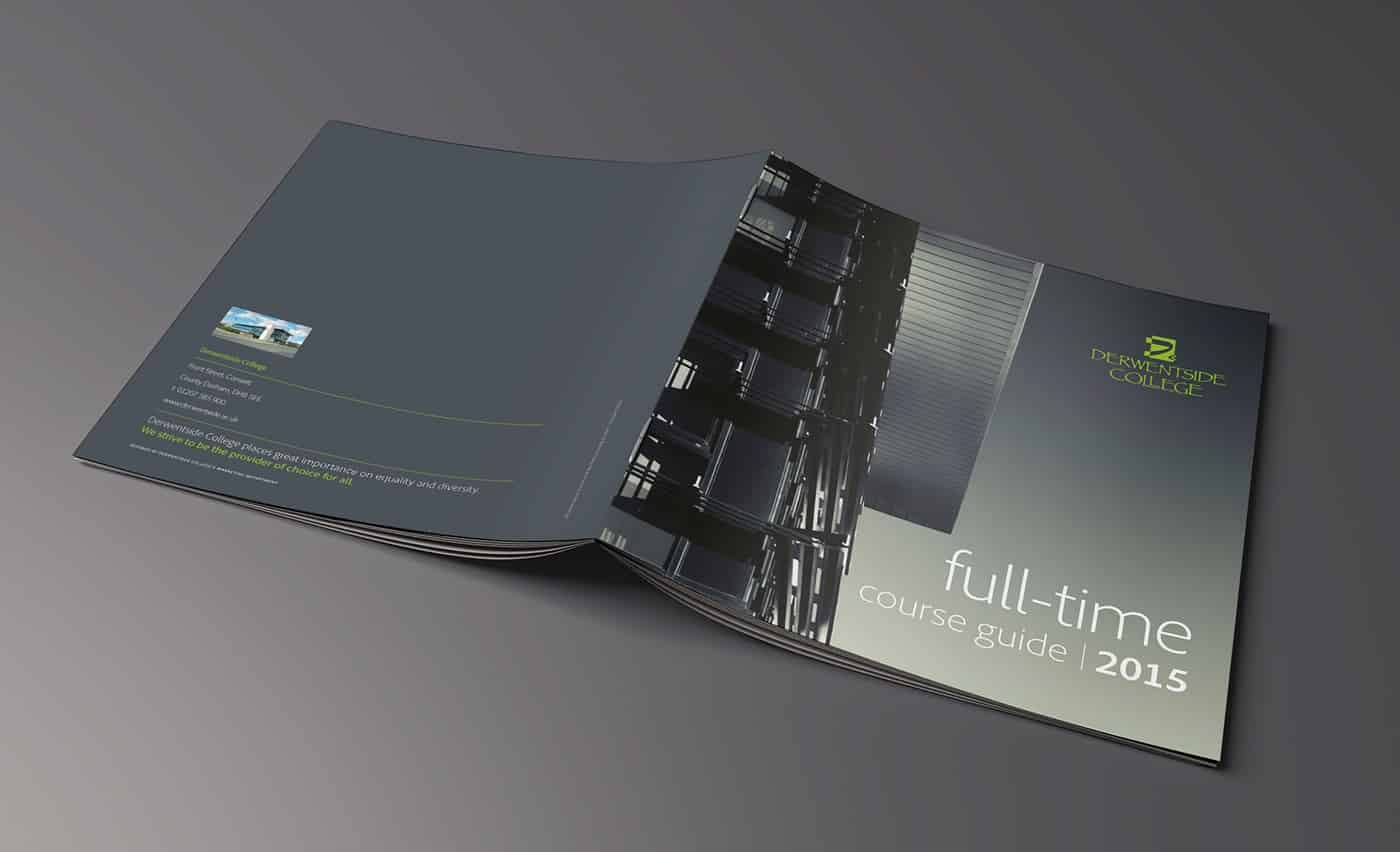
This ode to higher education is sleek and well executed. It isn’t always easy to pull off monochrome, even harder for an ombre gradient. But Derwentside makes it look smart and not a bit overdone. This outer wall and underside of the roof may never grace the cover of an architecture magazine, but they have managed to turn the ordinary into the extraordinary. Just like their students, I imagine.
Klein College of Media and Communication
by Leonard Benfante
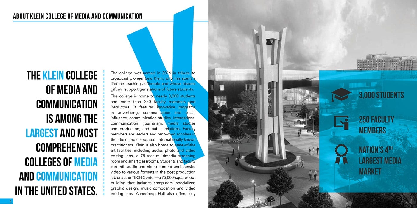
Just when we think that gray scale is done, Klein gives us another homerun. Even the fonts are larger than life. By sequentially spelling out ‘KLEIN’ one page at a time, the over-sized letters lure students further into the packet,. With the bright blue underscoring their message of success and individualized curriculum, their brochure hits it out of the park.
These are just a few ideas to spark your imagination. To find out how to make these looks work for you, give us a call at 800-930-7978. Speak to a live print expert to get started on brochure printing today!

