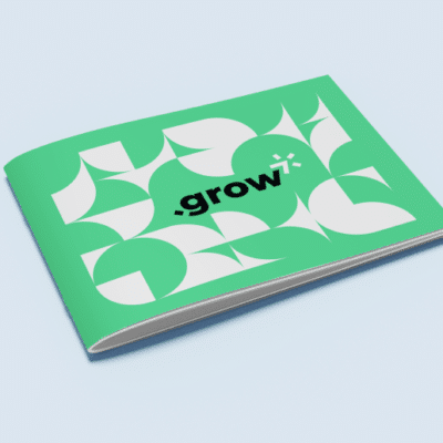
There are few print marketing materials more versatile and informative than brochures. A brochure is, at its most simple, a folded, single-page printout that includes text and images about a brand’s products and/or services. And if that sounds boring, just stick with us for a second—we promise there is a ton of room for creativity within that folded-up page.
To understand how you can get creative with brochures, you have to understand the purpose of a brochure beyond just its general definition. So what is a brochure used for? Anything you can think of. Brochures are used in marketing and advertising, but they’re also used in restaurants, retail shops, and doctor’s offices. You’ll find politicians distributing brochures, as well as PR firms, banks, schools, salespeople, and so on. Basically, if an individual or a company has something to tell you about, chances are they’re going to do it in a brochure.
The reason that brochures are such a ubiquitous print marketing tool comes down to their adaptability. Well beyond the general guidelines that answer the question “what is a brochure?” is the ability for brands to get as imaginative as they want with what their finished products look like. Not convinced? Here are 10 alternative brochure ideas to kickstart your next print marketing project.
1. Use a brochure as an invitation
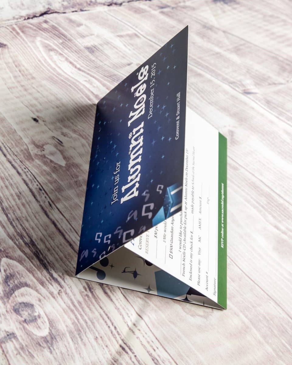
Next time you send out an invitation to a client- or lead-focused event, use it as an opportunity to share more than just the date, time, and place of your get together. By turning your invitation into a brochure, you give yourself significantly more room to go into information about who you are and what you do—which can be a real advantage if your event itself is marketing-driven.
2. Think beyond standard folding options
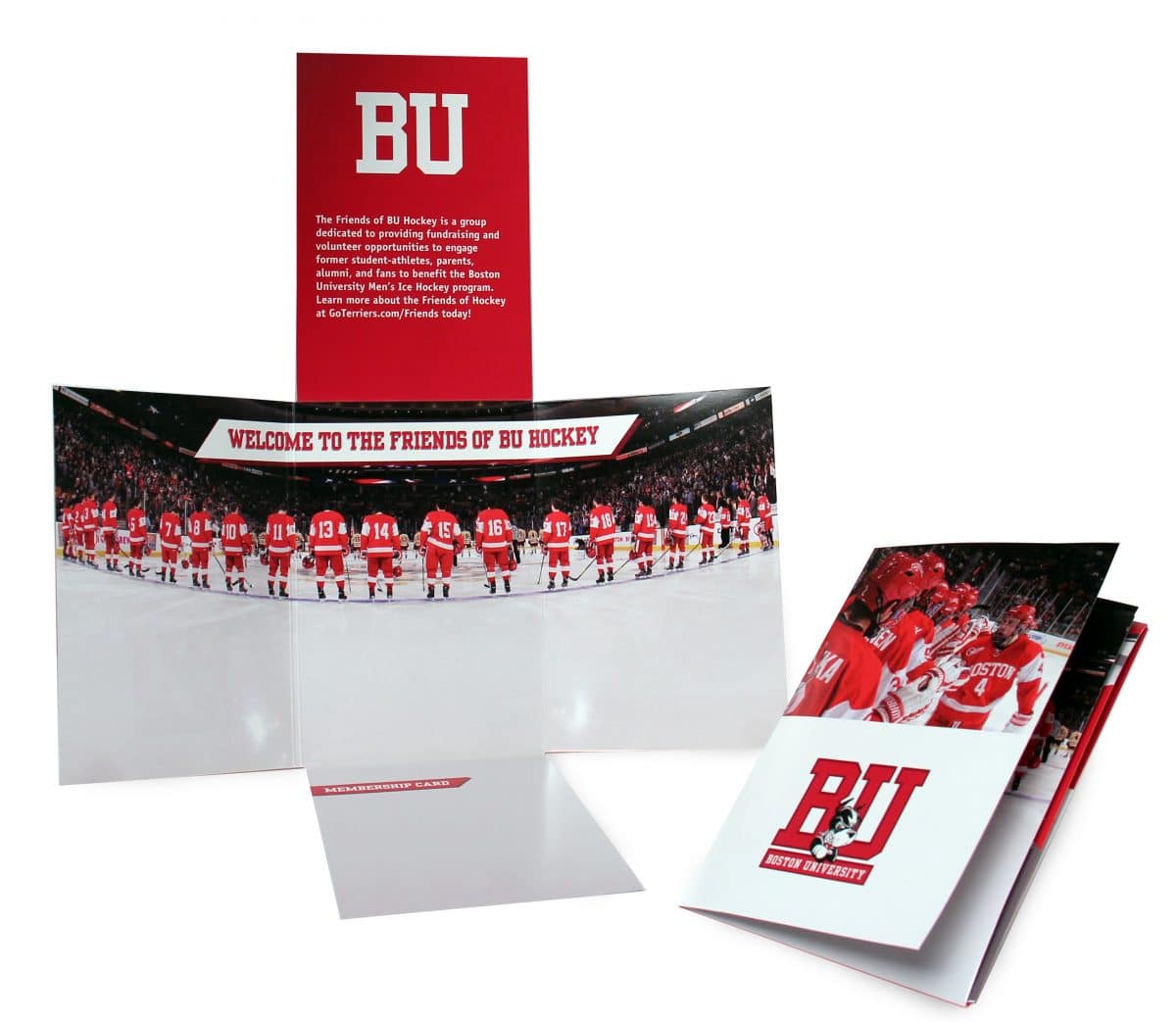
There’s no one way to fold a piece of paper. Help your brochure stand out by getting creative with your folds, opting for something non-traditional rather than just a standard panel arrangement. Doing this sends a subtle message about your brand that it’s forward thinking and into out-of-the-box ideas. In the example above, the unique fold is accentuated by images that work both as standalones when the brochure is opened and together when it’s closed.
3. Play around with shape
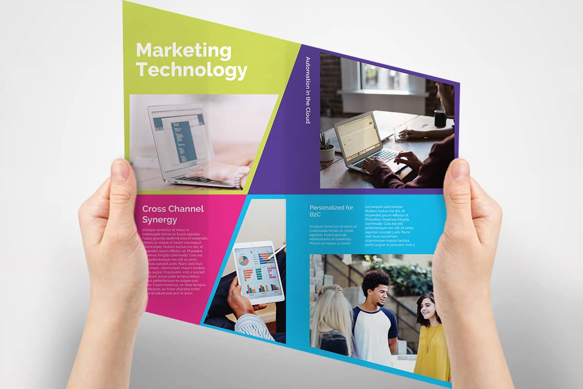
Have some fun with the overall shape of your brochure. Because while a brochure is essentially just a piece of paper, there’s no rule that that piece of paper has to be a rectangle. The shape you choose for your brochure is up to you. Go with a star and fold each point inwards to create panels. Go with a circle or a hexagon or a pirate ship—whatever makes sense for your brand. The shape just has to be foldable (and not necessarily even into symmetrical parts).
4. Size it small with a snake fold
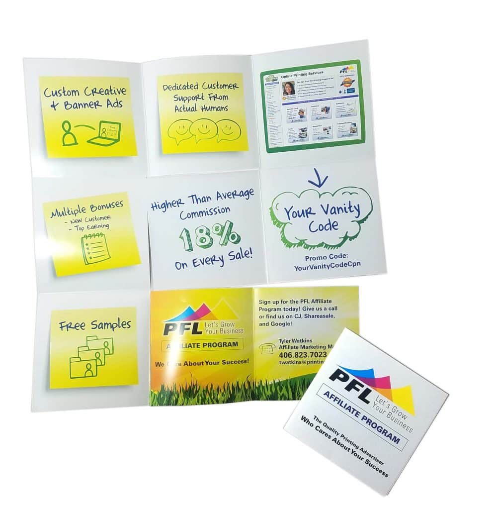
Big things really can come in small packages. Snake folds are an original method of brochure folding that balk standard patterns to create something unexpected, and lend themselves very well to tiny brochures that pack a major punch. Who knew you could get so many panels out of one standard size sheet of paper?
5. Include an infographic
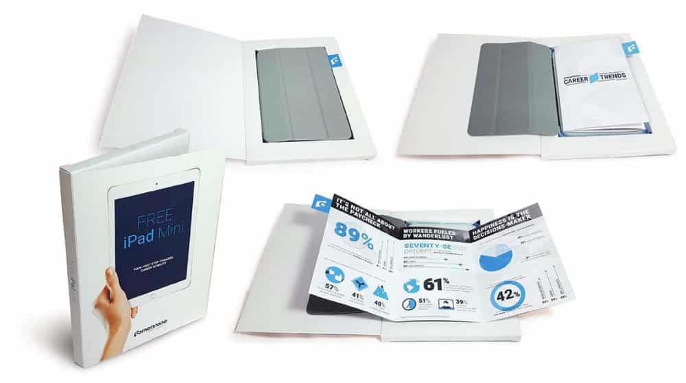
Infographics convey a ton of information in a quick, easily digestible format. And while you may be used to seeing infographics online, a brochure is a great way to bring them into print. The key to a good infographic is that it has to capture attention and it has to provide information in a non-distracting way. Be conscious of how you use color and text in your infographic so that you don’t overload the page—there should still be enough white space on there to carry the eye from point to point.
6. Tell a fortune
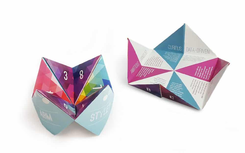
Even if you’re not in the business of fortune telling you can still design a creative brochure that mimics a paper fortune teller. Use each panel to highlight a different product or service that your company offers, or designate each panel in another way that you see fit. The benefit to this layout is that you can fit a ton of information in a relatively small brochure. And because the final product is three-dimensional, you’re sure to make a strong impression.
7. Make your imagery the star
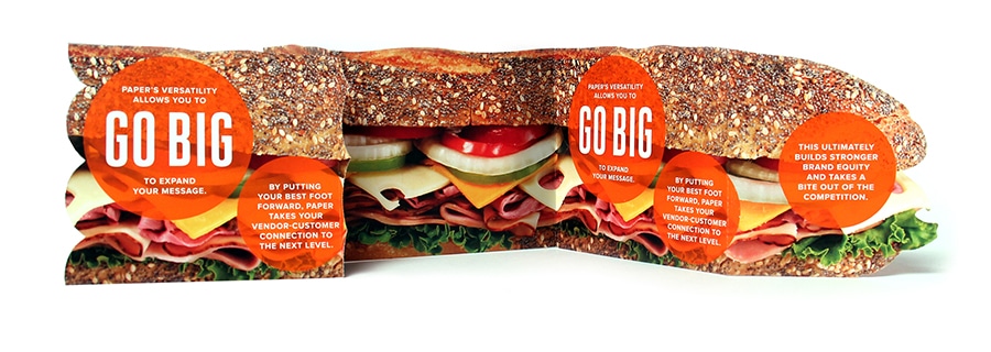
Brochures are used to share information, but to get someone to open it up in the first place you
have to grab their eye. Images are a great way to do this, especially when you incorporate the imagery into your overall brochure design instead of just using them to occasionally break up some text. In this example, the image dictates the entire shape of the brochure, and in doing so, immediately tells a story about this brand and what they do.
8. Supplement your brochure with a gift
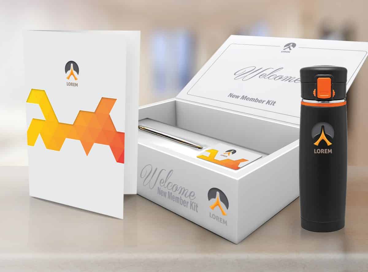
You already know why a client or a potential lead should pay attention to your brochure, but like all of us, they’re likely inundated with marketing materials every day. If you really want to stand out, it helps to sweeten the pot with a gift. By creating an integrated marketing bundle that includes a brochure and some sort of useful gift, you make it more likely that your recipient will notice your brochure among the others they’ve received, and will also give them more incentive to read what you have to say.
9. Embrace embossing
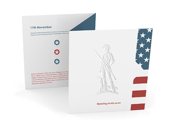
Adding embossed imagery or text to your print marketing materials adds a touch of something unexpected. It can be particularly effective on brochures like the ones in the image above, which are otherwise understated in their visual effect. Embossing adds depth and texture to a page, both of which can turn an unassuming brochure into something worth taking a second look at.
10. Pop it out
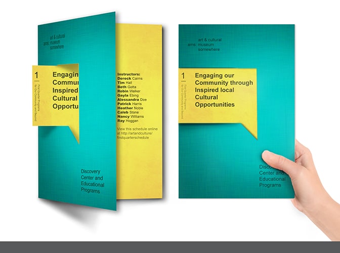
Speaking of unique design elements, consider including a pop out, which combines text from multiple panels of your brochure to highlight the message that you want to share. The brochure in the image above uses a pop out to make a strong point about what the objective of the ad is. And because it’s so clearly denoted, the organization doesn’t need to use a lot of other text to get that point across.
See? Brochures don’t have to be boring! Talk to a Printing for Less print expert to learn more about how you can create brochure that makes a big splash. Call us at 800-930-6040 to get started with brochures today.
