Using Die Cutting on Postcards
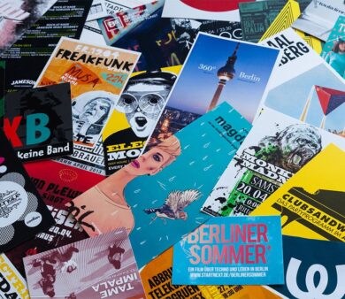
You’ve got a postcard with a clear call to action. It has bold, direct lettering. It’s a postcard, so you know it’s going to get held in your customer’s hand, it will get seen but it’s also only got a few seconds to make a lasting impression.
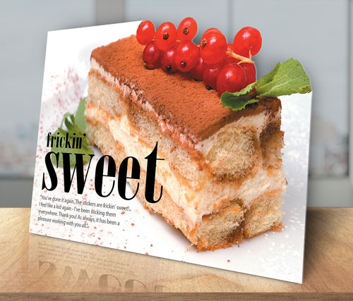
Try altering the shape of the card. It doesn’t have to be square. A postcard mailer can be any shape and if it’s unique it will cut through the clutter in the mailbox. This is called die-cutting. It works like a cookie cutter – a custom shape is made into a sharp, heavy die. That die is stamped onto your printed piece, cutting it out just like cookie dough.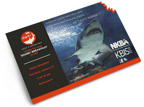
Die-cuts can come in almost any shape you can imagine – printing technology companies can have a custom die turned around quickly. Fine cuts and highly detailed work are possible – you aren’t stuck with simple rounded edges or basic shapes. Here are some tips to keep in mind when you’re using die-cuts:
- Make sure the die cut area has enough support so it doesn’t make the postcard dimensionally unstable or easily damaged.
- Integrate the die cut with printed design elements to enhance visiblity and impact.
- Conncect the die cut shape to some element of your business or message to increase the branding potential of your postcard.
Here are some creative ways to use a die-cut:
Interactive folds and tabs. Use die cuts to create an interactive fold on your postcard, giving the reader something to interact with as they glance over your message.
Realistic shape. Use a die cut to cut out a realistic version of your product, logo, or something else. Pair it with scented inks. Imagine a postcard for a bakery, die cut to look like a cookie and printed in chocolate-scented ink. Or a postcard for a pizzeria, die cut in a triangle and printed to look like a slice of pepperoni pizza. You’re only limited by your imagination.
Rounded edges for durability. Rounded edges are a simple die-cut to make and they hold up to bangs and dents better than square edges. They will also stand out from the rest of the rectangular mail pieces in the mailbox.
Three dimensional designs. Use a folded postcard with an offer inside the fold, use a die-cut window or other design to peek through to the offer, creating a 3D effect.
Die cuts add a strong tactile element to your postcard. Using die-cuts makes your postcard visually interesting and fun to hold, touch, and use. Postcards can almost guarantee they’ll be held and scanned, and if they engaged the reader with more than one sense you’ve got a better chance they’ll remember your message and act.
