Graphic Design Tips and Articles
Printing Design Guide with CMYK Color Chart
Tips, advice and information to help you pepare a graphic arts design file for commercial printing.
Preparing Photos for Commercial Printing
In this guide, you’ll learn what resolution is, how much you need when printing, and how to change it without lowering image quality. You’ll also learn how to edit digital photo files so that they look crisp and sharp in your printed projects.
Filling Text with Images and Creating Dutones with Photoshop
In this guide, you’ll learn to transform one photograph into a wide variety of duotones and step by step instructions for making images filledtext.
Design How-To: Working with Photos
So your staff meeting is coming up and your boss tells the administrative assistant to take some photos for the corporate newsletter. When he returns, he hands you generic snapshots taken from across the room. Here’s how to salvage the job with cropping and layout.
Successful Branding with Brochures
A good brochure is a balancing act of effective communication and appropriate design. To deliver, you need a shrewd understanding of your client and the target audience. Here are the three steps that will get you there, plus examples of five brochures that do the job right.
Design How-to: A Better Newsletter
Before & After magazine is renowned for its practical yet beautiful advice on laying out pages. This excerpt from the book “Before & After Page Design” is no exception. Here’s all you need to know — from the basics to the refined detail — to design successful newsletters.
The Art of Business: Design on a Shoestring
The mark of a good designer is not what can be done with a large budget, but what can be done with a small one. Here are tricks for closing the deal, managing your low-budget client, and creating a winning design.
Creative Fuel: Pentagram’s Kit Hinrichs Talks about Good Design
Is judging a design contest always a subjective experience? Is it possible to truly evaluate “good design”? Kit Hinrichs, a partner in the Pentagram design firm, says yes, if you understand the criteria.
Design How-To: Make Type and Photos Play Nice
When text and images are battling for the same space, you don’t have to give up one or the other. Here are practical techniques for bringing the two together.
Design How-To: Solve Color Dilemmas
No matter what you’re creating — a print piece, a Web site, an illustration — the element with the greatest effect on your audience is color. How do you choose the right one, or even more daunting, the best mix?
Design How-to: Endless Pattern Possibilities
Just one simple step-and-repeat technique is all you need to create striking background patterns perfect for the covers of books, annual reports, brochures — you name it.
Design How-To: Repurposing Art for a Digital Portfolio
Instead of lugging around a big black case, creating a compact digital portfolio that you can post on the Web or send via e-mail makes sense. But how to translate your traditional-media work to a digital format? And how should you prepare your existing digital files so they appear in the best light? Here’s what to do.
Design How-To: Make Eye-catching Small Calendars
What’s fun is that with modern desktop printers that render tiny type clearly, a calendar of your own is easier than ever to make and use.
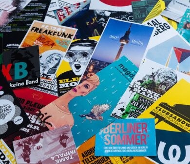
Posters That Stop Them On the Street
The best posters engage, inform, and motivate people. Here’s how to create them, no matter what the subject matter or where they’ll be posted.
Make Your Next Catalog a Work of Art
An effective catalog goes far beyond pictures and text slapped on a page. Creating one that generates sales takes strategic thinking and great design. Follow these 9 tips to make your catalogs stand out.
Giving Design Meaning
Design goes far beyond making something “pretty” on the outside. The best design takes into account customer needs and delivers meaningful experiences. This excerpt identifies seven design principles to follow and five process stages to go through to reach the end goal: design that matters.
Fly the Creative Skies
Fasten your seatbelts low and tight across your laps, ladies and gentleman, because we’ve got a quietly powerful creativity boost for you. This article, which combines full-page photos with insights from a fellow creative pro, will give you wings.
Sometimes a Logo Is Just a Logo
Quark’s new logo is strikingly similar to several others. Is it theft? A global conspiracy? Or a failure to follow basic design principles? Gene Gable gives you the dirt, including ways you can sidestep the same type of predicament.
Creative Fuel: Appreciate the View
Fire hydrants, taxicabs, a national book expo, and Central Park give Molly Joss a new outlook. What would open your eyes?
Creative Fuel: The Book Geek in Me
MMMmmmm, design books. The carefully chosen color palettes, the inspiring imagery, the sensual feel of the heavy paper stock. Molly Joss waxes rhapsodic and invites you to share your bibliocentric desires.
Creative Fuel: Tips for Stimulating Creativity
A nasty virus came with a silver lining — it gave Molly Joss the down time she needed to discover her inner Jackson Pollack and to create a plan for conjuring creativity anytime.
Creative Fuel for the Holidays: It’s in the Cards
The holiday season is a fine time to show your artistic side to clients and friends. But when the weight of expectation becomes too heavy, how do you light the creative spark? Molly W. Joss takes you through her annual internal debate.


